Accordion
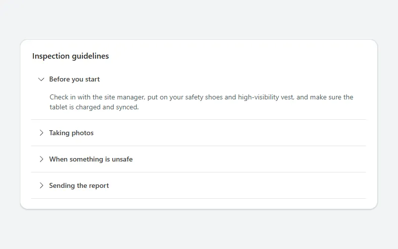
A card of collapsible sections with a rotating chevron, where opening one section closes the others and each section grows to fit its text.
- Version
- 1.0.0
- Updated
- Verified in Studio
- Not yet
- Author
- Ynias Bensch
- Tags
Overview
An accordion keeps long help text or optional details out of the way until people need them. Each section is a full-width button with a chevron and a heading; selecting it opens the text below and turns the chevron down. Opening a section closes the one that was open, and selecting an open section closes it.
The first section starts open. The open section is stored in locAccordionOpen as the section's number. Each section is its own container, so it is exactly as tall as its text; to add one, copy AccordionItem4, change the 4 in its control names and formulas to 5, and add AccordionItem5.Height to the Height of AccordionRoot.
When to use
- Help, guidelines and FAQs next to a form or a dashboard.
- Optional details that most people skip.
When not to use
- Content most people need: show it.
- Sections with many fields that people fill in one after the other: use a stepper.
Controls used
| Control | Version |
|---|---|
| GroupContainer | 1.5.0 |
| ModernText | 1.0.0 |
| ModernButton | 1.0.0 |
YAML
Works as is, with example data inline. Paste it into a screen or container; the steps are underHow to paste.
Not yet verified in Power Apps Studio. The control versions are drafted from documentation. If Studio flags one, see How to paste for the fix.
- AccordionRoot:
    Control: GroupContainer@1.5.0
    Variant: AutoLayout
    Properties:
      BorderColor: =ColorFade(App.Theme.Colors.Darker70, 88%)
      BorderThickness: =1
      DropShadow: =DropShadow.Light
      Fill: =Color.White
      Height: =AccordionTitle.Height + AccordionItem1.Height + AccordionItem2.Height + AccordionItem3.Height + AccordionItem4.Height + 40
      LayoutDirection: =LayoutDirection.Vertical
      LayoutGap: =0
      PaddingBottom: =20
      PaddingLeft: =20
      PaddingRight: =20
      PaddingTop: =20
      RadiusBottomLeft: =16
      RadiusBottomRight: =16
      RadiusTopLeft: =16
      RadiusTopRight: =16
      Width: =Min(720, Parent.Width)
    Children:
      - AccordionTitle:
          Control: ModernText@1.0.0
          Properties:
            AccessibleLabel: =Self.Text
            AlignInContainer: =AlignInContainer.Stretch
            FontWeight: =FontWeight.Semibold
            Height: =34
            LayoutMinHeight: =0
            LayoutMinWidth: =80
            PaddingBottom: =8
            PaddingTop: =0
            Size: =16
            Text: ="Inspection guidelines"
            Wrap: =false
      - AccordionItem1:
          Control: GroupContainer@1.5.0
          Variant: AutoLayout
          Properties:
            AlignInContainer: =AlignInContainer.Stretch
            DropShadow: =DropShadow.None
            FillPortions: =0
            Height: =AccordionHeader1.Height + If(AccordionBody1.Visible, AccordionBody1.Height, 0) + 1
            LayoutDirection: =LayoutDirection.Vertical
            LayoutMinHeight: =0
            LayoutMinWidth: =120
          Children:
            - AccordionHeader1:
                Control: ModernButton@1.0.0
                Properties:
                  AccessibleLabel: |
                    =Self.Text & If(Coalesce(locAccordionOpen, 1) = 1, ", expanded", ", collapsed")
                  Align: =Align.Left
                  AlignInContainer: =AlignInContainer.Stretch
                  Appearance: =ButtonAppearance.Transparent
                  FontWeight: =FontWeight.Semibold
                  Height: =52
                  Icon: ="ChevronRight"
                  IconRotation: =If(Coalesce(locAccordionOpen, 1) = 1, 90, 0)
                  LayoutMinHeight: =52
                  LayoutMinWidth: =80
                  OnSelect: |
                    =UpdateContext({locAccordionOpen: If(Coalesce(locAccordionOpen, 1) = 1, 0, 1)})
                  Size: =14
                  Text: ="Before you start"
            - AccordionBody1:
                Control: ModernText@1.0.0
                Properties:
                  AccessibleLabel: =Self.Text
                  AlignInContainer: =AlignInContainer.Stretch
                  AutoHeight: =true
                  Color: =ColorFade(App.Theme.Colors.Darker70, 30%)
                  FillPortions: =0
                  Height: =40
                  LayoutMinHeight: =0
                  LayoutMinWidth: =80
                  PaddingBottom: =16
                  PaddingLeft: =40
                  PaddingRight: =12
                  PaddingTop: =0
                  Size: =14
                  Text: ="Check in with the site manager, put on your safety shoes and high-visibility vest, and make sure the tablet is charged and synced."
                  Visible: =Coalesce(locAccordionOpen, 1) = 1
            - AccordionDivider1:
                Control: GroupContainer@1.5.0
                Variant: ManualLayout
                Properties:
                  AlignInContainer: =AlignInContainer.Stretch
                  DropShadow: =DropShadow.None
                  Fill: =ColorFade(App.Theme.Colors.Darker70, 90%)
                  FillPortions: =0
                  Height: =1
                  LayoutMinHeight: =1
                  LayoutMinWidth: =0
      - AccordionItem2:
          Control: GroupContainer@1.5.0
          Variant: AutoLayout
          Properties:
            AlignInContainer: =AlignInContainer.Stretch
            DropShadow: =DropShadow.None
            FillPortions: =0
            Height: =AccordionHeader2.Height + If(AccordionBody2.Visible, AccordionBody2.Height, 0) + 1
            LayoutDirection: =LayoutDirection.Vertical
            LayoutMinHeight: =0
            LayoutMinWidth: =120
          Children:
            - AccordionHeader2:
                Control: ModernButton@1.0.0
                Properties:
                  AccessibleLabel: |
                    =Self.Text & If(Coalesce(locAccordionOpen, 1) = 2, ", expanded", ", collapsed")
                  Align: =Align.Left
                  AlignInContainer: =AlignInContainer.Stretch
                  Appearance: =ButtonAppearance.Transparent
                  FontWeight: =FontWeight.Semibold
                  Height: =52
                  Icon: ="ChevronRight"
                  IconRotation: =If(Coalesce(locAccordionOpen, 1) = 2, 90, 0)
                  LayoutMinHeight: =52
                  LayoutMinWidth: =80
                  OnSelect: |
                    =UpdateContext({locAccordionOpen: If(Coalesce(locAccordionOpen, 1) = 2, 0, 2)})
                  Size: =14
                  Text: ="Taking photos"
            - AccordionBody2:
                Control: ModernText@1.0.0
                Properties:
                  AccessibleLabel: =Self.Text
                  AlignInContainer: =AlignInContainer.Stretch
                  AutoHeight: =true
                  Color: =ColorFade(App.Theme.Colors.Darker70, 30%)
                  FillPortions: =0
                  Height: =40
                  LayoutMinHeight: =0
                  LayoutMinWidth: =80
                  PaddingBottom: =16
                  PaddingLeft: =40
                  PaddingRight: =12
                  PaddingTop: =0
                  Size: =14
                  Text: ="Take one overview photo per room and a close-up of every finding. Photos upload in the background once you are back online."
                  Visible: =Coalesce(locAccordionOpen, 1) = 2
            - AccordionDivider2:
                Control: GroupContainer@1.5.0
                Variant: ManualLayout
                Properties:
                  AlignInContainer: =AlignInContainer.Stretch
                  DropShadow: =DropShadow.None
                  Fill: =ColorFade(App.Theme.Colors.Darker70, 90%)
                  FillPortions: =0
                  Height: =1
                  LayoutMinHeight: =1
                  LayoutMinWidth: =0
      - AccordionItem3:
          Control: GroupContainer@1.5.0
          Variant: AutoLayout
          Properties:
            AlignInContainer: =AlignInContainer.Stretch
            DropShadow: =DropShadow.None
            FillPortions: =0
            Height: =AccordionHeader3.Height + If(AccordionBody3.Visible, AccordionBody3.Height, 0) + 1
            LayoutDirection: =LayoutDirection.Vertical
            LayoutMinHeight: =0
            LayoutMinWidth: =120
          Children:
            - AccordionHeader3:
                Control: ModernButton@1.0.0
                Properties:
                  AccessibleLabel: |
                    =Self.Text & If(Coalesce(locAccordionOpen, 1) = 3, ", expanded", ", collapsed")
                  Align: =Align.Left
                  AlignInContainer: =AlignInContainer.Stretch
                  Appearance: =ButtonAppearance.Transparent
                  FontWeight: =FontWeight.Semibold
                  Height: =52
                  Icon: ="ChevronRight"
                  IconRotation: =If(Coalesce(locAccordionOpen, 1) = 3, 90, 0)
                  LayoutMinHeight: =52
                  LayoutMinWidth: =80
                  OnSelect: |
                    =UpdateContext({locAccordionOpen: If(Coalesce(locAccordionOpen, 1) = 3, 0, 3)})
                  Size: =14
                  Text: ="When something is unsafe"
            - AccordionBody3:
                Control: ModernText@1.0.0
                Properties:
                  AccessibleLabel: =Self.Text
                  AlignInContainer: =AlignInContainer.Stretch
                  AutoHeight: =true
                  Color: =ColorFade(App.Theme.Colors.Darker70, 30%)
                  FillPortions: =0
                  Height: =40
                  LayoutMinHeight: =0
                  LayoutMinWidth: =80
                  PaddingBottom: =16
                  PaddingLeft: =40
                  PaddingRight: =12
                  PaddingTop: =0
                  Size: =14
                  Text: ="Stop the activity, warn the people involved and log a critical finding. The site manager gets a notification straight away."
                  Visible: =Coalesce(locAccordionOpen, 1) = 3
            - AccordionDivider3:
                Control: GroupContainer@1.5.0
                Variant: ManualLayout
                Properties:
                  AlignInContainer: =AlignInContainer.Stretch
                  DropShadow: =DropShadow.None
                  Fill: =ColorFade(App.Theme.Colors.Darker70, 90%)
                  FillPortions: =0
                  Height: =1
                  LayoutMinHeight: =1
                  LayoutMinWidth: =0
      - AccordionItem4:
          Control: GroupContainer@1.5.0
          Variant: AutoLayout
          Properties:
            AlignInContainer: =AlignInContainer.Stretch
            DropShadow: =DropShadow.None
            FillPortions: =0
            Height: =AccordionHeader4.Height + If(AccordionBody4.Visible, AccordionBody4.Height, 0) + 1
            LayoutDirection: =LayoutDirection.Vertical
            LayoutMinHeight: =0
            LayoutMinWidth: =120
          Children:
            - AccordionHeader4:
                Control: ModernButton@1.0.0
                Properties:
                  AccessibleLabel: |
                    =Self.Text & If(Coalesce(locAccordionOpen, 1) = 4, ", expanded", ", collapsed")
                  Align: =Align.Left
                  AlignInContainer: =AlignInContainer.Stretch
                  Appearance: =ButtonAppearance.Transparent
                  FontWeight: =FontWeight.Semibold
                  Height: =52
                  Icon: ="ChevronRight"
                  IconRotation: =If(Coalesce(locAccordionOpen, 1) = 4, 90, 0)
                  LayoutMinHeight: =52
                  LayoutMinWidth: =80
                  OnSelect: |
                    =UpdateContext({locAccordionOpen: If(Coalesce(locAccordionOpen, 1) = 4, 0, 4)})
                  Size: =14
                  Text: ="Sending the report"
            - AccordionBody4:
                Control: ModernText@1.0.0
                Properties:
                  AccessibleLabel: =Self.Text
                  AlignInContainer: =AlignInContainer.Stretch
                  AutoHeight: =true
                  Color: =ColorFade(App.Theme.Colors.Darker70, 30%)
                  FillPortions: =0
                  Height: =40
                  LayoutMinHeight: =0
                  LayoutMinWidth: =80
                  PaddingBottom: =16
                  PaddingLeft: =40
                  PaddingRight: =12
                  PaddingTop: =0
                  Size: =14
                  Text: ="Review the checklist, sign on the last step and send. The report goes to the site manager and the safety team."
                  Visible: =Coalesce(locAccordionOpen, 1) = 4
            - AccordionDivider4:
                Control: GroupContainer@1.5.0
                Variant: ManualLayout
                Properties:
                  AlignInContainer: =AlignInContainer.Stretch
                  DropShadow: =DropShadow.None
                  Fill: =ColorFade(App.Theme.Colors.Darker70, 90%)
                  FillPortions: =0
                  Height: =1
                  LayoutMinHeight: =1
                  LayoutMinWidth: =0
Make it yours
The example runs on sample data. Replace these properties to connect it to your app.
Text on AccordionHeader1
The heading of the first section. Do the same for the other sections.
In the YAML
Text: ="Before you start"Your version
Text: ="What do I need on site?"Text on AccordionBody1
The text of the first section. It wraps, and the section grows to fit.
In the YAML
Text: ="Check in with the site manager, put on your safety shoes and high-visibility vest, and make sure the tablet is charged and synced."Your version
Text: ="Safety shoes, a high-visibility vest and the tablet with the latest checklist synced."Text on AccordionTitle
The title of the card.
In the YAML
Text: ="Inspection guidelines"Your version
Text: ="Frequently asked questions"How to paste
- Open your app in Power Apps Studio.
- Check that modern controls are on: Settings → Updates → Modern controls and themes. In newer environments they are on by default.
- Copy the YAML with the Copy button above the code.
- In the Tree view, select the screen or container that should hold the component and press Ctrl+V. The whole component arrives as one container,
AccordionRoot, with all its controls inside. - Work through Make it yours to swap the example data for your own.
Where your version of Studio has a code view for a control or screen, you can paste the same YAML there instead of into the tree view.
When Studio flags a control version
Each control in the YAML names its version, like Control: ModernButton@1.0.0. If that version is newer than what your environment knows, Studio falls back to the version it has or flags the control. All controls of one type in an app must also use the same version, so an app that already has an older ModernButton can reject the paste. To fix it, insert the same control from the Insert pane, copy it as code, note the version on its Control: line, update every matching line in the YAML and paste again.
Missing a component, or did this one not paste cleanly? Suggest a component or report an issue.