Components
Canvas app building blocks made of modern controls. Copy the YAML, paste it into Power Apps Studio, then make it yours.
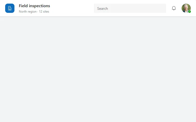
App header
A white top bar with app logo, title and subtitle, a search box, a notification button and the signed-in user's avatar.
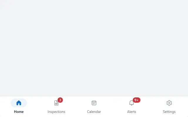
Mobile bottom nav
A phone tab bar pinned to the bottom of the screen with icons, labels, a pill behind the active icon and red count badges.
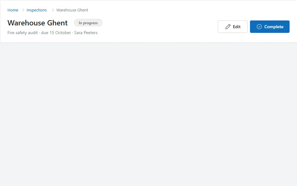
Page header
A page title band with a clickable breadcrumb, status badge, subtitle and Edit and primary action buttons on the right.
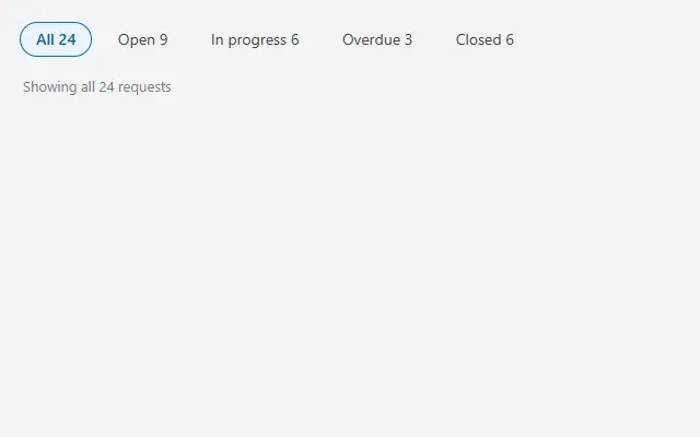
Tab bar
Pill-shaped tabs with a count per tab and a summary line that follows the selected tab, built on the modern Tab list control.
User menu
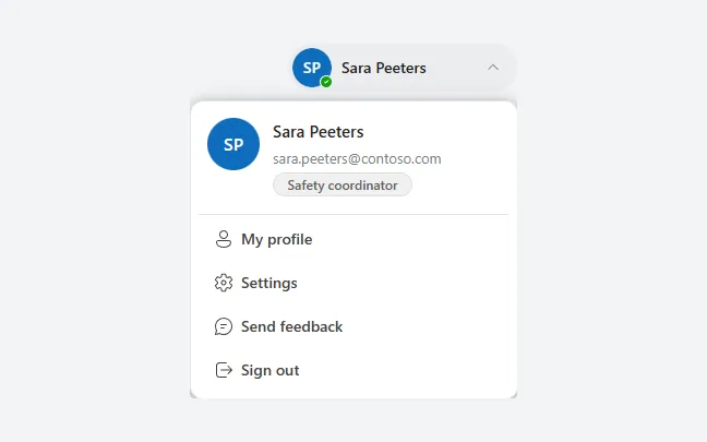
An avatar button that opens the signed-in user's name, email and role, with links to profile, settings and feedback and a sign-out button.
Command bar
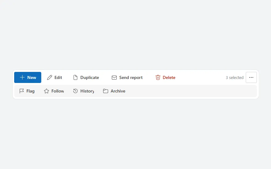
A toolbar of actions with icons, a selection count and a "…" toggle for a second row of less-used actions; labels collapse to icons on narrow screens.
Pagination
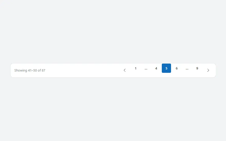
A page bar with "Showing 41–50 of 87", previous and next buttons and numbered pages that collapse into ellipses around the current page.
Row action menu
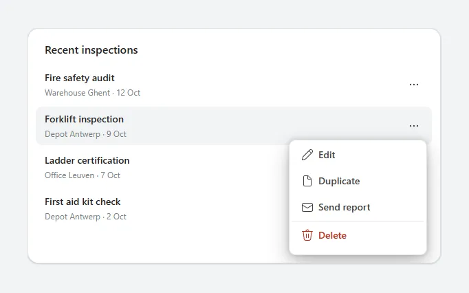
A list where each row has a "…" button that opens a popover menu with Edit, Duplicate, Send and a red Delete, closing on any outside tap.
Side navigation
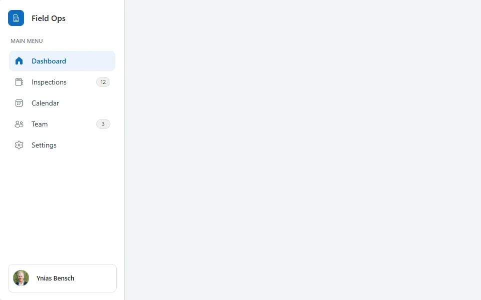
A white navigation panel with brand, menu items with icons and count badges, a highlighted active item and the user at the bottom.
Stepper
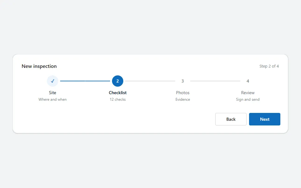
A wizard progress bar with numbered steps, done and current states, connector lines and Back and Next buttons, driven by one context variable.
Activity feed
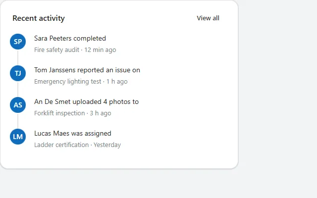
A card with recent events as a timeline, each with an initials avatar, what happened, on what, and how long ago.
Avatar group
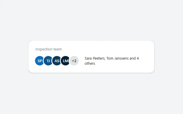
Overlapping initials for up to four people plus a +N bubble, drawn as SVG in theme colours, with their names summed up next to it.
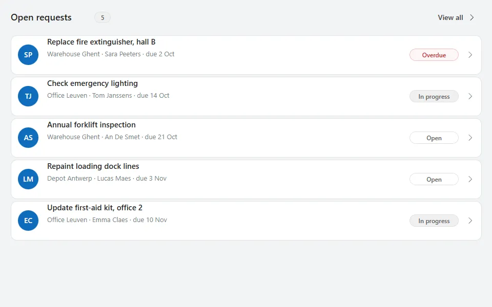
Card list
A list of white cards with an initials avatar, title, details line, coloured status pill and chevron, under a header with count and View all.
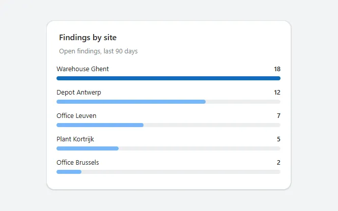
Ranked bar list
A top-N list of labels and values, sorted high to low, each with a bar scaled to the largest value; a chart built from containers only.
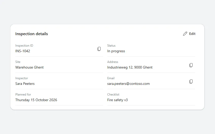
Record details list
A card of label and value pairs in two columns, one on phones, with copy buttons for values such as IDs, addresses and email addresses.
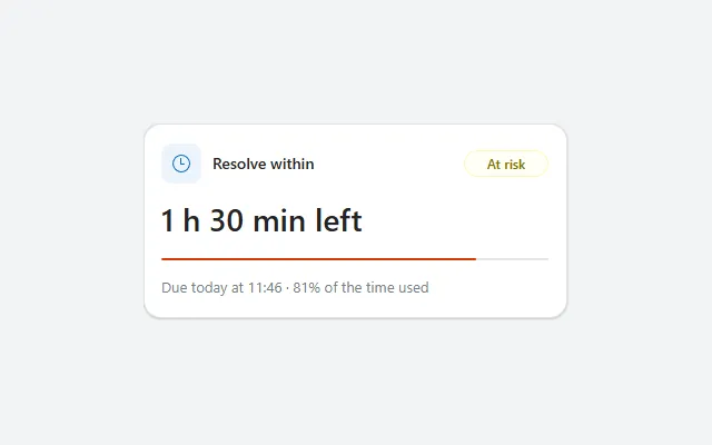
SLA countdown
Time left until a deadline, with a progress bar of the time used and a badge that turns from On track to At risk to Breached.
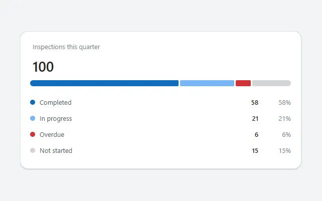
Stacked status bar
A total with one horizontal bar split into coloured segments per status, and a legend with the count and percentage of each.
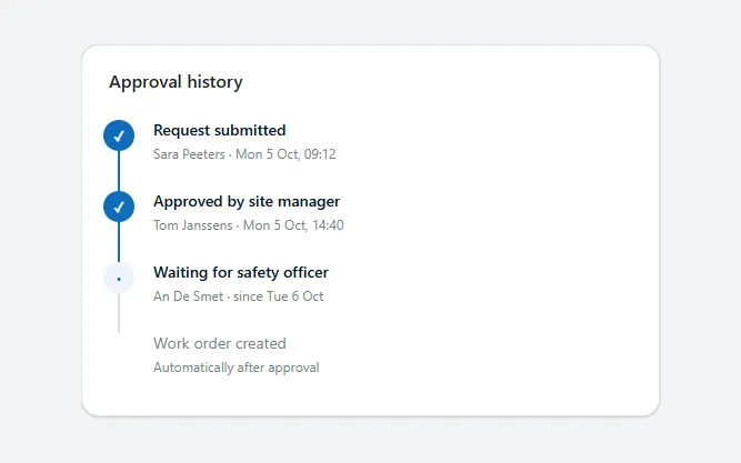
Status timeline
A vertical timeline of approval or workflow steps with done, current and upcoming states, a progress line and who and when for each step.
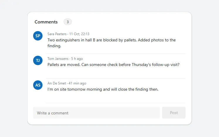
Comment thread
A card of comments with avatars, names, relative times and two-line text, and a field with a Post button underneath.
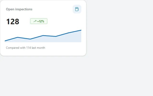
KPI tile
A stat card with label, icon, one big number, a trend badge and an SVG sparkline in the theme colour, drawn with Power Fx.
Photo viewer
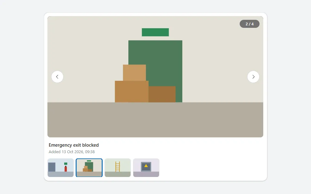
A large photo with previous and next buttons, a counter, its name and date, and a strip of thumbnails to jump to any photo.
Progress ring
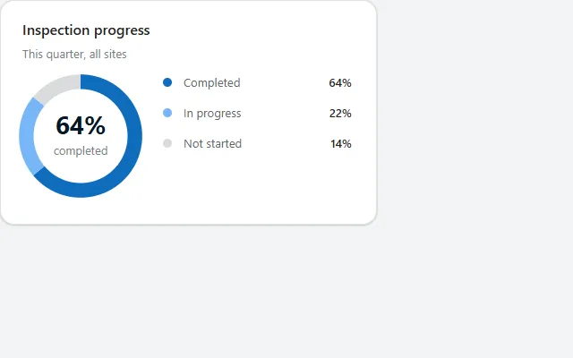
A donut chart with the main percentage in the middle and a legend, drawn as SVG in Power Fx from one table in the theme colours.
Task table
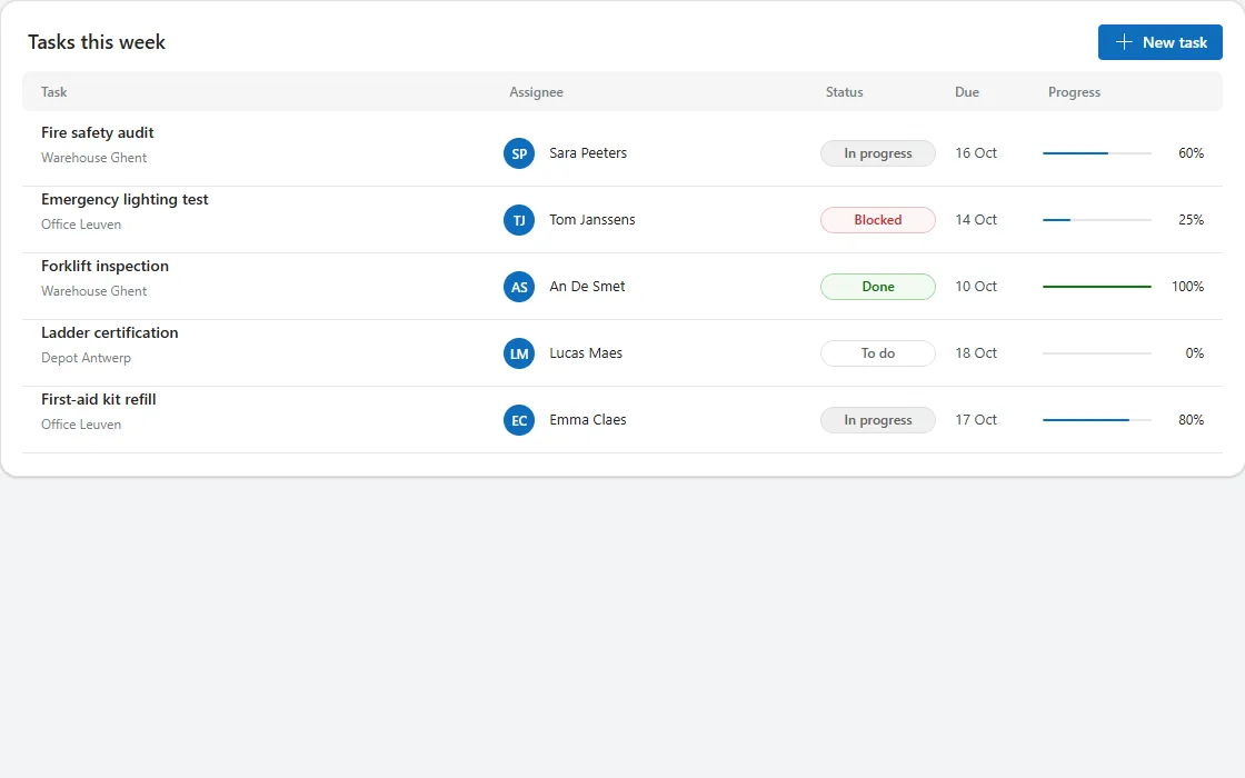
A table card with column headers and rows showing task and project, assignee avatar, status pill, due date and a progress bar.
Kanban board
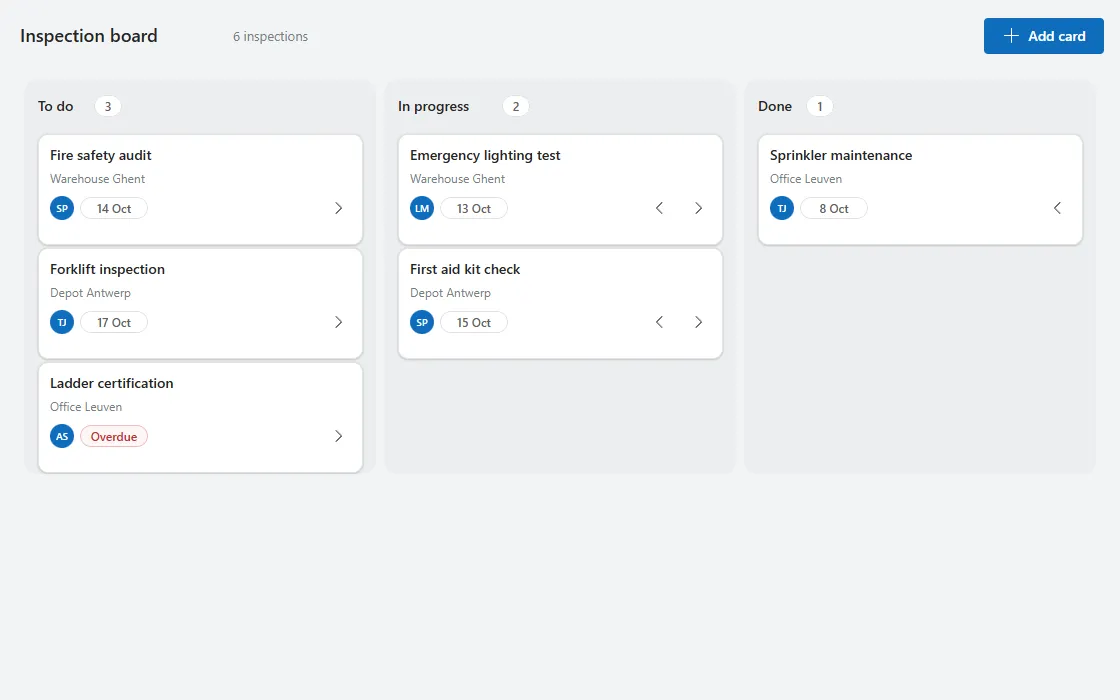
A board with a column per status, card counts, cards with owner and due date, an overdue badge and buttons to move cards between columns.
Month calendar
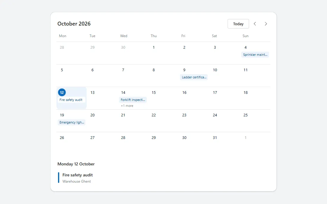
A month grid starting on Monday with today highlighted, event chips per day, previous and next month buttons and an agenda for the selected day.
Approval card
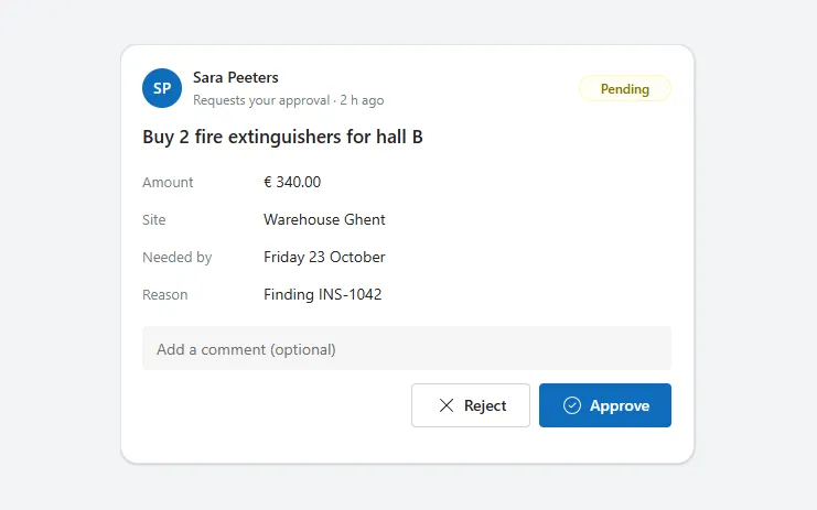
A request card with requester, status, details, an optional comment and Approve and Reject buttons that turn into a coloured result line.
Barcode scan field
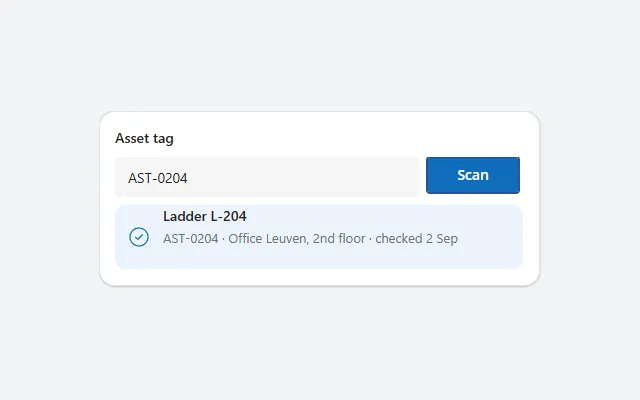
A text field with a Scan button that reads a barcode or QR code with the camera and shows the matching asset, or a hint when there is none.
Checklist
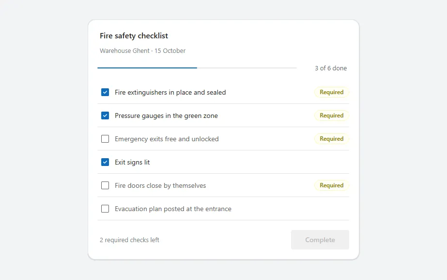
A checklist card with a progress bar, a checkbox per item, Required badges and a Complete button that unlocks when every required item is checked.
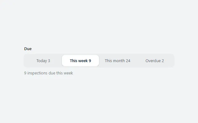
Segmented control
A pill track of options with a count each, where the selected one lifts as a white segment; stores the choice in one context variable.
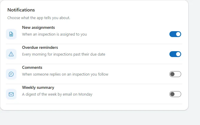
Settings list
A card of settings rows, each with an icon tile, title, one-line description and a toggle, separated by thin dividers.
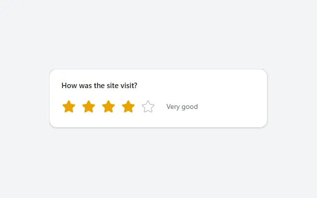
Star rating
Five stars that fill up to the selected rating in amber, with a word for the score next to them, stored in one context variable.
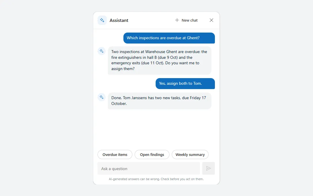
AI chat panel
A Copilot-style chat with message bubbles, suggestion chips, a prompt box and a thinking state, ready to connect to your own flow or agent.
Date range with presets
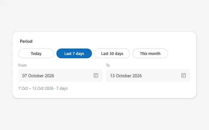
Quick period chips (today, last 7 or 30 days, this month) above From and To date pickers, with a summary of the chosen range in days.
Filter panel
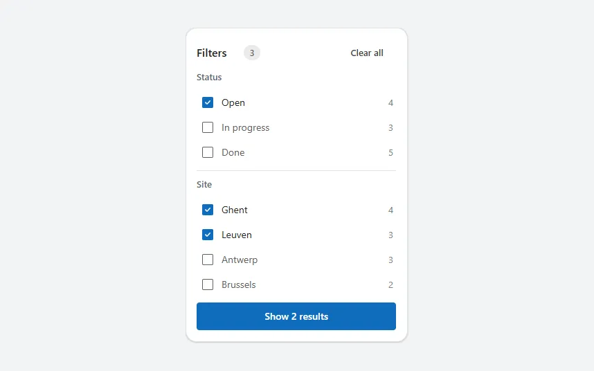
Checkbox groups per field with record counts, an active filter count, Clear all and a button that shows how many results match.
Form section
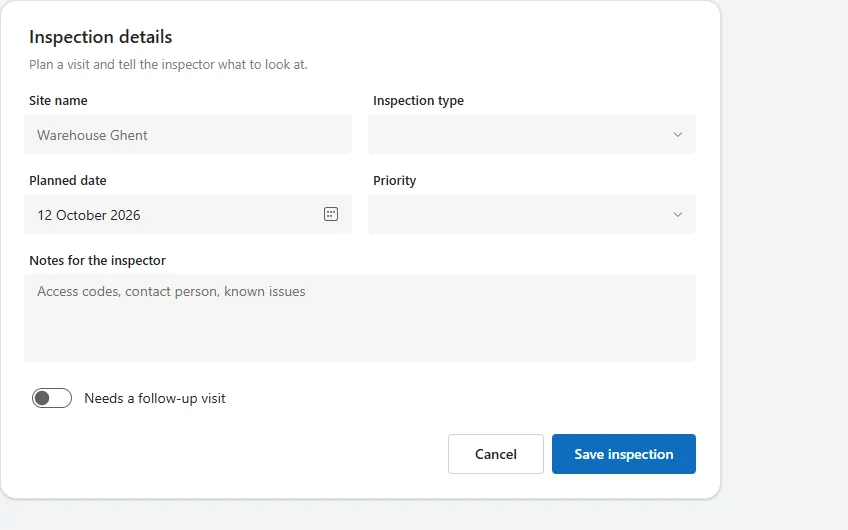
A white form card with title, two-column fields, a notes box, a toggle and Cancel and Save buttons, sized to its fields.
Photo upload
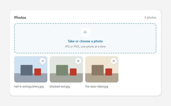
A dashed drop zone that opens the camera or file picker, with a grid of thumbnails, file names and a remove button per photo.
Search bar with filter chips
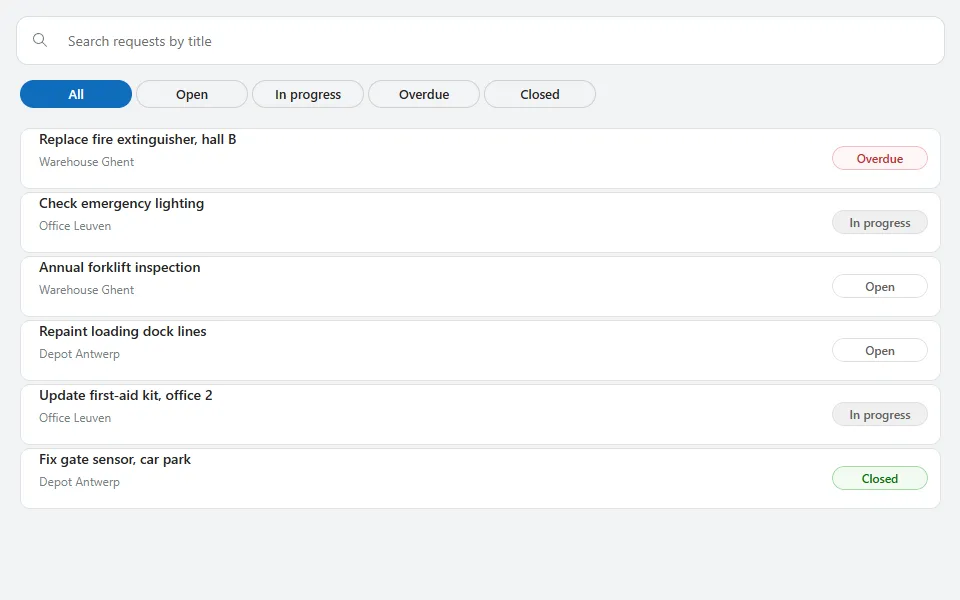
A rounded search field with pill-shaped status chips that filter a list of result cards together, working on inline example data.
Search with suggestions
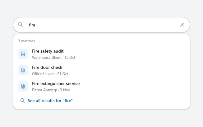
A rounded search field with a clear button and a panel of recent searches, live matches with icons and a "See all results" link.
Signature pad
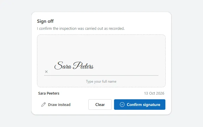
Sign off with a finger, pen or mouse, or type your name instead, with the signer's name, the date, Clear and Confirm buttons.
Tag picker
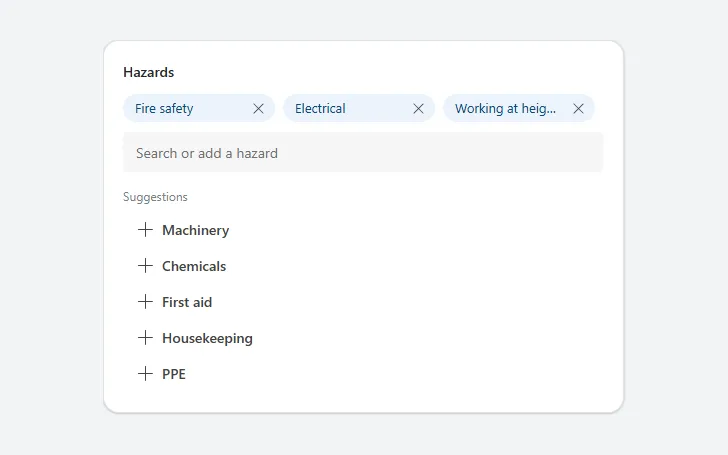
Chips for the chosen tags with a remove button each, a search field, matching suggestions and a Create button for new tags.
Empty state
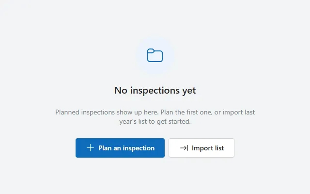
A centred icon in a soft circle, title, short explanation and primary and secondary actions for lists that have nothing to show yet.
Skeleton loader
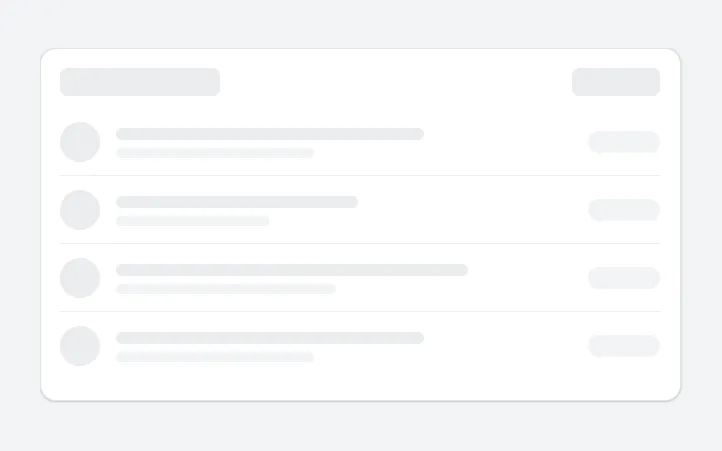
A pulsing placeholder card of grey bars and circles in the shape of a list, shown while data loads instead of a spinner.
Toast with undo
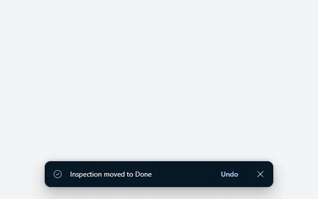
A dark notification at the bottom of the screen with a check icon, message, Undo button and close button, hiding itself after five seconds.
Alert banner
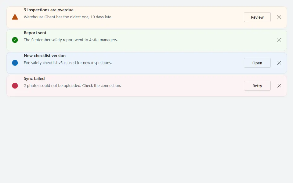
Dismissable info, success, warning and error messages with a coloured icon, title, text and an optional action button.
Confirm dialog
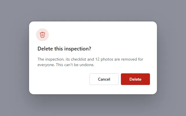
A modal with dimmed backdrop, icon, title, message and Cancel and destructive Delete buttons, opened and closed with one context variable.
Notification center
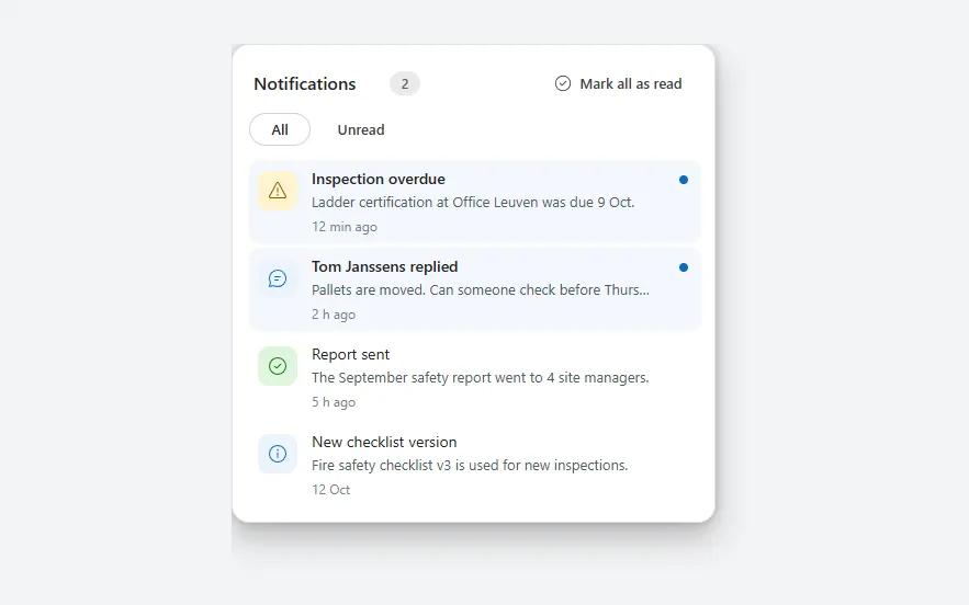
A panel of notifications with type icons, unread dots and count, an All or Unread filter, mark-as-read on tap and a Mark all as read button.
Sync status indicator
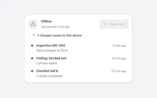
Shows whether the app is online, when it last synced and which changes are waiting, with a Sync now button and a spinner while it runs.
Accordion
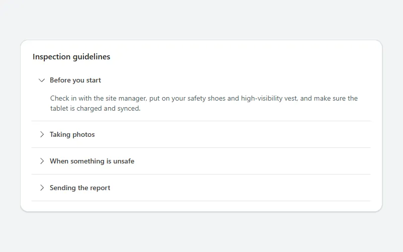
A card of collapsible sections with a rotating chevron, where opening one section closes the others and each section grows to fit its text.
List-detail split
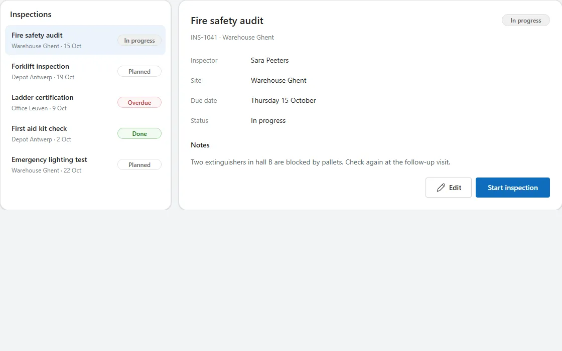
A list of records next to the details of the selected one, with notes and actions; on narrow screens it becomes a list with a Back button.
Side panel
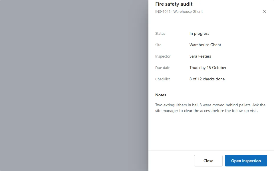
A drawer that slides over the screen from the right with a dimmed backdrop, title, close button, record details, notes and footer actions.
No component matches these filters.