Row action menu
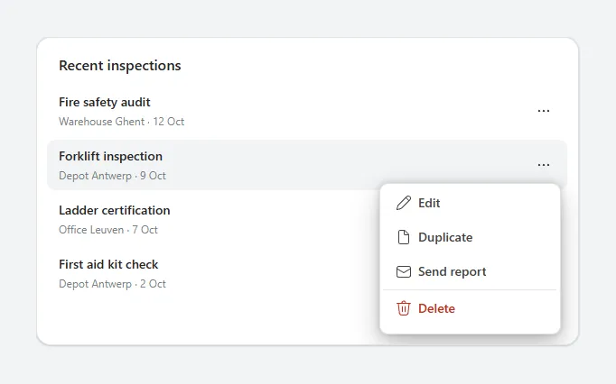
A list where each row has a "…" button that opens a popover menu with Edit, Duplicate, Send and a red Delete, closing on any outside tap.
- Version
- 1.0.0
- Updated
- Verified in Studio
- Not yet
- Author
- Ynias Bensch
- Tags
Overview
A row action menu keeps secondary actions out of the way: each row in the list has a "…" button, and selecting it opens a small menu under that row with Edit, Duplicate, Send report and, after a divider, Delete in red. Selecting an item runs it and closes the menu; selecting anywhere else closes it too.
The menu sits outside the gallery, so it can overlap the rows below instead of being cut off at the row's edge. The open row is in locRowActionMenuRow and gets a light grey background while its menu is open. The card grows when the menu of the last row opens, so the menu is never clipped.
When to use
- Lists where each row has three to six actions that people use now and then.
- Keeping rows clean on small screens, with the main action on the row itself.
When not to use
- One or two actions that people use all the time: show them as buttons on the row.
- Actions on several rows at once: use checkboxes and a command bar.
Controls used
| Control | Version |
|---|---|
| GroupContainer | 1.5.0 |
| ModernText | 1.0.0 |
| Gallery | 2.15.0 |
| ModernButton | 1.0.0 |
YAML
Works as is, with example data inline. Paste it into a screen or container; the steps are underHow to paste.
Not yet verified in Power Apps Studio. The control versions are drafted from documentation. If Studio flags one, see How to paste for the fix.
- RowActionMenuRoot:
    Control: GroupContainer@1.5.0
    Variant: ManualLayout
    Properties:
      BorderColor: =ColorFade(App.Theme.Colors.Darker70, 88%)
      BorderThickness: =1
      DropShadow: =DropShadow.Light
      Fill: =Color.White
      Height: =Max(RowActionMenuList.Y + RowActionMenuList.Height, If(RowActionMenuPanel.Visible, RowActionMenuPanel.Y + RowActionMenuPanel.Height, 0)) + 12
      RadiusBottomLeft: =16
      RadiusBottomRight: =16
      RadiusTopLeft: =16
      RadiusTopRight: =16
      Width: =Min(600, Parent.Width)
    Children:
      - RowActionMenuTitle:
          Control: ModernText@1.0.0
          Properties:
            AccessibleLabel: =Self.Text
            FontWeight: =FontWeight.Semibold
            Height: =26
            PaddingBottom: =0
            PaddingTop: =0
            Size: =16
            Text: ="Recent inspections"
            Width: =Parent.Width - 40
            Wrap: =false
            X: =20
            Y: =18
      - RowActionMenuList:
          Control: Gallery@2.15.0
          Variant: Vertical
          Properties:
            AccessibleLabel: =RowActionMenuTitle.Text
            BorderThickness: =0
            Height: =Self.AllItemsCount * (Self.TemplateHeight + Self.TemplatePadding) + Self.TemplatePadding
            Items: |
              =Table(
                  {Row: 1, Title: "Fire safety audit", Detail: "Warehouse Ghent · 12 Oct"},
                  {Row: 2, Title: "Forklift inspection", Detail: "Depot Antwerp · 9 Oct"},
                  {Row: 3, Title: "Ladder certification", Detail: "Office Leuven · 7 Oct"},
                  {Row: 4, Title: "First aid kit check", Detail: "Depot Antwerp · 2 Oct"}
              )
            ShowScrollbar: =false
            TabIndex: =0
            TemplatePadding: =0
            TemplateSize: =60
            Width: =Parent.Width - 24
            X: =12
            Y: =52
          Children:
            - RowActionMenuRowFill:
                Control: GroupContainer@1.5.0
                Variant: ManualLayout
                Properties:
                  DropShadow: =DropShadow.None
                  Fill: =If(ThisItem.Row = Coalesce(locRowActionMenuRow, 0), ColorFade(App.Theme.Colors.Darker70, 95%), Color.Transparent)
                  Height: =Parent.TemplateHeight - 4
                  RadiusBottomLeft: =10
                  RadiusBottomRight: =10
                  RadiusTopLeft: =10
                  RadiusTopRight: =10
                  Width: =Parent.TemplateWidth
                  X: =0
                  Y: =2
            - RowActionMenuItemTitle:
                Control: ModernText@1.0.0
                Properties:
                  AccessibleLabel: =Self.Text
                  FontWeight: =FontWeight.Semibold
                  Height: =22
                  PaddingBottom: =0
                  PaddingTop: =0
                  Size: =14
                  Text: =ThisItem.Title
                  Width: =Parent.TemplateWidth - 64
                  Wrap: =false
                  X: =8
                  Y: =9
            - RowActionMenuItemDetail:
                Control: ModernText@1.0.0
                Properties:
                  AccessibleLabel: =Self.Text
                  Color: =ColorFade(App.Theme.Colors.Darker70, 45%)
                  Height: =20
                  PaddingBottom: =0
                  PaddingTop: =0
                  Size: =12
                  Text: =ThisItem.Detail
                  Width: =Parent.TemplateWidth - 64
                  Wrap: =false
                  X: =8
                  Y: =31
            - RowActionMenuMore:
                Control: ModernButton@1.0.0
                Properties:
                  AccessibleLabel: ="Actions for " & RowActionMenuItemTitle.Text
                  Appearance: =ButtonAppearance.Subtle
                  Height: =36
                  Icon: ="MoreHorizontal"
                  Layout: =ButtonLayout.IconOnly
                  OnSelect: |
                    =UpdateContext({locRowActionMenuRow: If(Coalesce(locRowActionMenuRow, 0) = ThisItem.Row, 0, ThisItem.Row)})
                  Size: =14
                  Tooltip: ="More actions"
                  Width: =36
                  X: =Parent.TemplateWidth - Self.Width - 8
                  Y: =12
      - RowActionMenuDismiss:
          Control: ModernButton@1.0.0
          Properties:
            AccessibleLabel: ="Close menu"
            Appearance: =ButtonAppearance.Transparent
            Height: =Parent.Height
            OnSelect: |
              =UpdateContext({locRowActionMenuRow: 0})
            Text: =""
            Visible: =Coalesce(locRowActionMenuRow, 0) > 0
            Width: =Parent.Width
            X: =0
            Y: =0
      - RowActionMenuPanel:
          Control: GroupContainer@1.5.0
          Variant: AutoLayout
          Properties:
            BorderColor: =ColorFade(App.Theme.Colors.Darker70, 88%)
            BorderThickness: =1
            DropShadow: =DropShadow.Bold
            Fill: =Color.White
            Height: =4 * 36 + 9 + 3 * 2 + 8
            LayoutDirection: =LayoutDirection.Vertical
            LayoutGap: =2
            PaddingBottom: =4
            PaddingLeft: =4
            PaddingRight: =4
            PaddingTop: =4
            RadiusBottomLeft: =10
            RadiusBottomRight: =10
            RadiusTopLeft: =10
            RadiusTopRight: =10
            Visible: =Coalesce(locRowActionMenuRow, 0) > 0
            Width: =200
            X: =RowActionMenuList.X + RowActionMenuList.Width - Self.Width - 8
            Y: =RowActionMenuList.Y + (Coalesce(locRowActionMenuRow, 1) - 1) * (RowActionMenuList.TemplateHeight + RowActionMenuList.TemplatePadding) + 50
          Children:
            - RowActionMenuEdit:
                Control: ModernButton@1.0.0
                Properties:
                  AccessibleLabel: =Self.Text
                  Align: =Align.Left
                  AlignInContainer: =AlignInContainer.Stretch
                  Appearance: =ButtonAppearance.Subtle
                  Height: =36
                  Icon: ="Edit"
                  LayoutMinHeight: =36
                  LayoutMinWidth: =80
                  OnSelect: |
                    =Notify("Edit " & LookUp(RowActionMenuList.AllItems, Row = locRowActionMenuRow).Title & " (example only).", NotificationType.Information);
                    UpdateContext({locRowActionMenuRow: 0})
                  Size: =14
                  Text: ="Edit"
            - RowActionMenuDuplicate:
                Control: ModernButton@1.0.0
                Properties:
                  AccessibleLabel: =Self.Text
                  Align: =Align.Left
                  AlignInContainer: =AlignInContainer.Stretch
                  Appearance: =ButtonAppearance.Subtle
                  Height: =36
                  Icon: ="Document"
                  LayoutMinHeight: =36
                  LayoutMinWidth: =80
                  OnSelect: |
                    =Notify("Duplicate " & LookUp(RowActionMenuList.AllItems, Row = locRowActionMenuRow).Title & " (example only).", NotificationType.Information);
                    UpdateContext({locRowActionMenuRow: 0})
                  Size: =14
                  Text: ="Duplicate"
            - RowActionMenuSend:
                Control: ModernButton@1.0.0
                Properties:
                  AccessibleLabel: =Self.Text
                  Align: =Align.Left
                  AlignInContainer: =AlignInContainer.Stretch
                  Appearance: =ButtonAppearance.Subtle
                  Height: =36
                  Icon: ="Mail"
                  LayoutMinHeight: =36
                  LayoutMinWidth: =80
                  OnSelect: |
                    =Notify("Send " & LookUp(RowActionMenuList.AllItems, Row = locRowActionMenuRow).Title & " (example only).", NotificationType.Information);
                    UpdateContext({locRowActionMenuRow: 0})
                  Size: =14
                  Text: ="Send report"
            - RowActionMenuDivider:
                Control: GroupContainer@1.5.0
                Variant: ManualLayout
                Properties:
                  AlignInContainer: =AlignInContainer.Stretch
                  DropShadow: =DropShadow.None
                  Fill: =ColorFade(App.Theme.Colors.Darker70, 90%)
                  FillPortions: =0
                  Height: =1
                  LayoutMinHeight: =1
                  LayoutMinWidth: =0
            - RowActionMenuDelete:
                Control: ModernButton@1.0.0
                Properties:
                  AccessibleLabel: =Self.Text
                  Align: =Align.Left
                  AlignInContainer: =AlignInContainer.Stretch
                  Appearance: =ButtonAppearance.Subtle
                  Color: =RGBA(196, 43, 28, 1)
                  Height: =36
                  Icon: ="Delete"
                  LayoutMinHeight: =36
                  LayoutMinWidth: =80
                  OnSelect: |
                    =Notify("Delete " & LookUp(RowActionMenuList.AllItems, Row = locRowActionMenuRow).Title & " (example only).", NotificationType.Warning);
                    UpdateContext({locRowActionMenuRow: 0})
                  Size: =14
                  Text: ="Delete"
Make it yours
The example runs on sample data. Replace these properties to connect it to your app.
Items on RowActionMenuList
The rows. Keep Row, the row's position from 1, which places the menu under the right row.
In the YAML
Items: |
  =Table(
      {Row: 1, Title: "Fire safety audit", Detail: "Warehouse Ghent · 12 Oct"},
      {Row: 2, Title: "Forklift inspection", Detail: "Depot Antwerp · 9 Oct"},
      {Row: 3, Title: "Ladder certification", Detail: "Office Leuven · 7 Oct"},
      {Row: 4, Title: "First aid kit check", Detail: "Depot Antwerp · 2 Oct"}
  )
Your version
Items: |
  =With(
      {rows: Sort(Filter(Inspections, Status <> "Archived"), 'Due date', SortOrder.Descending)},
      ForAll(
          Sequence(CountRows(rows)) As i,
          With(
              {r: Index(rows, i.Value)},
              {Row: i.Value, Id: r.ID, Title: r.Title, Detail: r.Site & " · " & Text(r.'Due date', "d mmm")}
          )
      )
  )
OnSelect on RowActionMenuEdit
What each menu item does. Do the same for RowActionMenuDuplicate and RowActionMenuSend, and change their Text and Icon.
In the YAML
OnSelect: |
  =Notify("Edit " & LookUp(RowActionMenuList.AllItems, Row = locRowActionMenuRow).Title & " (example only).", NotificationType.Information);
  UpdateContext({locRowActionMenuRow: 0})
Your version
OnSelect: |
  =Set(varInspection, LookUp(Inspections, ID = LookUp(RowActionMenuList.AllItems, Row = locRowActionMenuRow).Id));
  UpdateContext({locRowActionMenuRow: 0});
  Navigate(InspectionScreen, ScreenTransition.None)
OnSelect on RowActionMenuDelete
The destructive action, in red. Confirm it first, for example by opening a confirm dialog.
In the YAML
OnSelect: |
  =Notify("Delete " & LookUp(RowActionMenuList.AllItems, Row = locRowActionMenuRow).Title & " (example only).", NotificationType.Warning);
  UpdateContext({locRowActionMenuRow: 0})
Your version
OnSelect: |
  =UpdateContext({locRowActionMenuRow: 0, locConfirmDialogOpen: true})
How to paste
- Open your app in Power Apps Studio.
- Check that modern controls are on: Settings → Updates → Modern controls and themes. In newer environments they are on by default.
- Copy the YAML with the Copy button above the code.
- In the Tree view, select the screen or container that should hold the component and press Ctrl+V. The whole component arrives as one container,
RowActionMenuRoot, with all its controls inside. - Work through Make it yours to swap the example data for your own.
Where your version of Studio has a code view for a control or screen, you can paste the same YAML there instead of into the tree view.
When Studio flags a control version
Each control in the YAML names its version, like Control: ModernButton@1.0.0. If that version is newer than what your environment knows, Studio falls back to the version it has or flags the control. All controls of one type in an app must also use the same version, so an app that already has an older ModernButton can reject the paste. To fix it, insert the same control from the Insert pane, copy it as code, note the version on its Control: line, update every matching line in the YAML and paste again.
Missing a component, or did this one not paste cleanly? Suggest a component or report an issue.