Skeleton loader
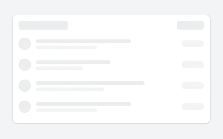
A pulsing placeholder card of grey bars and circles in the shape of a list, shown while data loads instead of a spinner.
- Version
- 1.0.0
- Updated
- Verified in Studio
- Not yet
- Author
- Ynias Bensch
- Tags
Overview
A skeleton screen shows the shape of the content before it arrives: a card with a title bar, and rows with a round avatar, two lines of text and a status pill. The lines have different lengths so the placeholder reads as a list, and a hidden timer makes the bars pulse gently.
Set a variable such as varLoading to true before a slow ClearCollect or Refresh and back to false after it, and bind Visible to it. Because the skeleton has the same layout as the list it stands in for, the screen doesn't jump when the data appears.
When to use
- Lists and cards that take more than a moment to load, such as data from SharePoint or a flow.
- Screens that load on
OnVisible, so people see the layout straight away.
When not to use
- Actions that take a few seconds after a button press: show a spinner or disable the button.
- Loading that usually takes less than half a second: the flash is more distracting than an empty moment.
Controls used
| Control | Version |
|---|---|
| GroupContainer | 1.5.0 |
| Timer | 2.1.0 |
| Gallery | 2.15.0 |
YAML
Works as is, with example data inline. Paste it into a screen or container; the steps are underHow to paste.
Not yet verified in Power Apps Studio. The control versions are drafted from documentation. If Studio flags one, see How to paste for the fix.
- SkeletonLoaderRoot:
    Control: GroupContainer@1.5.0
    Variant: AutoLayout
    Properties:
      BorderColor: =ColorFade(App.Theme.Colors.Darker70, 88%)
      BorderThickness: =1
      DropShadow: =DropShadow.Light
      Fill: =Color.White
      Height: =SkeletonLoaderHeader.Height + SkeletonLoaderGallery.Height + 12 + 40
      LayoutDirection: =LayoutDirection.Vertical
      LayoutGap: =12
      PaddingBottom: =20
      PaddingLeft: =20
      PaddingRight: =20
      PaddingTop: =20
      RadiusBottomLeft: =16
      RadiusBottomRight: =16
      RadiusTopLeft: =16
      RadiusTopRight: =16
      Visible: =true
      Width: =Min(640, Parent.Width)
    Children:
      - SkeletonLoaderHeader:
          Control: GroupContainer@1.5.0
          Variant: AutoLayout
          Properties:
            AlignInContainer: =AlignInContainer.Stretch
            DropShadow: =DropShadow.None
            FillPortions: =0
            Height: =28
            LayoutAlignItems: =LayoutAlignItems.Center
            LayoutDirection: =LayoutDirection.Horizontal
            LayoutGap: =12
            LayoutMinHeight: =28
            LayoutMinWidth: =120
          Children:
            - SkeletonLoaderTitleBar:
                Control: GroupContainer@1.5.0
                Variant: ManualLayout
                Properties:
                  DropShadow: =DropShadow.None
                  Fill: =ColorFade(App.Theme.Colors.Darker70, If(locSkeletonLoaderPulse, 88%, 92%))
                  FillPortions: =0
                  Height: =16
                  LayoutMinHeight: =16
                  LayoutMinWidth: =40
                  RadiusBottomLeft: =8
                  RadiusBottomRight: =8
                  RadiusTopLeft: =8
                  RadiusTopRight: =8
                  Width: =160
            - SkeletonLoaderSpacer:
                Control: GroupContainer@1.5.0
                Variant: ManualLayout
                Properties:
                  DropShadow: =DropShadow.None
                  FillPortions: =1
                  Height: =1
                  LayoutMinHeight: =1
                  LayoutMinWidth: =0
            - SkeletonLoaderActionBar:
                Control: GroupContainer@1.5.0
                Variant: ManualLayout
                Properties:
                  DropShadow: =DropShadow.None
                  Fill: =ColorFade(App.Theme.Colors.Darker70, If(locSkeletonLoaderPulse, 88%, 92%))
                  FillPortions: =0
                  Height: =28
                  LayoutMinHeight: =28
                  LayoutMinWidth: =40
                  RadiusBottomLeft: =8
                  RadiusBottomRight: =8
                  RadiusTopLeft: =8
                  RadiusTopRight: =8
                  Width: =88
            - SkeletonLoaderTimer:
                Control: Timer@2.1.0
                Properties:
                  AutoStart: =true
                  Duration: =700
                  OnTimerEnd: |
                    =UpdateContext({locSkeletonLoaderPulse: Not(locSkeletonLoaderPulse)})
                  Repeat: =true
                  Visible: =false
      - SkeletonLoaderGallery:
          Control: Gallery@2.15.0
          Variant: Vertical
          Properties:
            AccessibleLabel: ="Loading inspections"
            AlignInContainer: =AlignInContainer.Stretch
            BorderThickness: =0
            FillPortions: =0
            Height: =Self.AllItemsCount * (Self.TemplateHeight + Self.TemplatePadding) + Self.TemplatePadding
            Items: =Sequence(4)
            LayoutMinHeight: =0
            LayoutMinWidth: =120
            ShowScrollbar: =false
            TabIndex: =0
            TemplatePadding: =0
            TemplateSize: =68
          Children:
            - SkeletonLoaderAvatar:
                Control: GroupContainer@1.5.0
                Variant: ManualLayout
                Properties:
                  DropShadow: =DropShadow.None
                  Fill: =ColorFade(App.Theme.Colors.Darker70, If(locSkeletonLoaderPulse, 88%, 92%))
                  Height: =40
                  RadiusBottomLeft: =20
                  RadiusBottomRight: =20
                  RadiusTopLeft: =20
                  RadiusTopRight: =20
                  Width: =40
                  X: =0
                  Y: =14
            - SkeletonLoaderLine1:
                Control: GroupContainer@1.5.0
                Variant: ManualLayout
                Properties:
                  DropShadow: =DropShadow.None
                  Fill: =ColorFade(App.Theme.Colors.Darker70, If(locSkeletonLoaderPulse, 88%, 92%))
                  Height: =12
                  RadiusBottomLeft: =6
                  RadiusBottomRight: =6
                  RadiusTopLeft: =6
                  RadiusTopRight: =6
                  Width: =(Parent.TemplateWidth - 160) * Switch(Mod(ThisItem.Value, 3), 1, 0.7, 2, 0.55, 0.8)
                  X: =56
                  Y: =20
            - SkeletonLoaderLine2:
                Control: GroupContainer@1.5.0
                Variant: ManualLayout
                Properties:
                  DropShadow: =DropShadow.None
                  Fill: =ColorFade(App.Theme.Colors.Darker70, If(locSkeletonLoaderPulse, 91%, 95%))
                  Height: =10
                  RadiusBottomLeft: =5
                  RadiusBottomRight: =5
                  RadiusTopLeft: =5
                  RadiusTopRight: =5
                  Width: =(Parent.TemplateWidth - 160) * Switch(Mod(ThisItem.Value, 3), 1, 0.45, 2, 0.35, 0.5)
                  X: =56
                  Y: =40
            - SkeletonLoaderPill:
                Control: GroupContainer@1.5.0
                Variant: ManualLayout
                Properties:
                  DropShadow: =DropShadow.None
                  Fill: =ColorFade(App.Theme.Colors.Darker70, If(locSkeletonLoaderPulse, 91%, 95%))
                  Height: =22
                  RadiusBottomLeft: =11
                  RadiusBottomRight: =11
                  RadiusTopLeft: =11
                  RadiusTopRight: =11
                  Width: =72
                  X: =Parent.TemplateWidth - Self.Width
                  Y: =23
            - SkeletonLoaderDivider:
                Control: GroupContainer@1.5.0
                Variant: ManualLayout
                Properties:
                  DropShadow: =DropShadow.None
                  Fill: =ColorFade(App.Theme.Colors.Darker70, 92%)
                  Height: =1
                  Visible: =ThisItem.Value < SkeletonLoaderGallery.AllItemsCount
                  Width: =Parent.TemplateWidth
                  X: =0
                  Y: =Parent.TemplateHeight - 1
Make it yours
The example runs on sample data. Replace these properties to connect it to your app.
Visible on SkeletonLoaderRoot
Show the placeholder while your data loads. Hide the real list with the opposite condition, or place the skeleton on top of it.
In the YAML
Visible: =trueYour version
Visible: =varLoadingItems on SkeletonLoaderGallery
The number of placeholder rows. Use about as many as fit on the screen.
In the YAML
Items: =Sequence(4)Your version
Items: =Sequence(6)How to paste
- Open your app in Power Apps Studio.
- Check that modern controls are on: Settings → Updates → Modern controls and themes. In newer environments they are on by default.
- Copy the YAML with the Copy button above the code.
- In the Tree view, select the screen or container that should hold the component and press Ctrl+V. The whole component arrives as one container,
SkeletonLoaderRoot, with all its controls inside. - Work through Make it yours to swap the example data for your own.
Where your version of Studio has a code view for a control or screen, you can paste the same YAML there instead of into the tree view.
When Studio flags a control version
Each control in the YAML names its version, like Control: ModernButton@1.0.0. If that version is newer than what your environment knows, Studio falls back to the version it has or flags the control. All controls of one type in an app must also use the same version, so an app that already has an older ModernButton can reject the paste. To fix it, insert the same control from the Insert pane, copy it as code, note the version on its Control: line, update every matching line in the YAML and paste again.
Missing a component, or did this one not paste cleanly? Suggest a component or report an issue.