Checklist
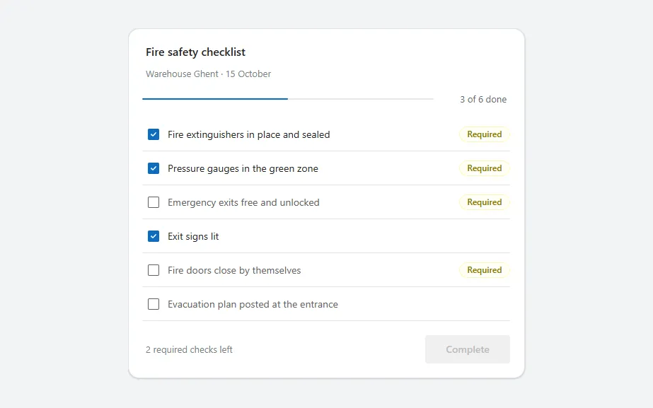
A checklist card with a progress bar, a checkbox per item, Required badges and a Complete button that unlocks when every required item is checked.
- Version
- 1.0.0
- Updated
- Verified in Studio
- Not yet
- Author
- Ynias Bensch
- Tags
Overview
A checklist for inspections and audits: a title, a progress bar with "3 of 6 done", and a row per item with a checkbox, separated by thin dividers. Items that must be done carry a yellow Required badge.
The footer counts the required items that are still open, and the Complete button stays disabled until there are none. The progress bar turns green when everything is checked. The counts read the checkboxes directly, so they update as people tick items, before anything is saved.
When to use
- Inspections, audits, handovers and other routines with a fixed list of checks.
- Up to about fifteen items per card; split longer lists into sections with a card each.
When not to use
- Checks that need more than yes or no, such as a measurement or a photo: use a form with a field per check.
- A to-do list people add items to: use a list with an add button.
Controls used
| Control | Version |
|---|---|
| GroupContainer | 1.5.0 |
| ModernText | 1.0.0 |
| ModernProgressBar | 1.0.0 |
| Gallery | 2.15.0 |
| ModernCheckbox | 1.0.2 |
| ModernBadge | 1.0.0 |
| ModernButton | 1.0.0 |
YAML
Works as is, with example data inline. Paste it into a screen or container; the steps are underHow to paste.
Not yet verified in Power Apps Studio. The control versions are drafted from documentation. If Studio flags one, see How to paste for the fix.
- ChecklistRoot:
    Control: GroupContainer@1.5.0
    Variant: AutoLayout
    Properties:
      BorderColor: =ColorFade(App.Theme.Colors.Darker70, 88%)
      BorderThickness: =1
      DropShadow: =DropShadow.Light
      Fill: =Color.White
      Height: =ChecklistTitle.Height + ChecklistSubtitle.Height + ChecklistProgress.Height + ChecklistGallery.Height + ChecklistFooter.Height + 4 * 8 + 40
      LayoutDirection: =LayoutDirection.Vertical
      LayoutGap: =8
      PaddingBottom: =20
      PaddingLeft: =20
      PaddingRight: =20
      PaddingTop: =20
      RadiusBottomLeft: =16
      RadiusBottomRight: =16
      RadiusTopLeft: =16
      RadiusTopRight: =16
      Width: =Min(560, Parent.Width)
    Children:
      - ChecklistTitle:
          Control: ModernText@1.0.0
          Properties:
            AccessibleLabel: =Self.Text
            AlignInContainer: =AlignInContainer.Stretch
            FontWeight: =FontWeight.Semibold
            Height: =26
            LayoutMinHeight: =0
            LayoutMinWidth: =80
            PaddingBottom: =0
            PaddingTop: =0
            Size: =16
            Text: ="Fire safety checklist"
            Wrap: =false
      - ChecklistSubtitle:
          Control: ModernText@1.0.0
          Properties:
            AccessibleLabel: =Self.Text
            AlignInContainer: =AlignInContainer.Stretch
            Color: =ColorFade(App.Theme.Colors.Darker70, 45%)
            Height: =20
            LayoutMinHeight: =0
            LayoutMinWidth: =80
            PaddingBottom: =0
            PaddingTop: =0
            Size: =13
            Text: ="Warehouse Ghent · 15 October"
            Wrap: =false
      - ChecklistProgress:
          Control: GroupContainer@1.5.0
          Variant: AutoLayout
          Properties:
            AlignInContainer: =AlignInContainer.Stretch
            DropShadow: =DropShadow.None
            FillPortions: =0
            Height: =36
            LayoutAlignItems: =LayoutAlignItems.Center
            LayoutDirection: =LayoutDirection.Horizontal
            LayoutGap: =12
            LayoutMinHeight: =36
            LayoutMinWidth: =120
          Children:
            - ChecklistProgressBar:
                Control: ModernProgressBar@1.0.0
                Properties:
                  AccessibleLabel: =ChecklistProgressText.Text
                  FillPortions: =1
                  Height: =16
                  LayoutMinHeight: =16
                  LayoutMinWidth: =60
                  Max: =Max(1, ChecklistGallery.AllItemsCount)
                  ProgressColor: =If(CountRows(Filter(ChecklistGallery.AllItems, ChecklistCheck.Checked)) = ChecklistGallery.AllItemsCount, ProgressColor.Success, ProgressColor.Brand)
                  Value: =CountRows(Filter(ChecklistGallery.AllItems, ChecklistCheck.Checked))
            - ChecklistProgressText:
                Control: ModernText@1.0.0
                Properties:
                  AccessibleLabel: =Self.Text
                  Align: =Align.Right
                  Color: =ColorFade(App.Theme.Colors.Darker70, 35%)
                  Height: =30
                  LayoutMinHeight: =0
                  LayoutMinWidth: =80
                  Size: =13
                  Text: =CountRows(Filter(ChecklistGallery.AllItems, ChecklistCheck.Checked)) & " of " & ChecklistGallery.AllItemsCount & " done"
                  Width: =96
                  Wrap: =false
      - ChecklistGallery:
          Control: Gallery@2.15.0
          Variant: Vertical
          Properties:
            AccessibleLabel: ="Checklist items"
            AlignInContainer: =AlignInContainer.Stretch
            BorderThickness: =0
            FillPortions: =0
            Height: =Self.AllItemsCount * (Self.TemplateHeight + Self.TemplatePadding) + Self.TemplatePadding
            Items: |
              =Table(
                  {Id: 1, Title: "Fire extinguishers in place and sealed", Required: true, Done: true},
                  {Id: 2, Title: "Pressure gauges in the green zone", Required: true, Done: true},
                  {Id: 3, Title: "Emergency exits free and unlocked", Required: true, Done: false},
                  {Id: 4, Title: "Exit signs lit", Required: false, Done: true},
                  {Id: 5, Title: "Fire doors close by themselves", Required: true, Done: false},
                  {Id: 6, Title: "Evacuation plan posted at the entrance", Required: false, Done: false}
              )
            LayoutMinHeight: =0
            LayoutMinWidth: =120
            ShowScrollbar: =false
            TabIndex: =0
            TemplatePadding: =0
            TemplateSize: =48
          Children:
            - ChecklistRow:
                Control: GroupContainer@1.5.0
                Variant: AutoLayout
                Properties:
                  DropShadow: =DropShadow.None
                  Height: =Parent.TemplateHeight - 1
                  LayoutAlignItems: =LayoutAlignItems.Center
                  LayoutDirection: =LayoutDirection.Horizontal
                  LayoutGap: =8
                  Width: =Parent.TemplateWidth
                  X: =0
                  Y: =0
                Children:
                  - ChecklistCheck:
                      Control: ModernCheckbox@1.0.2
                      Properties:
                        AccessibleLabel: =ThisItem.Title
                        Default: =ThisItem.Done
                        FillPortions: =1
                        Height: =40
                        Label: =ThisItem.Title
                        LayoutMinHeight: =40
                        LayoutMinWidth: =120
                        OnCheck: =Notify("Checked (example only).", NotificationType.Success)
                        OnUncheck: =Notify("Unchecked (example only).", NotificationType.Information)
                        Size: =14
                  - ChecklistRequired:
                      Control: ModernBadge@1.0.0
                      Properties:
                        AccessibleLabel: ="Required"
                        Appearance: =BadgeAppearance.Tint
                        Content: ="Required"
                        Height: =22
                        Intent: =BadgeIntent.Caution
                        LayoutMinHeight: =22
                        LayoutMinWidth: =72
                        Size: =12
                        Visible: =ThisItem.Required
                        Width: =72
            - ChecklistDivider:
                Control: GroupContainer@1.5.0
                Variant: ManualLayout
                Properties:
                  DropShadow: =DropShadow.None
                  Fill: =ColorFade(App.Theme.Colors.Darker70, 90%)
                  Height: =1
                  Width: =Parent.TemplateWidth
                  X: =0
                  Y: =Parent.TemplateHeight - 1
      - ChecklistFooter:
          Control: GroupContainer@1.5.0
          Variant: AutoLayout
          Properties:
            AlignInContainer: =AlignInContainer.Stretch
            DropShadow: =DropShadow.None
            FillPortions: =0
            Height: =52
            LayoutAlignItems: =LayoutAlignItems.End
            LayoutDirection: =LayoutDirection.Horizontal
            LayoutGap: =12
            LayoutMinHeight: =52
            LayoutMinWidth: =120
          Children:
            - ChecklistHint:
                Control: ModernText@1.0.0
                Properties:
                  AccessibleLabel: =Self.Text
                  Color: =ColorFade(App.Theme.Colors.Darker70, 45%)
                  FillPortions: =1
                  Height: =40
                  LayoutMinHeight: =0
                  LayoutMinWidth: =80
                  Size: =13
                  Text: |
                    =With(
                        {open: CountRows(Filter(ChecklistGallery.AllItems, Required && Not(ChecklistCheck.Checked)))},
                        If(open = 0, "All required checks are done.", open & " required " & If(open = 1, "check", "checks") & " left")
                    )
                  Wrap: =false
            - ChecklistSubmit:
                Control: ModernButton@1.0.0
                Properties:
                  AccessibleLabel: =Self.Text
                  Appearance: =ButtonAppearance.Primary
                  DisplayMode: =If(IsEmpty(Filter(ChecklistGallery.AllItems, Required && Not(ChecklistCheck.Checked))), DisplayMode.Edit, DisplayMode.Disabled)
                  Height: =40
                  LayoutMinHeight: =40
                  LayoutMinWidth: =120
                  OnSelect: =Notify("Inspection completed (example only).", NotificationType.Success)
                  Size: =14
                  Text: ="Complete"
                  Width: =120
Make it yours
The example runs on sample data. Replace these properties to connect it to your app.
Items on ChecklistGallery
One row per check, with Required and Done (the starting state) as true or false.
In the YAML
Items: |
  =Table(
      {Id: 1, Title: "Fire extinguishers in place and sealed", Required: true, Done: true},
      {Id: 2, Title: "Pressure gauges in the green zone", Required: true, Done: true},
      {Id: 3, Title: "Emergency exits free and unlocked", Required: true, Done: false},
      {Id: 4, Title: "Exit signs lit", Required: false, Done: true},
      {Id: 5, Title: "Fire doors close by themselves", Required: true, Done: false},
      {Id: 6, Title: "Evacuation plan posted at the entrance", Required: false, Done: false}
  )
Your version
Items: |
  =ForAll(
      Filter(Checks, InspectionId = varInspection.ID) As c,
      {Id: c.ID, Title: c.Title, Required: c.Required, Done: c.Done}
  )
OnCheck on ChecklistCheck
Store the check. Do the same in OnUncheck with false.
In the YAML
OnCheck: =Notify("Checked (example only).", NotificationType.Success)Your version
OnCheck: |
  =Patch(Checks, LookUp(Checks, ID = ThisItem.Id), {Done: true})
OnSelect on ChecklistSubmit
What completing the checklist does.
In the YAML
OnSelect: =Notify("Inspection completed (example only).", NotificationType.Success)Your version
OnSelect: |
  =Patch(Inspections, varInspection, {Status: "Done"});
  Navigate(InspectionsScreen, ScreenTransition.None)
Text on ChecklistTitle
The name of the checklist.
In the YAML
Text: ="Fire safety checklist"Your version
Text: ="Forklift daily check"How to paste
- Open your app in Power Apps Studio.
- Check that modern controls are on: Settings → Updates → Modern controls and themes. In newer environments they are on by default.
- Copy the YAML with the Copy button above the code.
- In the Tree view, select the screen or container that should hold the component and press Ctrl+V. The whole component arrives as one container,
ChecklistRoot, with all its controls inside. - Work through Make it yours to swap the example data for your own.
Where your version of Studio has a code view for a control or screen, you can paste the same YAML there instead of into the tree view.
When Studio flags a control version
Each control in the YAML names its version, like Control: ModernButton@1.0.0. If that version is newer than what your environment knows, Studio falls back to the version it has or flags the control. All controls of one type in an app must also use the same version, so an app that already has an older ModernButton can reject the paste. To fix it, insert the same control from the Insert pane, copy it as code, note the version on its Control: line, update every matching line in the YAML and paste again.
Missing a component, or did this one not paste cleanly? Suggest a component or report an issue.