Settings list
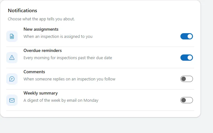
A card of settings rows, each with an icon tile, title, one-line description and a toggle, separated by thin dividers.
- Version
- 1.0.0
- Updated
- Verified in Studio
- Not yet
- Author
- Ynias Bensch
- Tags
Overview
A settings card in the style of modern app preferences: each row has an icon tile in the theme colour, a bold title, a muted description and a toggle on the right. Thin dividers separate the rows, and the card is as tall as its rows.
Rows come from a table, so adding a setting is adding a row. Each toggle starts from the row's Enabled value and reports changes through OnCheck and OnUncheck.
When to use
- Notification, privacy or display preferences that are simply on or off.
- Settings screens with up to about eight options per card; use several cards for groups.
When not to use
- Settings with more than two values: use a dropdown or radio group per row.
- Changes that need confirmation before they apply: use a form with a Save button.
Controls used
| Control | Version |
|---|---|
| GroupContainer | 1.5.0 |
| ModernText | 1.0.0 |
| Gallery | 2.15.0 |
| ModernIcon | 1.1.1 |
| ModernToggle | 1.0.1 |
YAML
Works as is, with example data inline. Paste it into a screen or container; the steps are underHow to paste.
Not yet verified in Power Apps Studio. The control versions are drafted from documentation. If Studio flags one, see How to paste for the fix.
- SettingsListRoot:
    Control: GroupContainer@1.5.0
    Variant: AutoLayout
    Properties:
      BorderColor: =ColorFade(App.Theme.Colors.Darker70, 88%)
      BorderThickness: =1
      DropShadow: =DropShadow.Light
      Fill: =Color.White
      Height: =SettingsListTitle.Height + SettingsListDescription.Height + SettingsListGallery.Height + 2 * 4 + 40
      LayoutDirection: =LayoutDirection.Vertical
      LayoutGap: =4
      PaddingBottom: =20
      PaddingLeft: =20
      PaddingRight: =20
      PaddingTop: =20
      RadiusBottomLeft: =16
      RadiusBottomRight: =16
      RadiusTopLeft: =16
      RadiusTopRight: =16
      Width: =Min(640, Parent.Width)
    Children:
      - SettingsListTitle:
          Control: ModernText@1.0.0
          Properties:
            AccessibleLabel: =Self.Text
            AlignInContainer: =AlignInContainer.Stretch
            FontWeight: =FontWeight.Semibold
            Height: =26
            LayoutMinHeight: =0
            LayoutMinWidth: =80
            PaddingBottom: =0
            PaddingTop: =0
            Size: =16
            Text: ="Notifications"
            Wrap: =false
      - SettingsListDescription:
          Control: ModernText@1.0.0
          Properties:
            AccessibleLabel: =Self.Text
            AlignInContainer: =AlignInContainer.Stretch
            Color: =ColorFade(App.Theme.Colors.Darker70, 45%)
            Height: =28
            LayoutMinHeight: =0
            LayoutMinWidth: =80
            PaddingBottom: =8
            PaddingTop: =0
            Size: =13
            Text: ="Choose what the app tells you about."
            Wrap: =false
      - SettingsListGallery:
          Control: Gallery@2.15.0
          Variant: Vertical
          Properties:
            AccessibleLabel: ="Notification settings"
            AlignInContainer: =AlignInContainer.Stretch
            BorderThickness: =0
            FillPortions: =0
            Height: =Self.AllItemsCount * (Self.TemplateHeight + Self.TemplatePadding) + Self.TemplatePadding
            Items: |
              =Table(
                  {Icon: "DocumentText", Title: "New assignments", Description: "When an inspection is assigned to you", Enabled: true},
                  {Icon: "Warning", Title: "Overdue reminders", Description: "Every morning for inspections past their due date", Enabled: true},
                  {Icon: "Chat", Title: "Comments", Description: "When someone replies on an inspection you follow", Enabled: false},
                  {Icon: "Mail", Title: "Weekly summary", Description: "A digest of the week by email on Monday", Enabled: false}
              )
            LayoutMinHeight: =0
            LayoutMinWidth: =120
            ShowScrollbar: =false
            TabIndex: =0
            TemplatePadding: =0
            TemplateSize: =68
          Children:
            - SettingsListRow:
                Control: GroupContainer@1.5.0
                Variant: AutoLayout
                Properties:
                  DropShadow: =DropShadow.None
                  Height: =Parent.TemplateHeight - 1
                  LayoutAlignItems: =LayoutAlignItems.Center
                  LayoutDirection: =LayoutDirection.Horizontal
                  LayoutGap: =14
                  Width: =Parent.TemplateWidth
                  X: =0
                  Y: =0
                Children:
                  - SettingsListIcon:
                      Control: ModernIcon@1.1.1
                      Properties:
                        AccessibleLabel: =ThisItem.Title
                        Fill: =App.Theme.Colors.Lighter80
                        Height: =36
                        Icon: =ThisItem.Icon
                        IconColor: =App.Theme.Colors.Primary
                        LayoutMinHeight: =36
                        LayoutMinWidth: =36
                        PaddingBottom: =8
                        PaddingLeft: =8
                        PaddingRight: =8
                        PaddingTop: =8
                        RadiusBottomLeft: =10
                        RadiusBottomRight: =10
                        RadiusTopLeft: =10
                        RadiusTopRight: =10
                        Width: =36
                  - SettingsListText:
                      Control: GroupContainer@1.5.0
                      Variant: AutoLayout
                      Properties:
                        DropShadow: =DropShadow.None
                        FillPortions: =1
                        Height: =44
                        LayoutDirection: =LayoutDirection.Vertical
                        LayoutGap: =2
                        LayoutMinHeight: =44
                        LayoutMinWidth: =80
                      Children:
                        - SettingsListItemTitle:
                            Control: ModernText@1.0.0
                            Properties:
                              AccessibleLabel: =Self.Text
                              AlignInContainer: =AlignInContainer.Stretch
                              FontWeight: =FontWeight.Semibold
                              Height: =22
                              LayoutMinHeight: =0
                              LayoutMinWidth: =60
                              PaddingBottom: =0
                              PaddingTop: =0
                              Size: =14
                              Text: =ThisItem.Title
                              Wrap: =false
                        - SettingsListItemDescription:
                            Control: ModernText@1.0.0
                            Properties:
                              AccessibleLabel: =Self.Text
                              AlignInContainer: =AlignInContainer.Stretch
                              Color: =ColorFade(App.Theme.Colors.Darker70, 45%)
                              Height: =20
                              LayoutMinHeight: =0
                              LayoutMinWidth: =60
                              PaddingBottom: =0
                              PaddingTop: =0
                              Size: =13
                              Text: =ThisItem.Description
                              Wrap: =false
                  - SettingsListToggle:
                      Control: ModernToggle@1.0.1
                      Properties:
                        AccessibleLabel: =ThisItem.Title
                        Default: =ThisItem.Enabled
                        Height: =40
                        Label: =""
                        LayoutMinHeight: =40
                        LayoutMinWidth: =52
                        OnCheck: =Notify(ThisItem.Title & " on", NotificationType.Success)
                        OnUncheck: =Notify(ThisItem.Title & " off", NotificationType.Information)
                        Size: =14
                        Width: =52
            - SettingsListDivider:
                Control: GroupContainer@1.5.0
                Variant: ManualLayout
                Properties:
                  DropShadow: =DropShadow.None
                  Fill: =ColorFade(App.Theme.Colors.Darker70, 90%)
                  Height: =1
                  Width: =Parent.TemplateWidth
                  X: =0
                  Y: =Parent.TemplateHeight - 1
Make it yours
The example runs on sample data. Replace these properties to connect it to your app.
Items on SettingsListGallery
One row per setting. Enabled sets the toggle's starting position; read it from where you store the user's preferences.
In the YAML
Items: |
  =Table(
      {Icon: "DocumentText", Title: "New assignments", Description: "When an inspection is assigned to you", Enabled: true},
      {Icon: "Warning", Title: "Overdue reminders", Description: "Every morning for inspections past their due date", Enabled: true},
      {Icon: "Chat", Title: "Comments", Description: "When someone replies on an inspection you follow", Enabled: false},
      {Icon: "Mail", Title: "Weekly summary", Description: "A digest of the week by email on Monday", Enabled: false}
  )
Your version
Items: |
  =ForAll(
      Preferences As p,
      {
          Key: p.Key,
          Icon: p.Icon,
          Title: p.Title,
          Description: p.Description,
          Enabled: LookUp(UserPreferences, Setting = p.Key && User = User().Email, Enabled)
      }
  )
OnCheck on SettingsListToggle
Store the change. Do the same in OnUncheck with false.
In the YAML
OnCheck: =Notify(ThisItem.Title & " on", NotificationType.Success)Your version
OnCheck: |
  =Patch(UserPreferences, LookUp(UserPreferences, Setting = ThisItem.Key && User = User().Email), {Enabled: true})
How to paste
- Open your app in Power Apps Studio.
- Check that modern controls are on: Settings → Updates → Modern controls and themes. In newer environments they are on by default.
- Copy the YAML with the Copy button above the code.
- In the Tree view, select the screen or container that should hold the component and press Ctrl+V. The whole component arrives as one container,
SettingsListRoot, with all its controls inside. - Work through Make it yours to swap the example data for your own.
Where your version of Studio has a code view for a control or screen, you can paste the same YAML there instead of into the tree view.
When Studio flags a control version
Each control in the YAML names its version, like Control: ModernButton@1.0.0. If that version is newer than what your environment knows, Studio falls back to the version it has or flags the control. All controls of one type in an app must also use the same version, so an app that already has an older ModernButton can reject the paste. To fix it, insert the same control from the Insert pane, copy it as code, note the version on its Control: line, update every matching line in the YAML and paste again.
Missing a component, or did this one not paste cleanly? Suggest a component or report an issue.