Photo viewer
A large photo with previous and next buttons, a counter, its name and date, and a strip of thumbnails to jump to any photo.
- Version
- 1.0.0
- Updated
- Verified in Studio
- Not yet
- Author
- Ynias Bensch
- Tags
Overview
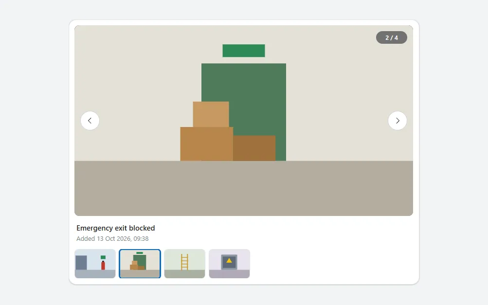
A viewer for the photos of an inspection, finding or asset. The selected photo fills a dark stage at 16:9 and keeps its proportions; round buttons on either side step through the photos, and a counter in the corner shows where you are. Below it are the photo's name and when it was added, and a row of thumbnails that jump straight to a photo.
The photos come from one hidden list, so the stage, the counter and the thumbnails always agree. The previous button disappears on the first photo and the next button on the last.
When to use
- Reviewing the photos added to a record, for example next to the photo upload.
- Two to eight photos; the thumbnails fit in one row on a tablet.
When not to use
- Large photo libraries: use a gallery with search and paging.
- A single photo: show it in an Image control.
Controls used
| Control | Version |
|---|---|
| GroupContainer | 1.5.0 |
| Gallery | 2.15.0 |
| Image | 2.2.3 |
| ModernButton | 1.0.0 |
| ModernText | 1.0.0 |
YAML
Works as is, with example data inline. Paste it into a screen or container; the steps are underHow to paste.
Not yet verified in Power Apps Studio. The control versions are drafted from documentation. If Studio flags one, see How to paste for the fix.
- PhotoViewerRoot:
    Control: GroupContainer@1.5.0
    Variant: AutoLayout
    Properties:
      BorderColor: =ColorFade(App.Theme.Colors.Darker70, 88%)
      BorderThickness: =1
      DropShadow: =DropShadow.Light
      Fill: =Color.White
      Height: =PhotoViewerStage.Height + PhotoViewerCaption.Height + PhotoViewerThumbs.Height + 2 * 12 + 24
      LayoutDirection: =LayoutDirection.Vertical
      LayoutGap: =12
      PaddingBottom: =12
      PaddingLeft: =12
      PaddingRight: =12
      PaddingTop: =12
      RadiusBottomLeft: =16
      RadiusBottomRight: =16
      RadiusTopLeft: =16
      RadiusTopRight: =16
      Width: =Min(720, Parent.Width)
    Children:
      - PhotoViewerSource:
          Control: Gallery@2.15.0
          Variant: Vertical
          Properties:
            AccessibleLabel: ="All photos"
            Height: =0
            Items: |
              =Table(
                  {Name: "Fire extinguisher, hall B", Added: DateAdd(Now(), -42, TimeUnit.Minutes), Image: "data:image/svg+xml;utf8," & EncodeUrl("<svg xmlns='http://www.w3.org/2000/svg' viewBox='0 0 320 180'><rect width='320' height='180' fill='#d9e4ee'/><rect y='128' width='320' height='52' fill='#a7b1bb'/><rect x='40' y='40' width='70' height='88' fill='#6d7f91'/><rect x='196' y='40' width='30' height='22' fill='#2e8b57'/><rect x='205' y='72' width='12' height='10' fill='#333333'/><rect x='200' y='80' width='22' height='48' rx='4' fill='#c0392b'/></svg>")},
                  {Name: "Emergency exit blocked", Added: DateAdd(Now(), -38, TimeUnit.Minutes), Image: "data:image/svg+xml;utf8," & EncodeUrl("<svg xmlns='http://www.w3.org/2000/svg' viewBox='0 0 320 180'><rect width='320' height='180' fill='#e5e1d8'/><rect y='128' width='320' height='52' fill='#b5ad9f'/><rect x='140' y='18' width='40' height='12' fill='#2e8b57'/><rect x='120' y='36' width='80' height='92' fill='#4f7a5a'/><rect x='100' y='96' width='50' height='32' fill='#b8864b'/><rect x='150' y='104' width='40' height='24' fill='#a0723c'/><rect x='112' y='72' width='34' height='24' fill='#c79a62'/></svg>")},
                  {Name: "Ladder L-204", Added: DateAdd(Now(), -31, TimeUnit.Minutes), Image: "data:image/svg+xml;utf8," & EncodeUrl("<svg xmlns='http://www.w3.org/2000/svg' viewBox='0 0 320 180'><rect width='320' height='180' fill='#dfe7dc'/><rect y='128' width='320' height='52' fill='#a9b0a2'/><rect x='140' y='30' width='6' height='100' fill='#c99a2e'/><rect x='176' y='30' width='6' height='100' fill='#c99a2e'/><rect x='140' y='50' width='42' height='4' fill='#c99a2e'/><rect x='140' y='70' width='42' height='4' fill='#c99a2e'/><rect x='140' y='90' width='42' height='4' fill='#c99a2e'/><rect x='140' y='110' width='42' height='4' fill='#c99a2e'/></svg>")},
                  {Name: "Electrical panel, room 1.12", Added: DateAdd(Now(), -12, TimeUnit.Minutes), Image: "data:image/svg+xml;utf8," & EncodeUrl("<svg xmlns='http://www.w3.org/2000/svg' viewBox='0 0 320 180'><rect width='320' height='180' fill='#e8e3ef'/><rect y='128' width='320' height='52' fill='#b0aab8'/><rect x='110' y='34' width='100' height='94' rx='4' fill='#8c96a3'/><rect x='120' y='46' width='80' height='70' fill='#5f6b78'/><polygon points='160,54 178,84 142,84' fill='#f1c40f'/></svg>")}
              )
            LayoutMinHeight: =0
            LayoutMinWidth: =0
            ShowScrollbar: =false
            TabIndex: =0
            Visible: =false
      - PhotoViewerStage:
          Control: GroupContainer@1.5.0
          Variant: ManualLayout
          Properties:
            AlignInContainer: =AlignInContainer.Stretch
            DropShadow: =DropShadow.None
            Fill: =App.Theme.Colors.Darker70
            FillPortions: =0
            Height: =Round((Parent.Width - 24) * 9 / 16, 0)
            LayoutMinHeight: =0
            LayoutMinWidth: =120
            RadiusBottomLeft: =10
            RadiusBottomRight: =10
            RadiusTopLeft: =10
            RadiusTopRight: =10
          Children:
            - PhotoViewerImage:
                Control: Image@2.2.3
                Properties:
                  AccessibleLabel: =PhotoViewerName.Text
                  Height: =Parent.Height
                  Image: =Index(PhotoViewerSource.AllItems, Min(Coalesce(locPhotoViewerIndex, 1), PhotoViewerSource.AllItemsCount)).Image
                  ImagePosition: =ImagePosition.Fit
                  TabIndex: =0
                  Width: =Parent.Width
                  X: =0
                  Y: =0
            - PhotoViewerPrevious:
                Control: ModernButton@1.0.0
                Properties:
                  AccessibleLabel: ="Previous photo"
                  Appearance: =ButtonAppearance.Secondary
                  Height: =40
                  Icon: ="ChevronLeft"
                  Layout: =ButtonLayout.IconOnly
                  OnSelect: |
                    =UpdateContext({locPhotoViewerIndex: Max(1, Coalesce(locPhotoViewerIndex, 1) - 1)})
                  RadiusBottomLeft: =20
                  RadiusBottomRight: =20
                  RadiusTopLeft: =20
                  RadiusTopRight: =20
                  Size: =14
                  Tooltip: ="Previous photo"
                  Visible: =Coalesce(locPhotoViewerIndex, 1) > 1
                  Width: =40
                  X: =12
                  Y: =(Parent.Height - Self.Height) / 2
            - PhotoViewerNext:
                Control: ModernButton@1.0.0
                Properties:
                  AccessibleLabel: ="Next photo"
                  Appearance: =ButtonAppearance.Secondary
                  Height: =40
                  Icon: ="ChevronRight"
                  Layout: =ButtonLayout.IconOnly
                  OnSelect: |
                    =UpdateContext({locPhotoViewerIndex: Min(PhotoViewerSource.AllItemsCount, Coalesce(locPhotoViewerIndex, 1) + 1)})
                  RadiusBottomLeft: =20
                  RadiusBottomRight: =20
                  RadiusTopLeft: =20
                  RadiusTopRight: =20
                  Size: =14
                  Tooltip: ="Next photo"
                  Visible: =Coalesce(locPhotoViewerIndex, 1) < PhotoViewerSource.AllItemsCount
                  Width: =40
                  X: =Parent.Width - Self.Width - 12
                  Y: =(Parent.Height - Self.Height) / 2
            - PhotoViewerCounter:
                Control: GroupContainer@1.5.0
                Variant: ManualLayout
                Properties:
                  DropShadow: =DropShadow.None
                  Fill: =ColorFade(Color.Black, 45%)
                  Height: =26
                  RadiusBottomLeft: =13
                  RadiusBottomRight: =13
                  RadiusTopLeft: =13
                  RadiusTopRight: =13
                  Width: =64
                  X: =Parent.Width - Self.Width - 12
                  Y: =12
                Children:
                  - PhotoViewerCount:
                      Control: ModernText@1.0.0
                      Properties:
                        AccessibleLabel: ="Photo " & Min(Coalesce(locPhotoViewerIndex, 1), PhotoViewerSource.AllItemsCount) & " of " & PhotoViewerSource.AllItemsCount
                        Align: =Align.Center
                        Color: =Color.White
                        FontWeight: =FontWeight.Semibold
                        Height: =Parent.Height
                        PaddingBottom: =0
                        PaddingTop: =0
                        Size: =12
                        Text: =Min(Coalesce(locPhotoViewerIndex, 1), PhotoViewerSource.AllItemsCount) & " / " & PhotoViewerSource.AllItemsCount
                        Width: =Parent.Width
                        Wrap: =false
                        X: =0
                        Y: =0
      - PhotoViewerCaption:
          Control: GroupContainer@1.5.0
          Variant: AutoLayout
          Properties:
            AlignInContainer: =AlignInContainer.Stretch
            DropShadow: =DropShadow.None
            FillPortions: =0
            Height: =44
            LayoutDirection: =LayoutDirection.Vertical
            LayoutGap: =0
            LayoutMinHeight: =44
            LayoutMinWidth: =120
            PaddingLeft: =4
          Children:
            - PhotoViewerName:
                Control: ModernText@1.0.0
                Properties:
                  AccessibleLabel: =Self.Text
                  AlignInContainer: =AlignInContainer.Stretch
                  FontWeight: =FontWeight.Semibold
                  Height: =24
                  LayoutMinHeight: =24
                  PaddingBottom: =0
                  PaddingLeft: =0
                  PaddingTop: =0
                  Size: =15
                  Text: =Index(PhotoViewerSource.AllItems, Min(Coalesce(locPhotoViewerIndex, 1), PhotoViewerSource.AllItemsCount)).Name
                  Wrap: =false
            - PhotoViewerTaken:
                Control: ModernText@1.0.0
                Properties:
                  AccessibleLabel: =Self.Text
                  AlignInContainer: =AlignInContainer.Stretch
                  Color: =ColorFade(App.Theme.Colors.Darker70, 45%)
                  Height: =20
                  LayoutMinHeight: =20
                  PaddingBottom: =0
                  PaddingLeft: =0
                  PaddingTop: =0
                  Size: =13
                  Text: ="Added " & Text(Index(PhotoViewerSource.AllItems, Min(Coalesce(locPhotoViewerIndex, 1), PhotoViewerSource.AllItemsCount)).Added, "d mmm yyyy, hh:mm")
                  Wrap: =false
      - PhotoViewerThumbs:
          Control: Gallery@2.15.0
          Variant: Horizontal
          Properties:
            AccessibleLabel: ="Thumbnails"
            AlignInContainer: =AlignInContainer.Stretch
            BorderThickness: =0
            FillPortions: =0
            Height: =60
            Items: |
              =ForAll(
                  Sequence(PhotoViewerSource.AllItemsCount) As i,
                  {Position: i.Value, Name: Index(PhotoViewerSource.AllItems, i.Value).Name, Image: Index(PhotoViewerSource.AllItems, i.Value).Image}
              )
            LayoutMinHeight: =60
            LayoutMinWidth: =120
            ShowScrollbar: =false
            TabIndex: =0
            TemplatePadding: =0
            TemplateSize: =92
          Children:
            - PhotoViewerThumb:
                Control: Image@2.2.3
                Properties:
                  AccessibleLabel: ="Show " & ThisItem.Name
                  BorderColor: =If(ThisItem.Position = Min(Coalesce(locPhotoViewerIndex, 1), PhotoViewerSource.AllItemsCount), App.Theme.Colors.Primary, ColorFade(App.Theme.Colors.Darker70, 88%))
                  BorderThickness: =If(ThisItem.Position = Min(Coalesce(locPhotoViewerIndex, 1), PhotoViewerSource.AllItemsCount), 3, 1)
                  Height: =Parent.TemplateHeight
                  Image: =ThisItem.Image
                  ImagePosition: =ImagePosition.Fill
                  OnSelect: |
                    =UpdateContext({locPhotoViewerIndex: ThisItem.Position})
                  RadiusBottomLeft: =8
                  RadiusBottomRight: =8
                  RadiusTopLeft: =8
                  RadiusTopRight: =8
                  TabIndex: =0
                  Width: =Parent.TemplateWidth - 8
                  X: =0
                  Y: =0
Make it yours
The example runs on sample data. Replace these properties to connect it to your app.
Items on PhotoViewerSource
The photos, in the order to show them, with the columns Name, Image and Added. The example reads the photos added with the photo upload component.
In the YAML
Items: |
  =Table(
      {Name: "Fire extinguisher, hall B", Added: DateAdd(Now(), -42, TimeUnit.Minutes), Image: "data:image/svg+xml;utf8," & EncodeUrl("<svg xmlns='http://www.w3.org/2000/svg' viewBox='0 0 320 180'><rect width='320' height='180' fill='#d9e4ee'/><rect y='128' width='320' height='52' fill='#a7b1bb'/><rect x='40' y='40' width='70' height='88' fill='#6d7f91'/><rect x='196' y='40' width='30' height='22' fill='#2e8b57'/><rect x='205' y='72' width='12' height='10' fill='#333333'/><rect x='200' y='80' width='22' height='48' rx='4' fill='#c0392b'/></svg>")},
      {Name: "Emergency exit blocked", Added: DateAdd(Now(), -38, TimeUnit.Minutes), Image: "data:image/svg+xml;utf8," & EncodeUrl("<svg xmlns='http://www.w3.org/2000/svg' viewBox='0 0 320 180'><rect width='320' height='180' fill='#e5e1d8'/><rect y='128' width='320' height='52' fill='#b5ad9f'/><rect x='140' y='18' width='40' height='12' fill='#2e8b57'/><rect x='120' y='36' width='80' height='92' fill='#4f7a5a'/><rect x='100' y='96' width='50' height='32' fill='#b8864b'/><rect x='150' y='104' width='40' height='24' fill='#a0723c'/><rect x='112' y='72' width='34' height='24' fill='#c79a62'/></svg>")},
      {Name: "Ladder L-204", Added: DateAdd(Now(), -31, TimeUnit.Minutes), Image: "data:image/svg+xml;utf8," & EncodeUrl("<svg xmlns='http://www.w3.org/2000/svg' viewBox='0 0 320 180'><rect width='320' height='180' fill='#dfe7dc'/><rect y='128' width='320' height='52' fill='#a9b0a2'/><rect x='140' y='30' width='6' height='100' fill='#c99a2e'/><rect x='176' y='30' width='6' height='100' fill='#c99a2e'/><rect x='140' y='50' width='42' height='4' fill='#c99a2e'/><rect x='140' y='70' width='42' height='4' fill='#c99a2e'/><rect x='140' y='90' width='42' height='4' fill='#c99a2e'/><rect x='140' y='110' width='42' height='4' fill='#c99a2e'/></svg>")},
      {Name: "Electrical panel, room 1.12", Added: DateAdd(Now(), -12, TimeUnit.Minutes), Image: "data:image/svg+xml;utf8," & EncodeUrl("<svg xmlns='http://www.w3.org/2000/svg' viewBox='0 0 320 180'><rect width='320' height='180' fill='#e8e3ef'/><rect y='128' width='320' height='52' fill='#b0aab8'/><rect x='110' y='34' width='100' height='94' rx='4' fill='#8c96a3'/><rect x='120' y='46' width='80' height='70' fill='#5f6b78'/><polygon points='160,54 178,84 142,84' fill='#f1c40f'/></svg>")}
  )
Your version
Items: =Sort(colFileUploadFiles, Added, SortOrder.Ascending)How to paste
- Open your app in Power Apps Studio.
- Check that modern controls are on: Settings → Updates → Modern controls and themes. In newer environments they are on by default.
- Copy the YAML with the Copy button above the code.
- In the Tree view, select the screen or container that should hold the component and press Ctrl+V. The whole component arrives as one container,
PhotoViewerRoot, with all its controls inside. - Work through Make it yours to swap the example data for your own.
Where your version of Studio has a code view for a control or screen, you can paste the same YAML there instead of into the tree view.
When Studio flags a control version
Each control in the YAML names its version, like Control: ModernButton@1.0.0. If that version is newer than what your environment knows, Studio falls back to the version it has or flags the control. All controls of one type in an app must also use the same version, so an app that already has an older ModernButton can reject the paste. To fix it, insert the same control from the Insert pane, copy it as code, note the version on its Control: line, update every matching line in the YAML and paste again.
Missing a component, or did this one not paste cleanly? Suggest a component or report an issue.