Star rating
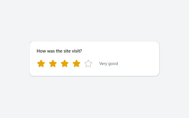
Five stars that fill up to the selected rating in amber, with a word for the score next to them, stored in one context variable.
- Version
- 1.0.0
- Updated
- Verified in Studio
- Not yet
- Author
- Ynias Bensch
- Tags
Overview
A star rating asks for a score from one to five in a single tap. The stars fill up to the one people select and turn amber, and the text next to them says what the score means, from Poor to Excellent. Selecting another star changes the score.
The score is kept in locStarRatingValue, which starts empty ("Not rated yet"). To show a saved rating, set the variable in the screen's OnVisible, for example UpdateContext({locStarRatingValue: varVisit.Rating}).
When to use
- Quick feedback after a visit, a training or a support request.
- Scores where five steps are enough and the meaning of each is clear.
When not to use
- Yes or no questions: use a toggle or two buttons.
- Precise scores or measurements: use a number input or a slider.
Before you paste
- Something that stores the rating, for example a Save button with
Patch(Visits, varVisit, {Rating: locStarRatingValue}).
Controls used
| Control | Version |
|---|---|
| GroupContainer | 1.5.0 |
| ModernText | 1.0.0 |
| Gallery | 2.15.0 |
| ModernIcon | 1.1.1 |
YAML
Works as is, with example data inline. Paste it into a screen or container; the steps are underHow to paste.
Not yet verified in Power Apps Studio. The control versions are drafted from documentation. If Studio flags one, see How to paste for the fix.
- StarRatingRoot:
    Control: GroupContainer@1.5.0
    Variant: AutoLayout
    Properties:
      BorderColor: =ColorFade(App.Theme.Colors.Darker70, 88%)
      BorderThickness: =1
      DropShadow: =DropShadow.Light
      Fill: =Color.White
      Height: =StarRatingQuestion.Height + StarRatingRow.Height + 8 + 40
      LayoutDirection: =LayoutDirection.Vertical
      LayoutGap: =8
      PaddingBottom: =20
      PaddingLeft: =20
      PaddingRight: =20
      PaddingTop: =20
      RadiusBottomLeft: =16
      RadiusBottomRight: =16
      RadiusTopLeft: =16
      RadiusTopRight: =16
      Width: =Min(440, Parent.Width)
    Children:
      - StarRatingQuestion:
          Control: ModernText@1.0.0
          Properties:
            AccessibleLabel: =Self.Text
            AlignInContainer: =AlignInContainer.Stretch
            FontWeight: =FontWeight.Semibold
            Height: =26
            LayoutMinHeight: =0
            LayoutMinWidth: =80
            PaddingBottom: =0
            PaddingTop: =0
            Size: =15
            Text: ="How was the site visit?"
            Wrap: =false
      - StarRatingRow:
          Control: GroupContainer@1.5.0
          Variant: AutoLayout
          Properties:
            AlignInContainer: =AlignInContainer.Stretch
            DropShadow: =DropShadow.None
            FillPortions: =0
            Height: =44
            LayoutAlignItems: =LayoutAlignItems.Center
            LayoutDirection: =LayoutDirection.Horizontal
            LayoutGap: =12
            LayoutMinHeight: =44
            LayoutMinWidth: =120
          Children:
            - StarRatingStars:
                Control: Gallery@2.15.0
                Variant: Horizontal
                Properties:
                  AccessibleLabel: =StarRatingQuestion.Text
                  BorderThickness: =0
                  FillPortions: =0
                  Height: =44
                  Items: =Sequence(5)
                  LayoutMinHeight: =44
                  LayoutMinWidth: =44
                  ShowScrollbar: =false
                  TabIndex: =0
                  TemplatePadding: =0
                  TemplateSize: =40
                  Width: =Self.AllItemsCount * Self.TemplateWidth
                Children:
                  - StarRatingStar:
                      Control: ModernIcon@1.1.1
                      Properties:
                        AccessibleLabel: =ThisItem.Value & If(ThisItem.Value = 1, " star", " stars")
                        Height: =40
                        Icon: ="Star"
                        IconColor: =If(ThisItem.Value <= Coalesce(locStarRatingValue, 0), RGBA(234, 163, 0, 1), ColorFade(App.Theme.Colors.Darker70, 75%))
                        IconStyle: =If(ThisItem.Value <= Coalesce(locStarRatingValue, 0), IconStyle.Filled, IconStyle.Outline)
                        OnSelect: |
                          =UpdateContext({locStarRatingValue: ThisItem.Value})
                        PaddingBottom: =4
                        PaddingLeft: =4
                        PaddingRight: =4
                        PaddingTop: =4
                        Width: =40
                        X: =0
                        Y: =2
            - StarRatingCaption:
                Control: ModernText@1.0.0
                Properties:
                  AccessibleLabel: =Self.Text
                  Color: =ColorFade(App.Theme.Colors.Darker70, 35%)
                  FillPortions: =1
                  Height: =30
                  LayoutMinHeight: =0
                  LayoutMinWidth: =60
                  Size: =14
                  Text: |
                    =Switch(
                        Coalesce(locStarRatingValue, 0),
                        1, "Poor",
                        2, "Fair",
                        3, "Good",
                        4, "Very good",
                        5, "Excellent",
                        "Not rated yet"
                    )
                  Wrap: =false
Make it yours
The example runs on sample data. Replace these properties to connect it to your app.
Items on StarRatingStars
The number of stars. With more than five, extend the words in StarRatingCaption too.
In the YAML
Items: =Sequence(5)Your version
Items: =Sequence(10)Text on StarRatingQuestion
The question people answer.
In the YAML
Text: ="How was the site visit?"Your version
Text: ="How safe did the site feel?"IconColor on StarRatingStar
The colour of the filled stars. The amber is hard-coded because the theme has no warm colour; use your accent colour if you prefer.
In the YAML
IconColor: =If(ThisItem.Value <= Coalesce(locStarRatingValue, 0), RGBA(234, 163, 0, 1), ColorFade(App.Theme.Colors.Darker70, 75%))Your version
IconColor: =If(ThisItem.Value <= Coalesce(locStarRatingValue, 0), App.Theme.Colors.Primary, ColorFade(App.Theme.Colors.Darker70, 75%))How to paste
- Open your app in Power Apps Studio.
- Check that modern controls are on: Settings → Updates → Modern controls and themes. In newer environments they are on by default.
- Copy the YAML with the Copy button above the code.
- In the Tree view, select the screen or container that should hold the component and press Ctrl+V. The whole component arrives as one container,
StarRatingRoot, with all its controls inside. - Work through Make it yours to swap the example data for your own.
Where your version of Studio has a code view for a control or screen, you can paste the same YAML there instead of into the tree view.
When Studio flags a control version
Each control in the YAML names its version, like Control: ModernButton@1.0.0. If that version is newer than what your environment knows, Studio falls back to the version it has or flags the control. All controls of one type in an app must also use the same version, so an app that already has an older ModernButton can reject the paste. To fix it, insert the same control from the Insert pane, copy it as code, note the version on its Control: line, update every matching line in the YAML and paste again.
Missing a component, or did this one not paste cleanly? Suggest a component or report an issue.