Approval card
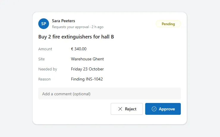
A request card with requester, status, details, an optional comment and Approve and Reject buttons that turn into a coloured result line.
- Version
- 1.0.0
- Updated
- Verified in Studio
- Not yet
- Author
- Ynias Bensch
- Tags
Overview
An approval card puts a decision in front of the right person: who asks and when, a status badge, what is being asked, the details that matter, and Approve and Reject buttons with room for a comment. It works for purchases, leave, access requests and finding sign-offs.
After a decision the comment field and buttons make way for a result line, green for approved and red for rejected, with the comment if there was one, and the badge changes from Pending. The decision is kept in locApprovalCardDecision; with your data, patch the request as well, or start a flow.
When to use
- Approvals that people handle in an app rather than in Teams or Outlook.
- Requests with a handful of details that fit on one card.
When not to use
- Approvals with several stages or approvers: show their progress with a status timeline next to the card.
- Bulk approval of many requests: use a table with checkboxes and a command bar.
Controls used
| Control | Version |
|---|---|
| GroupContainer | 1.5.0 |
| ModernAvatar | 1.1.0 |
| ModernText | 1.0.0 |
| ModernBadge | 1.0.0 |
| Gallery | 2.15.0 |
| ModernTextInput | 1.1.2 |
| ModernButton | 1.0.0 |
YAML
Works as is, with example data inline. Paste it into a screen or container; the steps are underHow to paste.
Not yet verified in Power Apps Studio. The control versions are drafted from documentation. If Studio flags one, see How to paste for the fix.
- ApprovalCardRoot:
    Control: GroupContainer@1.5.0
    Variant: AutoLayout
    Properties:
      BorderColor: =ColorFade(App.Theme.Colors.Darker70, 88%)
      BorderThickness: =1
      DropShadow: =DropShadow.Light
      Fill: =Color.White
      Height: |
        =ApprovalCardHeader.Height + ApprovalCardTitle.Height + ApprovalCardFields.Height + If(ApprovalCardComment.Visible, ApprovalCardComment.Height + ApprovalCardActions.Height + 2 * 12, ApprovalCardResult.Height + 12) + 3 * 12 + 40
      LayoutDirection: =LayoutDirection.Vertical
      LayoutGap: =12
      PaddingBottom: =20
      PaddingLeft: =20
      PaddingRight: =20
      PaddingTop: =20
      RadiusBottomLeft: =16
      RadiusBottomRight: =16
      RadiusTopLeft: =16
      RadiusTopRight: =16
      Width: =Min(520, Parent.Width)
    Children:
      - ApprovalCardHeader:
          Control: GroupContainer@1.5.0
          Variant: AutoLayout
          Properties:
            AlignInContainer: =AlignInContainer.Stretch
            DropShadow: =DropShadow.None
            FillPortions: =0
            Height: =40
            LayoutAlignItems: =LayoutAlignItems.Center
            LayoutDirection: =LayoutDirection.Horizontal
            LayoutGap: =10
            LayoutMinHeight: =40
            LayoutMinWidth: =120
          Children:
            - ApprovalCardAvatar:
                Control: ModernAvatar@1.1.0
                Properties:
                  AccessibleLabel: =ApprovalCardRequester.Text
                  Badge: =PresenceBadge.None
                  Height: =36
                  Image: =Blank()
                  LayoutMinHeight: =36
                  LayoutMinWidth: =36
                  Name: =ApprovalCardRequester.Text
                  Width: =36
            - ApprovalCardWho:
                Control: GroupContainer@1.5.0
                Variant: AutoLayout
                Properties:
                  DropShadow: =DropShadow.None
                  FillPortions: =1
                  Height: =40
                  LayoutDirection: =LayoutDirection.Vertical
                  LayoutMinHeight: =40
                  LayoutMinWidth: =80
                Children:
                  - ApprovalCardRequester:
                      Control: ModernText@1.0.0
                      Properties:
                        AccessibleLabel: =Self.Text
                        AlignInContainer: =AlignInContainer.Stretch
                        FontWeight: =FontWeight.Semibold
                        Height: =20
                        LayoutMinHeight: =0
                        LayoutMinWidth: =60
                        PaddingBottom: =0
                        PaddingLeft: =0
                        PaddingTop: =0
                        Size: =14
                        Text: ="Sara Peeters"
                        Wrap: =false
                  - ApprovalCardRequested:
                      Control: ModernText@1.0.0
                      Properties:
                        AccessibleLabel: =Self.Text
                        AlignInContainer: =AlignInContainer.Stretch
                        Color: =ColorFade(App.Theme.Colors.Darker70, 45%)
                        Height: =20
                        LayoutMinHeight: =0
                        LayoutMinWidth: =60
                        PaddingBottom: =0
                        PaddingLeft: =0
                        PaddingTop: =0
                        Size: =12
                        Text: ="Requests your approval · 2 h ago"
                        Wrap: =false
            - ApprovalCardStatus:
                Control: ModernBadge@1.0.0
                Properties:
                  AccessibleLabel: ="Status " & Coalesce(locApprovalCardDecision, "Pending")
                  Appearance: =BadgeAppearance.Tint
                  Content: =Coalesce(locApprovalCardDecision, "Pending")
                  Height: =24
                  Intent: |
                    =Switch(Coalesce(locApprovalCardDecision, "Pending"), "Approved", BadgeIntent.Positive, "Rejected", BadgeIntent.Critical, BadgeIntent.Caution)
                  LayoutMinHeight: =24
                  LayoutMinWidth: =72
                  Size: =12
                  Width: =84
      - ApprovalCardTitle:
          Control: ModernText@1.0.0
          Properties:
            AccessibleLabel: =Self.Text
            AlignInContainer: =AlignInContainer.Stretch
            AutoHeight: =true
            FillPortions: =0
            FontWeight: =FontWeight.Semibold
            Height: =28
            LayoutMinHeight: =0
            LayoutMinWidth: =80
            PaddingBottom: =0
            PaddingLeft: =0
            PaddingTop: =0
            Size: =17
            Text: ="Buy 2 fire extinguishers for hall B"
      - ApprovalCardFields:
          Control: Gallery@2.15.0
          Variant: Vertical
          Properties:
            AccessibleLabel: ="Request details"
            AlignInContainer: =AlignInContainer.Stretch
            BorderThickness: =0
            FillPortions: =0
            Height: =Self.AllItemsCount * (Self.TemplateHeight + Self.TemplatePadding) + Self.TemplatePadding
            Items: |
              =Table(
                  {Label: "Amount", Value: "€ 340.00"},
                  {Label: "Site", Value: "Warehouse Ghent"},
                  {Label: "Needed by", Value: "Friday 23 October"},
                  {Label: "Reason", Value: "Finding INS-1042"}
              )
            LayoutMinHeight: =0
            LayoutMinWidth: =120
            ShowScrollbar: =false
            TabIndex: =0
            TemplatePadding: =0
            TemplateSize: =34
          Children:
            - ApprovalCardFieldLabel:
                Control: ModernText@1.0.0
                Properties:
                  AccessibleLabel: =Self.Text
                  Color: =ColorFade(App.Theme.Colors.Darker70, 45%)
                  Height: =30
                  PaddingLeft: =0
                  Size: =13
                  Text: =ThisItem.Label
                  Width: =110
                  Wrap: =false
                  X: =0
                  Y: =2
            - ApprovalCardFieldValue:
                Control: ModernText@1.0.0
                Properties:
                  AccessibleLabel: =ApprovalCardFieldLabel.Text & " " & Self.Text
                  Height: =30
                  PaddingLeft: =0
                  Size: =14
                  Text: =ThisItem.Value
                  Width: =Parent.TemplateWidth - 110
                  Wrap: =false
                  X: =110
                  Y: =2
      - ApprovalCardComment:
          Control: ModernTextInput@1.1.2
          Properties:
            AccessibleLabel: ="Comment"
            AlignInContainer: =AlignInContainer.Stretch
            Height: =40
            LayoutMinHeight: =40
            LayoutMinWidth: =120
            Placeholder: ="Add a comment (optional)"
            Size: =14
            Visible: =IsBlank(locApprovalCardDecision)
      - ApprovalCardActions:
          Control: GroupContainer@1.5.0
          Variant: AutoLayout
          Properties:
            AlignInContainer: =AlignInContainer.Stretch
            DropShadow: =DropShadow.None
            FillPortions: =0
            Height: =40
            LayoutAlignItems: =LayoutAlignItems.Center
            LayoutDirection: =LayoutDirection.Horizontal
            LayoutGap: =8
            LayoutJustifyContent: =LayoutJustifyContent.End
            LayoutMinHeight: =40
            LayoutMinWidth: =120
            Visible: =IsBlank(locApprovalCardDecision)
          Children:
            - ApprovalCardReject:
                Control: ModernButton@1.0.0
                Properties:
                  AccessibleLabel: =Self.Text
                  Appearance: =ButtonAppearance.Secondary
                  Height: =40
                  Icon: ="Dismiss"
                  LayoutMinHeight: =40
                  LayoutMinWidth: =96
                  OnSelect: |
                    =UpdateContext({locApprovalCardDecision: "Rejected", locApprovalCardNote: ApprovalCardComment.Text})
                  Size: =14
                  Text: ="Reject"
                  Width: =108
            - ApprovalCardApprove:
                Control: ModernButton@1.0.0
                Properties:
                  AccessibleLabel: =Self.Text
                  Appearance: =ButtonAppearance.Primary
                  Height: =40
                  Icon: ="CheckmarkCircle"
                  LayoutMinHeight: =40
                  LayoutMinWidth: =96
                  OnSelect: |
                    =UpdateContext({locApprovalCardDecision: "Approved", locApprovalCardNote: ApprovalCardComment.Text})
                  Size: =14
                  Text: ="Approve"
                  Width: =120
      - ApprovalCardResult:
          Control: ModernText@1.0.0
          Properties:
            AccessibleLabel: =Self.Text
            AlignInContainer: =AlignInContainer.Stretch
            Color: =If(locApprovalCardDecision = "Approved", RGBA(16, 124, 16, 1), RGBA(168, 38, 28, 1))
            Fill: =If(locApprovalCardDecision = "Approved", RGBA(241, 250, 241, 1), RGBA(253, 243, 244, 1))
            Height: =44
            LayoutMinHeight: =0
            LayoutMinWidth: =80
            PaddingLeft: =14
            RadiusBottomLeft: =10
            RadiusBottomRight: =10
            RadiusTopLeft: =10
            RadiusTopRight: =10
            Size: =14
            Text: |
              =If(locApprovalCardDecision = "Approved", "✓ Approved", "✕ Rejected") & " by you · just now" & If(IsBlank(locApprovalCardNote), "", " · """ & locApprovalCardNote & """")
            Visible: =Not(IsBlank(locApprovalCardDecision))
            Wrap: =false
Make it yours
The example runs on sample data. Replace these properties to connect it to your app.
Items on ApprovalCardFields
The details people need to decide, as label and text pairs.
In the YAML
Items: |
  =Table(
      {Label: "Amount", Value: "€ 340.00"},
      {Label: "Site", Value: "Warehouse Ghent"},
      {Label: "Needed by", Value: "Friday 23 October"},
      {Label: "Reason", Value: "Finding INS-1042"}
  )
Your version
Items: |
  =Table(
      {Label: "Amount", Value: Text(varRequest.Amount, "€ #,##0.00")},
      {Label: "Cost centre", Value: varRequest.CostCentre},
      {Label: "Needed by", Value: Text(varRequest.'Needed by', "dddd d mmmm")}
  )
OnSelect on ApprovalCardApprove
Store the decision. Keep the UpdateContext, which shows the result line. Do the same in ApprovalCardReject with "Rejected".
In the YAML
OnSelect: |
  =UpdateContext({locApprovalCardDecision: "Approved", locApprovalCardNote: ApprovalCardComment.Text})
Your version
OnSelect: |
  =Patch(Requests, varRequest, {Status: "Approved", 'Decision comment': ApprovalCardComment.Text});
  UpdateContext({locApprovalCardDecision: "Approved", locApprovalCardNote: ApprovalCardComment.Text})
Text on ApprovalCardTitle
What is being asked. The requester's name is in ApprovalCardRequester.
In the YAML
Text: ="Buy 2 fire extinguishers for hall B"Your version
Text: =varRequest.TitleFill on ApprovalCardResult
The background of the result line, green for approved and red for rejected. Both are hard-coded, like its text Color; adjust them to your theme.
In the YAML
Fill: =If(locApprovalCardDecision = "Approved", RGBA(241, 250, 241, 1), RGBA(253, 243, 244, 1))Your version
Fill: =If(locApprovalCardDecision = "Approved", RGBA(223, 246, 221, 1), RGBA(253, 231, 233, 1))How to paste
- Open your app in Power Apps Studio.
- Check that modern controls are on: Settings → Updates → Modern controls and themes. In newer environments they are on by default.
- Copy the YAML with the Copy button above the code.
- In the Tree view, select the screen or container that should hold the component and press Ctrl+V. The whole component arrives as one container,
ApprovalCardRoot, with all its controls inside. - Work through Make it yours to swap the example data for your own.
Where your version of Studio has a code view for a control or screen, you can paste the same YAML there instead of into the tree view.
When Studio flags a control version
Each control in the YAML names its version, like Control: ModernButton@1.0.0. If that version is newer than what your environment knows, Studio falls back to the version it has or flags the control. All controls of one type in an app must also use the same version, so an app that already has an older ModernButton can reject the paste. To fix it, insert the same control from the Insert pane, copy it as code, note the version on its Control: line, update every matching line in the YAML and paste again.
Missing a component, or did this one not paste cleanly? Suggest a component or report an issue.