App header
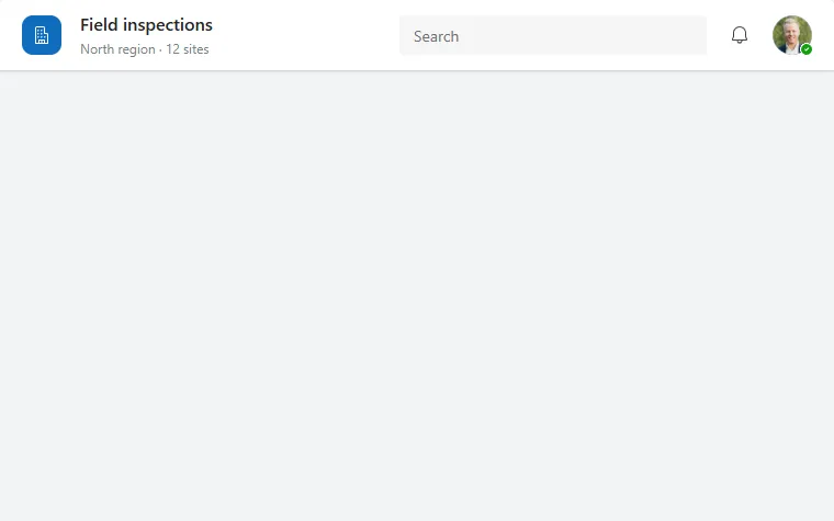
A white top bar with app logo, title and subtitle, a search box, a notification button and the signed-in user's avatar.
- Version
- 2.0.0
- Updated
- Verified in Studio
- Not yet
- Author
- Ynias Bensch
- Tags
Overview
The bar every screen starts with: a coloured logo tile, the app title with a subtitle underneath, a search box, a notification button and the user's avatar with presence. It is a white surface with a light shadow, so it reads as one layer above the page.
The search box hides itself when the bar is narrower than 720 pixels, so the title keeps its room on phones. The logo tile takes App.Theme.Colors.Primary, so it follows the app theme.
When to use
- As the first row of every screen, inside a vertical container above the content.
- When people need a search that is always one click away.
When not to use
- In apps embedded in Teams or SharePoint, which already show a header.
- When you need many actions: put them in a side navigation or a menu instead of more header buttons.
Controls used
| Control | Version |
|---|---|
| GroupContainer | 1.5.0 |
| ModernIcon | 1.1.1 |
| ModernText | 1.0.0 |
| ModernTextInput | 1.1.2 |
| ModernButton | 1.0.0 |
| ModernAvatar | 1.1.0 |
YAML
Works as is, with example data inline. Paste it into a screen or container; the steps are underHow to paste.
Not yet verified in Power Apps Studio. The control versions are drafted from documentation. If Studio flags one, see How to paste for the fix.
- AppHeaderRoot:
    Control: GroupContainer@1.5.0
    Variant: AutoLayout
    Properties:
      DropShadow: =DropShadow.Light
      Fill: =Color.White
      Height: =64
      LayoutAlignItems: =LayoutAlignItems.Center
      LayoutDirection: =LayoutDirection.Horizontal
      LayoutGap: =12
      PaddingLeft: =20
      PaddingRight: =20
      RadiusBottomLeft: =0
      RadiusBottomRight: =0
      RadiusTopLeft: =0
      RadiusTopRight: =0
      Width: =Parent.Width
    Children:
      - AppHeaderLogo:
          Control: ModernIcon@1.1.1
          Properties:
            AccessibleLabel: ="App logo"
            Fill: =App.Theme.Colors.Primary
            Height: =36
            Icon: ="Building"
            IconColor: =Color.White
            LayoutMinHeight: =36
            LayoutMinWidth: =36
            PaddingBottom: =8
            PaddingLeft: =8
            PaddingRight: =8
            PaddingTop: =8
            RadiusBottomLeft: =10
            RadiusBottomRight: =10
            RadiusTopLeft: =10
            RadiusTopRight: =10
            Width: =36
      - AppHeaderTitleBlock:
          Control: GroupContainer@1.5.0
          Variant: AutoLayout
          Properties:
            DropShadow: =DropShadow.None
            FillPortions: =1
            Height: =44
            LayoutDirection: =LayoutDirection.Vertical
            LayoutJustifyContent: =LayoutJustifyContent.Center
            LayoutMinHeight: =44
            LayoutMinWidth: =120
          Children:
            - AppHeaderTitle:
                Control: ModernText@1.0.0
                Properties:
                  AccessibleLabel: =Self.Text
                  AlignInContainer: =AlignInContainer.Stretch
                  FontWeight: =FontWeight.Semibold
                  Height: =24
                  LayoutMinHeight: =0
                  LayoutMinWidth: =80
                  PaddingBottom: =0
                  PaddingTop: =0
                  Size: =16
                  Text: ="Field inspections"
                  Wrap: =false
            - AppHeaderSubtitle:
                Control: ModernText@1.0.0
                Properties:
                  AccessibleLabel: =Self.Text
                  AlignInContainer: =AlignInContainer.Stretch
                  Color: =ColorFade(App.Theme.Colors.Darker70, 45%)
                  Height: =20
                  LayoutMinHeight: =0
                  LayoutMinWidth: =80
                  PaddingBottom: =0
                  PaddingTop: =0
                  Size: =12
                  Text: ="North region · 12 sites"
                  Wrap: =false
      - AppHeaderSearch:
          Control: ModernTextInput@1.1.2
          Properties:
            AccessibleLabel: ="Search"
            Height: =36
            LayoutMinHeight: =36
            LayoutMinWidth: =200
            Placeholder: ="Search"
            Size: =14
            Type: =TextInputType.Search
            Visible: =Parent.Width > 720
            Width: =280
      - AppHeaderAction:
          Control: ModernButton@1.0.0
          Properties:
            AccessibleLabel: ="Notifications"
            Appearance: =ButtonAppearance.Subtle
            Height: =36
            Icon: ="Alert"
            Layout: =ButtonLayout.IconOnly
            LayoutMinHeight: =36
            LayoutMinWidth: =36
            OnSelect: =Notify("No new notifications.", NotificationType.Information)
            Size: =14
            Tooltip: ="Notifications"
            Width: =36
      - AppHeaderAvatar:
          Control: ModernAvatar@1.1.0
          Properties:
            AccessibleLabel: =User().FullName
            Badge: =PresenceBadge.Available
            Height: =36
            Image: =User().Image
            LayoutMinHeight: =36
            LayoutMinWidth: =36
            Name: =User().FullName
            Width: =36
Make it yours
The example runs on sample data. Replace these properties to connect it to your app.
Text on AppHeaderTitle
The app name.
In the YAML
Text: ="Field inspections"Your version
Text: ="Site audits"Text on AppHeaderSubtitle
A short line under the title, such as the current region or the selected record.
In the YAML
Text: ="North region · 12 sites"Your version
Text: =varRegion.Name & " · " & CountRows(Sites) & " sites"OnSelect on AppHeaderAction
What the bell does. Change Icon and AccessibleLabel on the same button if it does something else.
In the YAML
OnSelect: =Notify("No new notifications.", NotificationType.Information)Your version
OnSelect: =Navigate(NotificationsScreen, ScreenTransition.Cover)Image on AppHeaderAvatar
The avatar picture. By default the signed-in user's Microsoft 365 photo; point it at your own photo column if you keep a staff table.
In the YAML
Image: =User().ImageYour version
Image: =LookUp(Staff, Email = User().Email).PhotoHow to paste
- Open your app in Power Apps Studio.
- Check that modern controls are on: Settings → Updates → Modern controls and themes. In newer environments they are on by default.
- Copy the YAML with the Copy button above the code.
- In the Tree view, select the screen or container that should hold the component and press Ctrl+V. The whole component arrives as one container,
AppHeaderRoot, with all its controls inside. - Work through Make it yours to swap the example data for your own.
Where your version of Studio has a code view for a control or screen, you can paste the same YAML there instead of into the tree view.
When Studio flags a control version
Each control in the YAML names its version, like Control: ModernButton@1.0.0. If that version is newer than what your environment knows, Studio falls back to the version it has or flags the control. All controls of one type in an app must also use the same version, so an app that already has an older ModernButton can reject the paste. To fix it, insert the same control from the Insert pane, copy it as code, note the version on its Control: line, update every matching line in the YAML and paste again.
Missing a component, or did this one not paste cleanly? Suggest a component or report an issue.