Tab bar
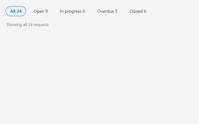
Pill-shaped tabs with a count per tab and a summary line that follows the selected tab, built on the modern Tab list control.
- Version
- 1.0.0
- Updated
- Verified in Studio
- Not yet
- Author
- Ynias Bensch
- Tags
Overview
Segmented tabs that filter a list by status: each tab carries its count, the selected tab is a filled pill, and a line underneath says what is shown. It uses the modern Tab list control with the SubtleCircular appearance.
Point a gallery at the selection, for example Filter(Requests, TabBarTabs.Selected.Value = "All" || Status = TabBarTabs.Selected.Value).
When to use
- Switching between three to six views of the same list.
- The top of a list screen, right under the header.
When not to use
- More than six options: use a dropdown or the filter chips.
- Moving between different screens of the app: use the side navigation.
Controls used
| Control | Version |
|---|---|
| GroupContainer | 1.5.0 |
| ModernTabList | 1.0.2 |
| ModernText | 1.0.0 |
YAML
Works as is, with example data inline. Paste it into a screen or container; the steps are underHow to paste.
Not yet verified in Power Apps Studio. The control versions are drafted from documentation. If Studio flags one, see How to paste for the fix.
- TabBarRoot:
    Control: GroupContainer@1.5.0
    Variant: AutoLayout
    Properties:
      DropShadow: =DropShadow.None
      Height: =TabBarTabs.Height + TabBarSummary.Height + 8 + 32
      LayoutDirection: =LayoutDirection.Vertical
      LayoutGap: =8
      PaddingBottom: =16
      PaddingLeft: =16
      PaddingRight: =16
      PaddingTop: =16
      Width: =Parent.Width
    Children:
      - TabBarTabs:
          Control: ModernTabList@1.0.2
          Properties:
            AccessibleLabel: ="Filter requests by status"
            Appearance: =TabListAppearance.SubtleCircular
            Height: =40
            ItemDisplayText: =ThisItem.Value & "  " & ThisItem.Count
            Items: |
              =Table(
                  {Value: "All", Count: 24},
                  {Value: "Open", Count: 9},
                  {Value: "In progress", Count: 6},
                  {Value: "Overdue", Count: 3},
                  {Value: "Closed", Count: 6}
              )
            LayoutMinHeight: =40
            LayoutMinWidth: =200
            OnChange: =Notify("Show " & Lower(Self.Selected.Value) & " requests", NotificationType.Information)
            TabSize: =TabSize.Medium
            Width: =Min(560, Parent.Width - 32)
      - TabBarSummary:
          Control: ModernText@1.0.0
          Properties:
            AccessibleLabel: =Self.Text
            AlignInContainer: =AlignInContainer.Stretch
            Color: =ColorFade(App.Theme.Colors.Darker70, 45%)
            Height: =30
            LayoutMinHeight: =0
            LayoutMinWidth: =80
            Size: =13
            Text: |
              =If(
                  TabBarTabs.Selected.Value = "All",
                  "Showing all " & TabBarTabs.Selected.Count & " requests",
                  "Showing " & TabBarTabs.Selected.Count & " " & Lower(TabBarTabs.Selected.Value) & " requests"
              )
            Wrap: =false
Make it yours
The example runs on sample data. Replace these properties to connect it to your app.
Items on TabBarTabs
One row per tab. Count is shown next to the label; calculate it from your data.
In the YAML
Items: |
  =Table(
      {Value: "All", Count: 24},
      {Value: "Open", Count: 9},
      {Value: "In progress", Count: 6},
      {Value: "Overdue", Count: 3},
      {Value: "Closed", Count: 6}
  )
Your version
Items: |
  =Table(
      {Value: "All", Count: CountRows(Requests)},
      {Value: "Open", Count: CountRows(Filter(Requests, Status = "Open"))},
      {Value: "Closed", Count: CountRows(Filter(Requests, Status = "Closed"))}
  )
OnChange on TabBarTabs
What happens when people pick a tab. Most lists simply read TabBarTabs.Selected.Value in their own filter, so this can also stay empty.
In the YAML
OnChange: =Notify("Show " & Lower(Self.Selected.Value) & " requests", NotificationType.Information)Your version
OnChange: |
  =UpdateContext({locStatus: Self.Selected.Value})
How to paste
- Open your app in Power Apps Studio.
- Check that modern controls are on: Settings → Updates → Modern controls and themes. In newer environments they are on by default.
- Copy the YAML with the Copy button above the code.
- In the Tree view, select the screen or container that should hold the component and press Ctrl+V. The whole component arrives as one container,
TabBarRoot, with all its controls inside. - Work through Make it yours to swap the example data for your own.
Where your version of Studio has a code view for a control or screen, you can paste the same YAML there instead of into the tree view.
When Studio flags a control version
Each control in the YAML names its version, like Control: ModernButton@1.0.0. If that version is newer than what your environment knows, Studio falls back to the version it has or flags the control. All controls of one type in an app must also use the same version, so an app that already has an older ModernButton can reject the paste. To fix it, insert the same control from the Insert pane, copy it as code, note the version on its Control: line, update every matching line in the YAML and paste again.
Missing a component, or did this one not paste cleanly? Suggest a component or report an issue.