AI chat panel
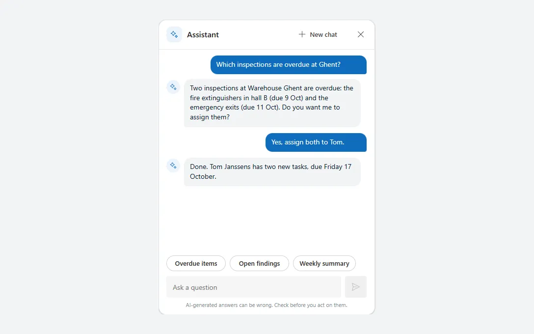
A Copilot-style chat with message bubbles, suggestion chips, a prompt box and a thinking state, ready to connect to your own flow or agent.
- Version
- 1.0.0
- Updated
- Verified in Studio
- Not yet
- Author
- Ynias Bensch
- Tags
Overview
A chat panel in the style of Microsoft 365 Copilot, for an assistant inside your app. Questions appear on the right in the theme colour and answers on the left in grey with a sparkle avatar; each bubble is as wide and as tall as its text. Above the prompt box are suggestion chips that fill in a question, and a disclaimer sits at the bottom. With no messages yet, the panel shows a welcome instead.
This is only the interface. The Send button adds the question to colAiChatPanelMessages and, in the example, a fixed reply; you replace that reply with a call to your own flow or agent. Change the three chips' Text to questions that fit your app.
When to use
- A side panel that answers questions about the app's data, for example through a flow with Azure OpenAI.
- Guided help for people who don't know where to find something.
When not to use
- A Copilot Studio agent without any custom design: the Copilot Studio chat control embeds it directly.
- Questions with fixed answers: a FAQ or search is faster and always right.
Before you paste
- Something that answers, such as a Power Automate flow that calls Azure OpenAI or a Copilot Studio agent, added to the app. The example calls a flow named
AskAssistantthat returnsanswer.
Controls used
| Control | Version |
|---|---|
| GroupContainer | 1.5.0 |
| ModernIcon | 1.1.1 |
| ModernText | 1.0.0 |
| ModernButton | 1.0.0 |
| Gallery | 2.15.0 |
| ModernSpinner | 1.1.0 |
| ModernTextInput | 1.1.2 |
YAML
Works as is, with example data inline. Paste it into a screen or container; the steps are underHow to paste.
Not yet verified in Power Apps Studio. The control versions are drafted from documentation. If Studio flags one, see How to paste for the fix.
- AiChatPanelRoot:
Control: GroupContainer@1.5.0
Variant: AutoLayout
Properties:
BorderColor: =ColorFade(App.Theme.Colors.Darker70, 88%)
BorderThickness: =1
DropShadow: =DropShadow.Light
Fill: =Color.White
Height: =Parent.Height
LayoutDirection: =LayoutDirection.Vertical
LayoutGap: =0
RadiusBottomLeft: =16
RadiusBottomRight: =16
RadiusTopLeft: =16
RadiusTopRight: =16
Width: =Min(440, Parent.Width)
Children:
- AiChatPanelHeader:
Control: GroupContainer@1.5.0
Variant: AutoLayout
Properties:
AlignInContainer: =AlignInContainer.Stretch
DropShadow: =DropShadow.None
FillPortions: =0
Height: =60
LayoutAlignItems: =LayoutAlignItems.Center
LayoutDirection: =LayoutDirection.Horizontal
LayoutGap: =10
LayoutMinHeight: =60
LayoutMinWidth: =120
PaddingLeft: =16
PaddingRight: =10
Children:
- AiChatPanelLogo:
Control: ModernIcon@1.1.1
Properties:
AccessibleLabel: ="Assistant"
Fill: =App.Theme.Colors.Lighter80
Height: =32
Icon: ="Sparkle"
IconColor: =App.Theme.Colors.Primary
LayoutMinHeight: =32
LayoutMinWidth: =32
PaddingBottom: =6
PaddingLeft: =6
PaddingRight: =6
PaddingTop: =6
RadiusBottomLeft: =10
RadiusBottomRight: =10
RadiusTopLeft: =10
RadiusTopRight: =10
Width: =32
- AiChatPanelTitle:
Control: ModernText@1.0.0
Properties:
AccessibleLabel: =Self.Text
FillPortions: =1
FontWeight: =FontWeight.Semibold
Height: =28
LayoutMinHeight: =28
LayoutMinWidth: =80
PaddingBottom: =0
PaddingLeft: =0
PaddingTop: =0
Size: =16
Text: ="Assistant"
Wrap: =false
- AiChatPanelNew:
Control: ModernButton@1.0.0
Properties:
AccessibleLabel: ="Start a new chat"
Appearance: =ButtonAppearance.Subtle
Height: =36
Icon: ="Add"
LayoutMinHeight: =36
LayoutMinWidth: =112
OnSelect: |
=Clear(colAiChatPanelMessages);
UpdateContext({locAiChatPanelDraft: ""});
Reset(AiChatPanelPrompt)
Size: =13
Text: ="New chat"
Width: =120
- AiChatPanelClose:
Control: ModernButton@1.0.0
Properties:
AccessibleLabel: ="Close the assistant"
Appearance: =ButtonAppearance.Subtle
Height: =36
Icon: ="Dismiss"
Layout: =ButtonLayout.IconOnly
LayoutMinHeight: =36
LayoutMinWidth: =36
OnSelect: |
=Notify("Close the panel (example only).", NotificationType.Information)
Size: =14
Tooltip: ="Close"
Width: =36
- AiChatPanelDivider:
Control: GroupContainer@1.5.0
Variant: ManualLayout
Properties:
AlignInContainer: =AlignInContainer.Stretch
DropShadow: =DropShadow.None
Fill: =ColorFade(App.Theme.Colors.Darker70, 90%)
FillPortions: =0
Height: =1
LayoutMinHeight: =1
LayoutMinWidth: =0
- AiChatPanelWelcome:
Control: GroupContainer@1.5.0
Variant: AutoLayout
Properties:
AlignInContainer: =AlignInContainer.Stretch
DropShadow: =DropShadow.None
FillPortions: =1
LayoutAlignItems: =LayoutAlignItems.Center
LayoutDirection: =LayoutDirection.Vertical
LayoutGap: =6
LayoutJustifyContent: =LayoutJustifyContent.Center
LayoutMinHeight: =0
LayoutMinWidth: =120
PaddingLeft: =24
PaddingRight: =24
Visible: =IsEmpty(colAiChatPanelMessages)
Children:
- AiChatPanelWelcomeIcon:
Control: ModernIcon@1.1.1
Properties:
AccessibleLabel: ="Assistant"
Fill: =App.Theme.Colors.Lighter80
Height: =56
Icon: ="Sparkle"
IconColor: =App.Theme.Colors.Primary
LayoutMinHeight: =56
LayoutMinWidth: =56
PaddingBottom: =12
PaddingLeft: =12
PaddingRight: =12
PaddingTop: =12
RadiusBottomLeft: =28
RadiusBottomRight: =28
RadiusTopLeft: =28
RadiusTopRight: =28
Width: =56
- AiChatPanelWelcomeTitle:
Control: ModernText@1.0.0
Properties:
AccessibleLabel: =Self.Text
Align: =Align.Center
AlignInContainer: =AlignInContainer.Stretch
FontWeight: =FontWeight.Semibold
Height: =30
LayoutMinHeight: =30
Size: =18
Text: ="How can I help?"
Wrap: =false
- AiChatPanelWelcomeText:
Control: ModernText@1.0.0
Properties:
AccessibleLabel: =Self.Text
Align: =Align.Center
AlignInContainer: =AlignInContainer.Stretch
Color: =ColorFade(App.Theme.Colors.Darker70, 45%)
Height: =24
LayoutMinHeight: =24
Size: =13
Text: ="Ask about inspections, findings or sites."
Wrap: =false
- AiChatPanelMessages:
Control: Gallery@2.15.0
Variant: VariableHeight
Properties:
AccessibleLabel: ="Conversation"
AlignInContainer: =AlignInContainer.Stretch
BorderThickness: =0
FillPortions: =1
Items: =colAiChatPanelMessages
LayoutMinHeight: =0
LayoutMinWidth: =120
ShowScrollbar: =false
TabIndex: =0
TemplatePadding: =0
TemplateSize: =48
Visible: =Not(IsEmpty(colAiChatPanelMessages))
Children:
- AiChatPanelAvatar:
Control: ModernIcon@1.1.1
Properties:
AccessibleLabel: ="Assistant"
Fill: =App.Theme.Colors.Lighter80
Height: =28
Icon: ="Sparkle"
IconColor: =App.Theme.Colors.Primary
PaddingBottom: =5
PaddingLeft: =5
PaddingRight: =5
PaddingTop: =5
RadiusBottomLeft: =14
RadiusBottomRight: =14
RadiusTopLeft: =14
RadiusTopRight: =14
Visible: =ThisItem.Role = "assistant"
Width: =28
X: =16
Y: =14
- AiChatPanelBubble:
Control: GroupContainer@1.5.0
Variant: ManualLayout
Properties:
DropShadow: =DropShadow.None
Fill: =If(ThisItem.Role = "user", App.Theme.Colors.Primary, ColorFade(App.Theme.Colors.Darker70, 95%))
Height: |
=With(
{maxW: Min(Parent.TemplateWidth - 68, 360)},
RoundUp(Len(ThisItem.Text) * 1.1 / ((maxW - 24) / 7.5), 0) * 20 + 18
)
RadiusBottomLeft: =If(ThisItem.Role = "user", 14, 4)
RadiusBottomRight: =If(ThisItem.Role = "user", 4, 14)
RadiusTopLeft: =14
RadiusTopRight: =14
Width: |
=With(
{maxW: Min(Parent.TemplateWidth - 68, 360)},
Min(maxW, Len(ThisItem.Text) * 7.5 + 26)
)
X: =If(ThisItem.Role = "user", Parent.TemplateWidth - Self.Width - 16, 52)
Y: =12
Children:
- AiChatPanelText:
Control: ModernText@1.0.0
Properties:
AccessibleLabel: |
=If(ThisItem.Role = "user", "You: ", "Assistant: ") & Self.Text
Color: =If(ThisItem.Role = "user", Color.White, App.Theme.Colors.Darker70)
Height: =Parent.Height - 16
PaddingBottom: =0
PaddingLeft: =0
PaddingRight: =0
PaddingTop: =0
Size: =14
Text: =ThisItem.Text
VerticalAlign: =VerticalAlign.Top
Width: =Parent.Width - 24
X: =12
Y: =8
- AiChatPanelThinking:
Control: ModernSpinner@1.1.0
Properties:
AccessibleLabel: ="The assistant is thinking"
AlignInContainer: =AlignInContainer.Start
Height: =36
Label: ="Thinking…"
LabelPosition: =SpinnerLabelPosition.After
LayoutMinHeight: =36
LayoutMinWidth: =120
PaddingLeft: =52
Size: =13
Visible: =locAiChatPanelBusy
Width: =200
- AiChatPanelSuggestions:
Control: GroupContainer@1.5.0
Variant: AutoLayout
Properties:
AlignInContainer: =AlignInContainer.Stretch
DropShadow: =DropShadow.None
FillPortions: =0
Height: =44
LayoutAlignItems: =LayoutAlignItems.Center
LayoutDirection: =LayoutDirection.Horizontal
LayoutGap: =8
LayoutMinHeight: =44
LayoutMinWidth: =120
PaddingLeft: =16
PaddingRight: =16
Children:
- AiChatPanelSuggestion1:
Control: ModernButton@1.0.0
Properties:
AccessibleLabel: |
="Suggestion: " & Self.Text
Appearance: =ButtonAppearance.Secondary
Height: =32
LayoutMinHeight: =32
LayoutMinWidth: =40
OnSelect: |
=UpdateContext({locAiChatPanelDraft: Self.Text})
RadiusBottomLeft: =16
RadiusBottomRight: =16
RadiusTopLeft: =16
RadiusTopRight: =16
Size: =13
Text: ="Overdue items"
Width: =Len(Self.Text) * 7 + 30
- AiChatPanelSuggestion2:
Control: ModernButton@1.0.0
Properties:
AccessibleLabel: |
="Suggestion: " & Self.Text
Appearance: =ButtonAppearance.Secondary
Height: =32
LayoutMinHeight: =32
LayoutMinWidth: =40
OnSelect: |
=UpdateContext({locAiChatPanelDraft: Self.Text})
RadiusBottomLeft: =16
RadiusBottomRight: =16
RadiusTopLeft: =16
RadiusTopRight: =16
Size: =13
Text: ="Open findings"
Width: =Len(Self.Text) * 7 + 30
- AiChatPanelSuggestion3:
Control: ModernButton@1.0.0
Properties:
AccessibleLabel: |
="Suggestion: " & Self.Text
Appearance: =ButtonAppearance.Secondary
Height: =32
LayoutMinHeight: =32
LayoutMinWidth: =40
OnSelect: |
=UpdateContext({locAiChatPanelDraft: Self.Text})
RadiusBottomLeft: =16
RadiusBottomRight: =16
RadiusTopLeft: =16
RadiusTopRight: =16
Size: =13
Text: ="Weekly summary"
Width: =Len(Self.Text) * 7 + 30
- AiChatPanelComposer:
Control: GroupContainer@1.5.0
Variant: AutoLayout
Properties:
AlignInContainer: =AlignInContainer.Stretch
DropShadow: =DropShadow.None
FillPortions: =0
Height: =52
LayoutAlignItems: =LayoutAlignItems.Center
LayoutDirection: =LayoutDirection.Horizontal
LayoutGap: =8
LayoutMinHeight: =52
LayoutMinWidth: =120
PaddingLeft: =16
PaddingRight: =16
Children:
- AiChatPanelPrompt:
Control: ModernTextInput@1.1.2
Properties:
AccessibleLabel: ="Message to the assistant"
Default: =locAiChatPanelDraft
FillPortions: =1
Height: =44
LayoutMinHeight: =44
LayoutMinWidth: =120
Placeholder: ="Ask a question"
Size: =14
- AiChatPanelSend:
Control: ModernButton@1.0.0
Properties:
AccessibleLabel: ="Send"
Appearance: =ButtonAppearance.Primary
DisplayMode: =If(IsBlank(Trim(AiChatPanelPrompt.Text)) || locAiChatPanelBusy, DisplayMode.Disabled, DisplayMode.Edit)
Height: =44
Icon: ="Send"
Layout: =ButtonLayout.IconOnly
LayoutMinHeight: =44
LayoutMinWidth: =44
OnSelect: |
=With(
{q: Trim(AiChatPanelPrompt.Text)},
Collect(colAiChatPanelMessages, {Role: "user", Text: q, Sent: Now()});
UpdateContext({locAiChatPanelDraft: "", locAiChatPanelBusy: true});
Reset(AiChatPanelPrompt);
Collect(colAiChatPanelMessages, {Role: "assistant", Text: "This is an example reply. Connect your own flow or agent in the OnSelect of the send button.", Sent: Now()});
UpdateContext({locAiChatPanelBusy: false})
)
Size: =14
Tooltip: ="Send"
Width: =44
- AiChatPanelDisclaimer:
Control: ModernText@1.0.0
Properties:
AccessibleLabel: =Self.Text
Align: =Align.Center
AlignInContainer: =AlignInContainer.Stretch
Color: =ColorFade(App.Theme.Colors.Darker70, 50%)
Height: =30
LayoutMinHeight: =30
PaddingBottom: =8
PaddingTop: =0
Size: =11
Text: ="AI-generated answers can be wrong. Check before you act on them."
Wrap: =falseMake it yours
The example runs on sample data. Replace these properties to connect it to your app.
OnSelect on AiChatPanelSend
Sends the question and adds the answer. Replace the example reply with a call to your flow or agent; keep the busy flag around it so the thinking state shows.
In the YAML
OnSelect: |
  =With(
      {q: Trim(AiChatPanelPrompt.Text)},
      Collect(colAiChatPanelMessages, {Role: "user", Text: q, Sent: Now()});
      UpdateContext({locAiChatPanelDraft: "", locAiChatPanelBusy: true});
      Reset(AiChatPanelPrompt);
      Collect(colAiChatPanelMessages, {Role: "assistant", Text: "This is an example reply. Connect your own flow or agent in the OnSelect of the send button.", Sent: Now()});
      UpdateContext({locAiChatPanelBusy: false})
  )
Your version
OnSelect: |
  =With(
      {q: Trim(AiChatPanelPrompt.Text)},
      Collect(colAiChatPanelMessages, {Role: "user", Text: q, Sent: Now()});
      UpdateContext({locAiChatPanelDraft: "", locAiChatPanelBusy: true});
      Reset(AiChatPanelPrompt);
      Collect(colAiChatPanelMessages, {Role: "assistant", Text: AskAssistant.Run(q).answer, Sent: Now()});
      UpdateContext({locAiChatPanelBusy: false})
  )
Items on AiChatPanelMessages
The conversation, oldest first. Send adds to colAiChatPanelMessages with the columns Role, Text and Sent; load a saved conversation into it to continue one.
In the YAML
Items: =colAiChatPanelMessagesYour version
Items: =Sort(colAiChatPanelMessages, Sent, SortOrder.Ascending)How to paste
- Open your app in Power Apps Studio.
- Check that modern controls are on: Settings → Updates → Modern controls and themes. In newer environments they are on by default.
- Copy the YAML with the Copy button above the code.
- In the Tree view, select the screen or container that should hold the component and press Ctrl+V. The whole component arrives as one container,
AiChatPanelRoot, with all its controls inside. - Work through Make it yours to swap the example data for your own.
Where your version of Studio has a code view for a control or screen, you can paste the same YAML there instead of into the tree view.
When Studio flags a control version
Each control in the YAML names its version, like Control: ModernButton@1.0.0. If that version is newer than what your environment knows, Studio falls back to the version it has or flags the control. All controls of one type in an app must also use the same version, so an app that already has an older ModernButton can reject the paste. To fix it, insert the same control from the Insert pane, copy it as code, note the version on its Control: line, update every matching line in the YAML and paste again.
Missing a component, or did this one not paste cleanly? Suggest a component or report an issue.