User menu
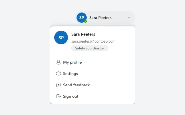
An avatar button that opens the signed-in user's name, email and role, with links to profile, settings and feedback and a sign-out button.
- Version
- 1.0.0
- Updated
- Verified in Studio
- Not yet
- Author
- Ynias Bensch
- Tags
Overview
The account menu from Microsoft 365 for the top right of a screen. A rounded button shows the avatar, the name and a chevron; selecting it opens a card with a larger avatar, the email address, a role badge, links to the profile, settings and feedback, and Sign out.
The menu opens below the button inside the same container, so put the component last in the screen's tree to keep it above the content. Sign out uses Exit(true), which closes the app and signs the user out of it.
When to use
- Apps with an app header, next to or instead of the plain avatar.
- When people need settings, help or sign-out from every screen.
When not to use
- Apps embedded in Teams or SharePoint: the host already shows the account.
- One action only, such as Settings: use an icon button.
Controls used
| Control | Version |
|---|---|
| GroupContainer | 1.5.0 |
| ModernAvatar | 1.1.0 |
| ModernText | 1.0.0 |
| ModernIcon | 1.1.1 |
| ModernButton | 1.0.0 |
| ModernBadge | 1.0.0 |
YAML
Works as is, with example data inline. Paste it into a screen or container; the steps are underHow to paste.
Not yet verified in Power Apps Studio. The control versions are drafted from documentation. If Studio flags one, see How to paste for the fix.
- UserMenuRoot:
    Control: GroupContainer@1.5.0
    Variant: AutoLayout
    Properties:
      DropShadow: =DropShadow.None
      Height: =UserMenuTrigger.Height + If(UserMenuPanel.Visible, 8 + UserMenuPanel.Height, 0)
      LayoutDirection: =LayoutDirection.Vertical
      LayoutGap: =8
      Width: =Min(300, Parent.Width)
      X: =Parent.Width - Self.Width - 16
      Y: =12
    Children:
      - UserMenuTrigger:
          Control: GroupContainer@1.5.0
          Variant: ManualLayout
          Properties:
            AlignInContainer: =AlignInContainer.End
            DropShadow: =DropShadow.None
            Fill: =If(locUserMenuOpen, ColorFade(App.Theme.Colors.Darker70, 92%), Color.Transparent)
            FillPortions: =0
            Height: =44
            LayoutMinHeight: =44
            LayoutMinWidth: =44
            RadiusBottomLeft: =22
            RadiusBottomRight: =22
            RadiusTopLeft: =22
            RadiusTopRight: =22
            Width: =Min(210, Parent.Width)
          Children:
            - UserMenuTriggerAvatar:
                Control: ModernAvatar@1.1.0
                Properties:
                  AccessibleLabel: =UserMenuName.Text
                  Badge: =PresenceBadge.Available
                  Height: =36
                  Image: =""
                  Name: =UserMenuName.Text
                  Width: =36
                  X: =4
                  Y: =4
            - UserMenuTriggerName:
                Control: ModernText@1.0.0
                Properties:
                  AccessibleLabel: =Self.Text
                  FontWeight: =FontWeight.Semibold
                  Height: =30
                  PaddingBottom: =0
                  PaddingTop: =0
                  Size: =14
                  Text: =UserMenuName.Text
                  Width: =Parent.Width - 84
                  Wrap: =false
                  X: =44
                  Y: =7
            - UserMenuTriggerChevron:
                Control: ModernIcon@1.1.1
                Properties:
                  AccessibleLabel: =If(locUserMenuOpen, "Menu open", "Menu closed")
                  Height: =16
                  Icon: =If(locUserMenuOpen, "ChevronUp", "ChevronDown")
                  IconColor: =ColorFade(App.Theme.Colors.Darker70, 45%)
                  Width: =16
                  X: =Parent.Width - 30
                  Y: =14
            - UserMenuToggle:
                Control: ModernButton@1.0.0
                Properties:
                  AccessibleLabel: ="Account menu for " & UserMenuName.Text
                  Appearance: =ButtonAppearance.Transparent
                  Height: =Parent.Height
                  OnSelect: |
                    =UpdateContext({locUserMenuOpen: Not(locUserMenuOpen)})
                  Text: =""
                  Width: =Parent.Width
                  X: =0
                  Y: =0
      - UserMenuPanel:
          Control: GroupContainer@1.5.0
          Variant: AutoLayout
          Properties:
            AlignInContainer: =AlignInContainer.Stretch
            BorderColor: =ColorFade(App.Theme.Colors.Darker70, 88%)
            BorderThickness: =1
            DropShadow: =DropShadow.Bold
            Fill: =Color.White
            FillPortions: =0
            Height: =UserMenuProfile.Height + 1 + 4 * 36 + 5 * 4 + 16 + 8
            LayoutDirection: =LayoutDirection.Vertical
            LayoutGap: =4
            LayoutMinHeight: =0
            LayoutMinWidth: =120
            PaddingBottom: =8
            PaddingLeft: =8
            PaddingRight: =8
            PaddingTop: =16
            RadiusBottomLeft: =12
            RadiusBottomRight: =12
            RadiusTopLeft: =12
            RadiusTopRight: =12
            Visible: =locUserMenuOpen
          Children:
            - UserMenuProfile:
                Control: GroupContainer@1.5.0
                Variant: AutoLayout
                Properties:
                  AlignInContainer: =AlignInContainer.Stretch
                  DropShadow: =DropShadow.None
                  FillPortions: =0
                  Height: =84
                  LayoutDirection: =LayoutDirection.Horizontal
                  LayoutGap: =12
                  LayoutMinHeight: =84
                  LayoutMinWidth: =120
                  PaddingLeft: =8
                  PaddingRight: =8
                Children:
                  - UserMenuAvatar:
                      Control: ModernAvatar@1.1.0
                      Properties:
                        AccessibleLabel: =UserMenuName.Text
                        Badge: =PresenceBadge.None
                        Height: =48
                        Image: =""
                        LayoutMinHeight: =48
                        LayoutMinWidth: =48
                        Name: =UserMenuName.Text
                        Width: =48
                  - UserMenuDetails:
                      Control: GroupContainer@1.5.0
                      Variant: AutoLayout
                      Properties:
                        DropShadow: =DropShadow.None
                        FillPortions: =1
                        Height: =72
                        LayoutDirection: =LayoutDirection.Vertical
                        LayoutGap: =2
                        LayoutMinHeight: =72
                        LayoutMinWidth: =80
                      Children:
                        - UserMenuName:
                            Control: ModernText@1.0.0
                            Properties:
                              AccessibleLabel: =Self.Text
                              AlignInContainer: =AlignInContainer.Stretch
                              FontWeight: =FontWeight.Semibold
                              Height: =24
                              LayoutMinHeight: =24
                              PaddingBottom: =0
                              PaddingLeft: =0
                              PaddingTop: =0
                              Size: =15
                              Text: ="Sara Peeters"
                              Wrap: =false
                        - UserMenuEmail:
                            Control: ModernText@1.0.0
                            Properties:
                              AccessibleLabel: =Self.Text
                              AlignInContainer: =AlignInContainer.Stretch
                              Color: =ColorFade(App.Theme.Colors.Darker70, 45%)
                              Height: =22
                              LayoutMinHeight: =22
                              PaddingBottom: =0
                              PaddingLeft: =0
                              PaddingTop: =0
                              Size: =13
                              Text: ="sara.peeters@contoso.com"
                              Wrap: =false
                        - UserMenuRole:
                            Control: ModernBadge@1.0.0
                            Properties:
                              AccessibleLabel: |
                                ="Role: Safety coordinator"
                              Appearance: =BadgeAppearance.Tint
                              Content: ="Safety coordinator"
                              Height: =22
                              Intent: =BadgeIntent.Informative
                              LayoutMinHeight: =22
                              LayoutMinWidth: =60
                              Size: =12
                              Width: =128
            - UserMenuDivider:
                Control: GroupContainer@1.5.0
                Variant: ManualLayout
                Properties:
                  AlignInContainer: =AlignInContainer.Stretch
                  DropShadow: =DropShadow.None
                  Fill: =ColorFade(App.Theme.Colors.Darker70, 88%)
                  FillPortions: =0
                  Height: =1
                  LayoutMinHeight: =1
                  LayoutMinWidth: =0
            - UserMenuProfileLink:
                Control: ModernButton@1.0.0
                Properties:
                  AccessibleLabel: =Self.Text
                  Align: =Align.Left
                  AlignInContainer: =AlignInContainer.Stretch
                  Appearance: =ButtonAppearance.Subtle
                  Height: =36
                  Icon: ="Person"
                  LayoutMinHeight: =36
                  LayoutMinWidth: =80
                  OnSelect: |
                    =Notify("Open your profile (example only).", NotificationType.Information);
                    UpdateContext({locUserMenuOpen: false})
                  Size: =14
                  Text: ="My profile"
            - UserMenuSettings:
                Control: ModernButton@1.0.0
                Properties:
                  AccessibleLabel: =Self.Text
                  Align: =Align.Left
                  AlignInContainer: =AlignInContainer.Stretch
                  Appearance: =ButtonAppearance.Subtle
                  Height: =36
                  Icon: ="Settings"
                  LayoutMinHeight: =36
                  LayoutMinWidth: =80
                  OnSelect: |
                    =Notify("Open settings (example only).", NotificationType.Information);
                    UpdateContext({locUserMenuOpen: false})
                  Size: =14
                  Text: ="Settings"
            - UserMenuFeedback:
                Control: ModernButton@1.0.0
                Properties:
                  AccessibleLabel: =Self.Text
                  Align: =Align.Left
                  AlignInContainer: =AlignInContainer.Stretch
                  Appearance: =ButtonAppearance.Subtle
                  Height: =36
                  Icon: ="Chat"
                  LayoutMinHeight: =36
                  LayoutMinWidth: =80
                  OnSelect: |
                    =Launch("mailto:helpdesk@contoso.com?subject=" & EncodeUrl("Feedback on the app"));
                    UpdateContext({locUserMenuOpen: false})
                  Size: =14
                  Text: ="Send feedback"
            - UserMenuSignOut:
                Control: ModernButton@1.0.0
                Properties:
                  AccessibleLabel: =Self.Text
                  Align: =Align.Left
                  AlignInContainer: =AlignInContainer.Stretch
                  Appearance: =ButtonAppearance.Subtle
                  Height: =36
                  Icon: ="ArrowExit"
                  LayoutMinHeight: =36
                  LayoutMinWidth: =80
                  OnSelect: |
                    =Exit(true)
                  Size: =14
                  Text: ="Sign out"
Make it yours
The example runs on sample data. Replace these properties to connect it to your app.
Text on UserMenuName
The name on the button and in the menu. The avatars read it too, for their initials.
In the YAML
Text: ="Sara Peeters"Your version
Text: =User().FullNameText on UserMenuEmail
The email address under the name.
In the YAML
Text: ="sara.peeters@contoso.com"Your version
Text: =User().EmailImage on UserMenuAvatar
The photo in the menu. It is blank in the example so the preview shows initials; do the same on UserMenuTriggerAvatar.
In the YAML
Image: =""Your version
Image: =User().ImageContent on UserMenuRole
The role badge. Change its AccessibleLabel too, or remove the badge if your app has no roles.
In the YAML
Content: ="Safety coordinator"Your version
Content: =Coalesce(LookUp(TeamMembers, Email = User().Email).Role, "Member")OnSelect on UserMenuSettings
Where Settings goes. Do the same for My profile and Send feedback; keep closing the menu.
In the YAML
OnSelect: |
  =Notify("Open settings (example only).", NotificationType.Information);
  UpdateContext({locUserMenuOpen: false})
Your version
OnSelect: |
  =UpdateContext({locUserMenuOpen: false});
  Navigate(SettingsScreen, ScreenTransition.None)
How to paste
- Open your app in Power Apps Studio.
- Check that modern controls are on: Settings → Updates → Modern controls and themes. In newer environments they are on by default.
- Copy the YAML with the Copy button above the code.
- In the Tree view, select the screen or container that should hold the component and press Ctrl+V. The whole component arrives as one container,
UserMenuRoot, with all its controls inside. - Work through Make it yours to swap the example data for your own.
Where your version of Studio has a code view for a control or screen, you can paste the same YAML there instead of into the tree view.
When Studio flags a control version
Each control in the YAML names its version, like Control: ModernButton@1.0.0. If that version is newer than what your environment knows, Studio falls back to the version it has or flags the control. All controls of one type in an app must also use the same version, so an app that already has an older ModernButton can reject the paste. To fix it, insert the same control from the Insert pane, copy it as code, note the version on its Control: line, update every matching line in the YAML and paste again.
Missing a component, or did this one not paste cleanly? Suggest a component or report an issue.