List-detail split
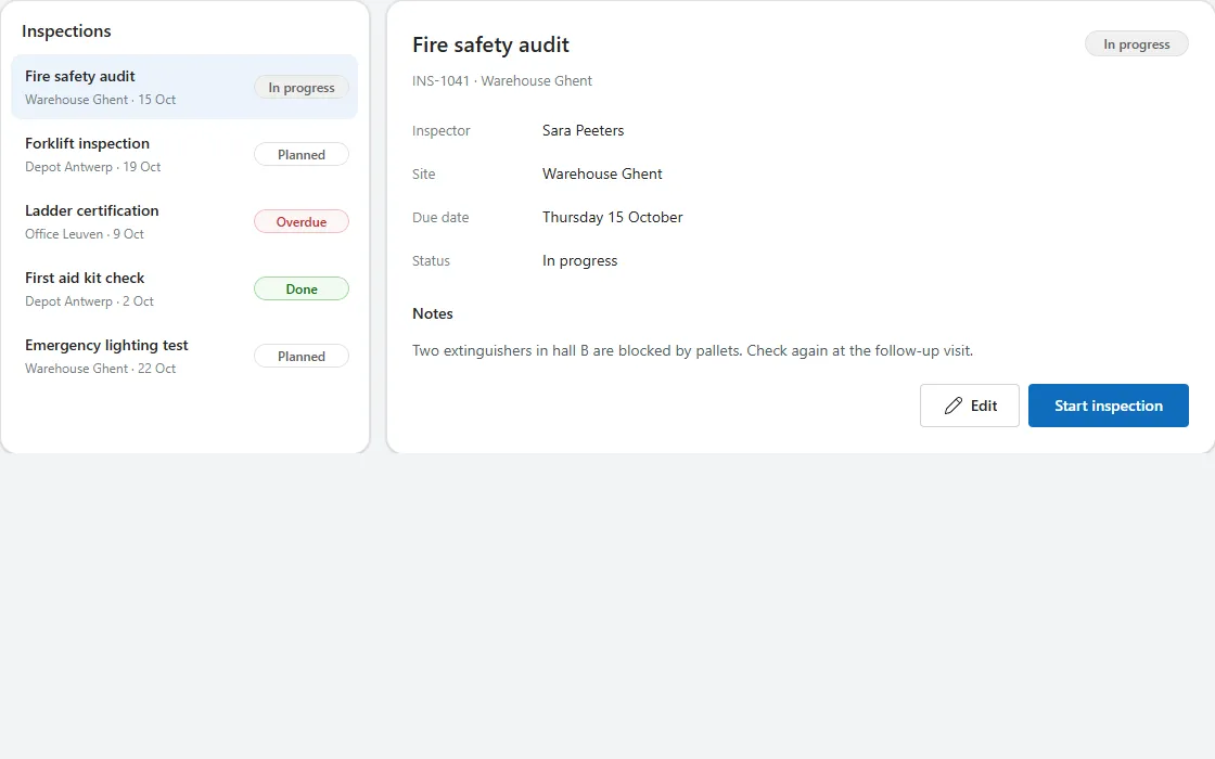
A list of records next to the details of the selected one, with notes and actions; on narrow screens it becomes a list with a Back button.
- Version
- 1.0.0
- Updated
- Verified in Studio
- Not yet
- Author
- Ynias Bensch
- Tags
Overview
The list-detail pattern from Outlook and Teams: a list of records on the left, and the details of the selected record on the right, with its status, a few fields, notes and buttons. The selected row is tinted, and the first record is selected when the screen opens.
On screens narrower than 720 pixels only the list shows. Selecting a row opens the details full width with a Back button, which returns to the list; locListDetailOpen tracks which of the two is showing. Both panels are as tall as the taller of the two, and the list grows with its rows instead of scrolling.
When to use
- Browsing records and reading their details without switching screens, on tablets and desktops.
- Lists of up to about twenty records; filter or page longer lists.
When not to use
- Records with many fields or long forms: open them on their own screen.
- Comparing several records side by side: use a table.
Controls used
| Control | Version |
|---|---|
| GroupContainer | 1.5.0 |
| ModernText | 1.0.0 |
| Gallery | 2.15.0 |
| ModernBadge | 1.0.0 |
| ModernButton | 1.0.0 |
YAML
Works as is, with example data inline. Paste it into a screen or container; the steps are underHow to paste.
Not yet verified in Power Apps Studio. The control versions are drafted from documentation. If Studio flags one, see How to paste for the fix.
- ListDetailRoot:
Control: GroupContainer@1.5.0
Variant: AutoLayout
Properties:
DropShadow: =DropShadow.None
Height: |
=Max(
ListDetailListHeader.Height + ListDetailList.Height + 8 + 32,
If(ListDetailBack.Visible, ListDetailBack.Height + 8, 0) + ListDetailHeading.Height + ListDetailSubtitle.Height + ListDetailFields.Height + ListDetailNotesLabel.Height + ListDetailNotes.Height + ListDetailActions.Height + 5 * 8 + 48
)
LayoutDirection: =LayoutDirection.Horizontal
LayoutGap: =16
Width: =Parent.Width
Children:
- ListDetailListPanel:
Control: GroupContainer@1.5.0
Variant: AutoLayout
Properties:
BorderColor: =ColorFade(App.Theme.Colors.Darker70, 88%)
BorderThickness: =1
DropShadow: =DropShadow.Light
Fill: =Color.White
FillPortions: =If(ListDetailRoot.Width >= 720, 0, 1)
Height: =Parent.Height
LayoutDirection: =LayoutDirection.Vertical
LayoutGap: =8
LayoutMinHeight: =0
LayoutMinWidth: =200
PaddingBottom: =16
PaddingLeft: =8
PaddingRight: =8
PaddingTop: =16
RadiusBottomLeft: =16
RadiusBottomRight: =16
RadiusTopLeft: =16
RadiusTopRight: =16
Visible: =ListDetailRoot.Width >= 720 || Not(locListDetailOpen)
Width: =340
Children:
- ListDetailListHeader:
Control: ModernText@1.0.0
Properties:
AccessibleLabel: =Self.Text
AlignInContainer: =AlignInContainer.Stretch
FontWeight: =FontWeight.Semibold
Height: =24
LayoutMinHeight: =0
LayoutMinWidth: =80
PaddingBottom: =0
PaddingLeft: =12
PaddingTop: =0
Size: =16
Text: ="Inspections"
Wrap: =false
- ListDetailList:
Control: Gallery@2.15.0
Variant: Vertical
Properties:
AccessibleLabel: =ListDetailListHeader.Text
AlignInContainer: =AlignInContainer.Stretch
BorderThickness: =0
FillPortions: =0
Height: =Self.AllItemsCount * (Self.TemplateHeight + Self.TemplatePadding) + Self.TemplatePadding
Items: |
=Table(
{Id: 1, Title: "Fire safety audit", Site: "Warehouse Ghent", Status: "In progress", Inspector: "Sara Peeters", Due: Date(2026, 10, 15), Notes: "Two extinguishers in hall B are blocked by pallets. Check again at the follow-up visit."},
{Id: 2, Title: "Forklift inspection", Site: "Depot Antwerp", Status: "Planned", Inspector: "Tom Janssens", Due: Date(2026, 10, 19), Notes: "Yearly inspection of the three electric forklifts."},
{Id: 3, Title: "Ladder certification", Site: "Office Leuven", Status: "Overdue", Inspector: "An De Smet", Due: Date(2026, 10, 9), Notes: "Certificates of the fixed ladders on the roof expired."},
{Id: 4, Title: "First aid kit check", Site: "Depot Antwerp", Status: "Done", Inspector: "Lucas Maes", Due: Date(2026, 10, 2), Notes: "All kits complete."},
{Id: 5, Title: "Emergency lighting test", Site: "Warehouse Ghent", Status: "Planned", Inspector: "Sara Peeters", Due: Date(2026, 10, 22), Notes: "Test all emergency lights for one hour."}
)
LayoutMinHeight: =0
LayoutMinWidth: =120
ShowScrollbar: =false
TabIndex: =0
TemplatePadding: =2
TemplateSize: =60
Children:
- ListDetailRow:
Control: GroupContainer@1.5.0
Variant: ManualLayout
Properties:
DropShadow: =DropShadow.None
Fill: |
=If(ListDetailRoot.Width >= 720 && ThisItem.Id = ListDetailList.Selected.Id, App.Theme.Colors.Lighter80, Color.Transparent)
Height: =Parent.TemplateHeight
RadiusBottomLeft: =10
RadiusBottomRight: =10
RadiusTopLeft: =10
RadiusTopRight: =10
Width: =Parent.TemplateWidth
X: =0
Y: =0
- ListDetailRowTitle:
Control: ModernText@1.0.0
Properties:
AccessibleLabel: =Self.Text
FontWeight: =FontWeight.Semibold
Height: =22
PaddingBottom: =0
PaddingTop: =0
Size: =14
Text: =ThisItem.Title
Width: =Parent.TemplateWidth - 112
Wrap: =false
X: =8
Y: =9
- ListDetailRowSite:
Control: ModernText@1.0.0
Properties:
AccessibleLabel: =Self.Text
Color: =ColorFade(App.Theme.Colors.Darker70, 45%)
Height: =20
PaddingBottom: =0
PaddingTop: =0
Size: =12
Text: =ThisItem.Site & " · " & Text(ThisItem.Due, "d mmm")
Width: =Parent.TemplateWidth - 112
Wrap: =false
X: =8
Y: =31
- ListDetailRowStatus:
Control: ModernBadge@1.0.0
Properties:
AccessibleLabel: ="Status " & ThisItem.Status
Appearance: =BadgeAppearance.Tint
Content: =ThisItem.Status
Height: =22
Intent: |
=Switch(ThisItem.Status, "Done", BadgeIntent.Positive, "Overdue", BadgeIntent.Critical, "In progress", BadgeIntent.Informative, BadgeIntent.Neutral)
Size: =12
Width: =88
X: =Parent.TemplateWidth - Self.Width - 8
Y: =19
- ListDetailRowSelect:
Control: ModernButton@1.0.0
Properties:
AccessibleLabel: =ThisItem.Title & ", " & ThisItem.Status
Appearance: =ButtonAppearance.Transparent
Height: =Parent.TemplateHeight
OnSelect: |
=Select(Parent);
UpdateContext({locListDetailOpen: true})
Text: =""
Width: =Parent.TemplateWidth
X: =0
Y: =0
- ListDetailDetailPanel:
Control: GroupContainer@1.5.0
Variant: AutoLayout
Properties:
BorderColor: =ColorFade(App.Theme.Colors.Darker70, 88%)
BorderThickness: =1
DropShadow: =DropShadow.Light
Fill: =Color.White
FillPortions: =1
Height: =Parent.Height
LayoutDirection: =LayoutDirection.Vertical
LayoutGap: =8
LayoutMinHeight: =0
LayoutMinWidth: =200
PaddingBottom: =24
PaddingLeft: =24
PaddingRight: =24
PaddingTop: =24
RadiusBottomLeft: =16
RadiusBottomRight: =16
RadiusTopLeft: =16
RadiusTopRight: =16
Visible: =ListDetailRoot.Width >= 720 || locListDetailOpen
Children:
- ListDetailBack:
Control: ModernButton@1.0.0
Properties:
AccessibleLabel: ="Back to the list"
Appearance: =ButtonAppearance.Subtle
Height: =32
Icon: ="ChevronRight"
IconRotation: =180
LayoutMinHeight: =32
LayoutMinWidth: =72
OnSelect: |
=UpdateContext({locListDetailOpen: false})
Size: =14
Text: ="Back"
Visible: =ListDetailRoot.Width < 720
Width: =84
- ListDetailHeading:
Control: GroupContainer@1.5.0
Variant: AutoLayout
Properties:
AlignInContainer: =AlignInContainer.Stretch
DropShadow: =DropShadow.None
FillPortions: =0
Height: =32
LayoutAlignItems: =LayoutAlignItems.Center
LayoutDirection: =LayoutDirection.Horizontal
LayoutGap: =12
LayoutMinHeight: =32
LayoutMinWidth: =120
Children:
- ListDetailTitle:
Control: ModernText@1.0.0
Properties:
AccessibleLabel: =Self.Text
FillPortions: =1
FontWeight: =FontWeight.Semibold
Height: =32
LayoutMinHeight: =0
LayoutMinWidth: =80
PaddingBottom: =0
PaddingLeft: =0
PaddingTop: =0
Size: =20
Text: =ListDetailList.Selected.Title
Wrap: =false
- ListDetailStatus:
Control: ModernBadge@1.0.0
Properties:
AccessibleLabel: ="Status " & ListDetailList.Selected.Status
Appearance: =BadgeAppearance.Tint
Content: =ListDetailList.Selected.Status
Height: =24
Intent: |
=Switch(ListDetailList.Selected.Status, "Done", BadgeIntent.Positive, "Overdue", BadgeIntent.Critical, "In progress", BadgeIntent.Informative, BadgeIntent.Neutral)
LayoutMinHeight: =24
LayoutMinWidth: =80
Size: =12
Width: =96
- ListDetailSubtitle:
Control: ModernText@1.0.0
Properties:
AccessibleLabel: =Self.Text
AlignInContainer: =AlignInContainer.Stretch
Color: =ColorFade(App.Theme.Colors.Darker70, 45%)
Height: =28
LayoutMinHeight: =0
LayoutMinWidth: =80
PaddingBottom: =8
PaddingLeft: =0
PaddingTop: =0
Size: =13
Text: ="INS-104" & ListDetailList.Selected.Id & " · " & ListDetailList.Selected.Site
Wrap: =false
- ListDetailFields:
Control: Gallery@2.15.0
Variant: Vertical
Properties:
AccessibleLabel: ="Details"
AlignInContainer: =AlignInContainer.Stretch
BorderThickness: =0
FillPortions: =0
Height: =Self.AllItemsCount * (Self.TemplateHeight + Self.TemplatePadding) + Self.TemplatePadding
Items: |
=Table(
{Label: "Inspector", Value: ListDetailList.Selected.Inspector},
{Label: "Site", Value: ListDetailList.Selected.Site},
{Label: "Due date", Value: Text(ListDetailList.Selected.Due, "dddd d mmmm")},
{Label: "Status", Value: ListDetailList.Selected.Status}
)
LayoutMinHeight: =0
LayoutMinWidth: =120
ShowScrollbar: =false
TabIndex: =0
TemplatePadding: =0
TemplateSize: =40
Children:
- ListDetailFieldLabel:
Control: ModernText@1.0.0
Properties:
AccessibleLabel: =Self.Text
Color: =ColorFade(App.Theme.Colors.Darker70, 45%)
Height: =30
PaddingLeft: =0
Size: =13
Text: =ThisItem.Label
Width: =120
Wrap: =false
X: =0
Y: =5
- ListDetailFieldValue:
Control: ModernText@1.0.0
Properties:
AccessibleLabel: =ListDetailFieldLabel.Text & " " & Self.Text
Height: =30
PaddingLeft: =0
Size: =14
Text: =ThisItem.Value
Width: =Parent.TemplateWidth - 120
Wrap: =false
X: =120
Y: =5
- ListDetailNotesLabel:
Control: ModernText@1.0.0
Properties:
AccessibleLabel: =Self.Text
AlignInContainer: =AlignInContainer.Stretch
FontWeight: =FontWeight.Semibold
Height: =32
LayoutMinHeight: =0
LayoutMinWidth: =60
PaddingBottom: =0
PaddingLeft: =0
PaddingTop: =10
Size: =14
Text: ="Notes"
Wrap: =false
- ListDetailNotes:
Control: ModernText@1.0.0
Properties:
AccessibleLabel: =Self.Text
AlignInContainer: =AlignInContainer.Stretch
AutoHeight: =true
Color: =ColorFade(App.Theme.Colors.Darker70, 30%)
FillPortions: =0
Height: =40
LayoutMinHeight: =0
LayoutMinWidth: =60
PaddingLeft: =0
Size: =14
Text: =ListDetailList.Selected.Notes
- ListDetailActions:
Control: GroupContainer@1.5.0
Variant: AutoLayout
Properties:
AlignInContainer: =AlignInContainer.Stretch
DropShadow: =DropShadow.None
FillPortions: =0
Height: =48
LayoutAlignItems: =LayoutAlignItems.End
LayoutDirection: =LayoutDirection.Horizontal
LayoutGap: =8
LayoutJustifyContent: =LayoutJustifyContent.End
LayoutMinHeight: =48
LayoutMinWidth: =120
Children:
- ListDetailEdit:
Control: ModernButton@1.0.0
Properties:
AccessibleLabel: =Self.Text
Appearance: =ButtonAppearance.Secondary
Height: =40
Icon: ="Edit"
LayoutMinHeight: =40
LayoutMinWidth: =80
OnSelect: =Notify("Edit " & ListDetailList.Selected.Title & " (example only).", NotificationType.Information)
Size: =14
Text: ="Edit"
Width: =92
- ListDetailOpen:
Control: ModernButton@1.0.0
Properties:
AccessibleLabel: =Self.Text
Appearance: =ButtonAppearance.Primary
Height: =40
LayoutMinHeight: =40
LayoutMinWidth: =96
OnSelect: =Notify("Start " & ListDetailList.Selected.Title & " (example only).", NotificationType.Information)
Size: =14
Text: ="Start inspection"
Width: =148Make it yours
The example runs on sample data. Replace these properties to connect it to your app.
Items on ListDetailList
The records, each with an Id, Title, Site, Status, Inspector, Due (a date) and Notes. Map your own columns onto those names, or rename them in the formulas that read them.
In the YAML
Items: |
  =Table(
      {Id: 1, Title: "Fire safety audit", Site: "Warehouse Ghent", Status: "In progress", Inspector: "Sara Peeters", Due: Date(2026, 10, 15), Notes: "Two extinguishers in hall B are blocked by pallets. Check again at the follow-up visit."},
      {Id: 2, Title: "Forklift inspection", Site: "Depot Antwerp", Status: "Planned", Inspector: "Tom Janssens", Due: Date(2026, 10, 19), Notes: "Yearly inspection of the three electric forklifts."},
      {Id: 3, Title: "Ladder certification", Site: "Office Leuven", Status: "Overdue", Inspector: "An De Smet", Due: Date(2026, 10, 9), Notes: "Certificates of the fixed ladders on the roof expired."},
      {Id: 4, Title: "First aid kit check", Site: "Depot Antwerp", Status: "Done", Inspector: "Lucas Maes", Due: Date(2026, 10, 2), Notes: "All kits complete."},
      {Id: 5, Title: "Emergency lighting test", Site: "Warehouse Ghent", Status: "Planned", Inspector: "Sara Peeters", Due: Date(2026, 10, 22), Notes: "Test all emergency lights for one hour."}
  )
Your version
Items: |
  =ForAll(
      Sort(Filter(Inspections, Status <> "Archived"), 'Due date') As r,
      {Id: r.ID, Title: r.Title, Site: r.Site, Status: r.Status, Inspector: r.'Assigned to'.DisplayName, Due: r.'Due date', Notes: r.Notes}
  )
OnSelect on ListDetailOpen
The main action for the selected record. Its Edit neighbour works the same way.
In the YAML
OnSelect: =Notify("Start " & ListDetailList.Selected.Title & " (example only).", NotificationType.Information)Your version
OnSelect: |
  =Set(varInspection, LookUp(Inspections, ID = ListDetailList.Selected.Id));
  Navigate(InspectionScreen, ScreenTransition.None)
How to paste
- Open your app in Power Apps Studio.
- Check that modern controls are on: Settings → Updates → Modern controls and themes. In newer environments they are on by default.
- Copy the YAML with the Copy button above the code.
- In the Tree view, select the screen or container that should hold the component and press Ctrl+V. The whole component arrives as one container,
ListDetailRoot, with all its controls inside. - Work through Make it yours to swap the example data for your own.
Where your version of Studio has a code view for a control or screen, you can paste the same YAML there instead of into the tree view.
When Studio flags a control version
Each control in the YAML names its version, like Control: ModernButton@1.0.0. If that version is newer than what your environment knows, Studio falls back to the version it has or flags the control. All controls of one type in an app must also use the same version, so an app that already has an older ModernButton can reject the paste. To fix it, insert the same control from the Insert pane, copy it as code, note the version on its Control: line, update every matching line in the YAML and paste again.
Missing a component, or did this one not paste cleanly? Suggest a component or report an issue.