Alert banner
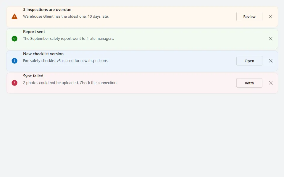
Dismissable info, success, warning and error messages with a coloured icon, title, text and an optional action button.
- Version
- 1.0.0
- Updated
- Verified in Studio
- Not yet
- Author
- Ynias Bensch
- Tags
Overview
Inline messages in four intents, each with a coloured icon, a bold title, a line of text, an optional action and a close button. They stack in a gallery that is exactly as tall as the visible messages.
Dismissing a message adds its Id to the context variable locAlertBannerHidden, and the gallery filters those out, so it works without collections or extra setup.
When to use
- Status that stays relevant until people act on it: overdue work, failed syncs, new versions.
- The top of a screen or section, above the content it is about.
When not to use
- Short confirmations after an action: use
Notifyinstead. - Questions that need an answer before people can continue: use the confirm dialog.
Controls used
| Control | Version |
|---|---|
| GroupContainer | 1.5.0 |
| Gallery | 2.15.0 |
| ModernIcon | 1.1.1 |
| ModernText | 1.0.0 |
| ModernButton | 1.0.0 |
YAML
Works as is, with example data inline. Paste it into a screen or container; the steps are underHow to paste.
Not yet verified in Power Apps Studio. The control versions are drafted from documentation. If Studio flags one, see How to paste for the fix.
- AlertBannerRoot:
    Control: GroupContainer@1.5.0
    Variant: AutoLayout
    Properties:
      DropShadow: =DropShadow.None
      Height: =AlertBannerGallery.Height + 32
      LayoutDirection: =LayoutDirection.Vertical
      PaddingBottom: =16
      PaddingLeft: =16
      PaddingRight: =16
      PaddingTop: =16
      Width: =Parent.Width
    Children:
      - AlertBannerGallery:
          Control: Gallery@2.15.0
          Variant: Vertical
          Properties:
            AccessibleLabel: ="Messages"
            AlignInContainer: =AlignInContainer.Stretch
            BorderThickness: =0
            FillPortions: =0
            Height: =Self.AllItemsCount * (Self.TemplateHeight + Self.TemplatePadding) + Self.TemplatePadding
            Items: |
              =Filter(
                  Table(
                      {Id: 1, Intent: "Warning", Title: "3 inspections are overdue", Message: "Warehouse Ghent has the oldest one, 10 days late.", Action: "Review"},
                      {Id: 2, Intent: "Success", Title: "Report sent", Message: "The September safety report went to 4 site managers.", Action: ""},
                      {Id: 3, Intent: "Info", Title: "New checklist version", Message: "Fire safety checklist v3 is used for new inspections.", Action: "Open"},
                      {Id: 4, Intent: "Error", Title: "Sync failed", Message: "2 photos could not be uploaded. Check the connection.", Action: "Retry"}
                  ),
                  Not("|" & Id & "|" in locAlertBannerHidden)
              )
            LayoutMinHeight: =0
            LayoutMinWidth: =120
            ShowScrollbar: =false
            TabIndex: =0
            TemplatePadding: =5
            TemplateSize: =70
          Children:
            - AlertBannerItem:
                Control: GroupContainer@1.5.0
                Variant: AutoLayout
                Properties:
                  BorderColor: =ColorFade(Self.Fill, -6%)
                  BorderThickness: =1
                  DropShadow: =DropShadow.None
                  Fill: |
                    =Switch(
                        ThisItem.Intent,
                        "Success", RGBA(241, 250, 241, 1),
                        "Warning", RGBA(255, 248, 240, 1),
                        "Error", RGBA(253, 243, 244, 1),
                        App.Theme.Colors.Lighter80
                    )
                  Height: =Parent.TemplateHeight
                  LayoutAlignItems: =LayoutAlignItems.Center
                  LayoutDirection: =LayoutDirection.Horizontal
                  LayoutGap: =12
                  PaddingLeft: =16
                  PaddingRight: =8
                  RadiusBottomLeft: =12
                  RadiusBottomRight: =12
                  RadiusTopLeft: =12
                  RadiusTopRight: =12
                  Width: =Parent.TemplateWidth
                  X: =0
                  Y: =0
                Children:
                  - AlertBannerIcon:
                      Control: ModernIcon@1.1.1
                      Properties:
                        AccessibleLabel: =ThisItem.Intent
                        Height: =24
                        Icon: =Switch(ThisItem.Intent, "Success", "CheckmarkCircle", "Warning", "Warning", "Error", "ErrorCircle", "Info")
                        IconColor: |
                          =Switch(
                              ThisItem.Intent,
                              "Success", RGBA(16, 124, 16, 1),
                              "Warning", RGBA(188, 75, 9, 1),
                              "Error", RGBA(196, 49, 75, 1),
                              App.Theme.Colors.Primary
                          )
                        IconStyle: =IconStyle.Filled
                        LayoutMinHeight: =24
                        LayoutMinWidth: =24
                        Width: =24
                  - AlertBannerText:
                      Control: GroupContainer@1.5.0
                      Variant: AutoLayout
                      Properties:
                        DropShadow: =DropShadow.None
                        FillPortions: =1
                        Height: =44
                        LayoutDirection: =LayoutDirection.Vertical
                        LayoutGap: =2
                        LayoutMinHeight: =44
                        LayoutMinWidth: =80
                      Children:
                        - AlertBannerTitle:
                            Control: ModernText@1.0.0
                            Properties:
                              AccessibleLabel: =Self.Text
                              AlignInContainer: =AlignInContainer.Stretch
                              FontWeight: =FontWeight.Semibold
                              Height: =22
                              LayoutMinHeight: =0
                              LayoutMinWidth: =60
                              PaddingBottom: =0
                              PaddingTop: =0
                              Size: =14
                              Text: =ThisItem.Title
                              Wrap: =false
                        - AlertBannerMessage:
                            Control: ModernText@1.0.0
                            Properties:
                              AccessibleLabel: =Self.Text
                              AlignInContainer: =AlignInContainer.Stretch
                              Color: =ColorFade(App.Theme.Colors.Darker70, 25%)
                              Height: =20
                              LayoutMinHeight: =0
                              LayoutMinWidth: =60
                              PaddingBottom: =0
                              PaddingTop: =0
                              Size: =13
                              Text: =ThisItem.Message
                              Wrap: =false
                  - AlertBannerAction:
                      Control: ModernButton@1.0.0
                      Properties:
                        AccessibleLabel: =Self.Text
                        Appearance: =ButtonAppearance.Outline
                        Height: =32
                        LayoutMinHeight: =32
                        LayoutMinWidth: =80
                        OnSelect: |
                          =Notify(ThisItem.Action & ": " & ThisItem.Title, NotificationType.Information)
                        Size: =13
                        Text: =ThisItem.Action
                        Visible: =!IsBlank(ThisItem.Action)
                        Width: =88
                  - AlertBannerDismiss:
                      Control: ModernButton@1.0.0
                      Properties:
                        AccessibleLabel: ="Dismiss " & ThisItem.Title
                        Appearance: =ButtonAppearance.Transparent
                        Height: =32
                        Icon: ="Dismiss"
                        Layout: =ButtonLayout.IconOnly
                        LayoutMinHeight: =32
                        LayoutMinWidth: =32
                        OnSelect: |
                          =UpdateContext({locAlertBannerHidden: locAlertBannerHidden & "|" & ThisItem.Id & "|"})
                        Size: =14
                        Width: =32
Make it yours
The example runs on sample data. Replace these properties to connect it to your app.
Items on AlertBannerGallery
The messages. Keep the Filter so dismissed ones stay hidden; Intent is Info, Success, Warning or Error, and an empty Action hides the button.
In the YAML
Items: |
  =Filter(
      Table(
          {Id: 1, Intent: "Warning", Title: "3 inspections are overdue", Message: "Warehouse Ghent has the oldest one, 10 days late.", Action: "Review"},
          {Id: 2, Intent: "Success", Title: "Report sent", Message: "The September safety report went to 4 site managers.", Action: ""},
          {Id: 3, Intent: "Info", Title: "New checklist version", Message: "Fire safety checklist v3 is used for new inspections.", Action: "Open"},
          {Id: 4, Intent: "Error", Title: "Sync failed", Message: "2 photos could not be uploaded. Check the connection.", Action: "Retry"}
      ),
      Not("|" & Id & "|" in locAlertBannerHidden)
  )
Your version
Items: |
  =Filter(
      AddColumns(
          Filter(Announcements, Active),
          Id, ID,
          Intent, Severity.Value,
          Action, If(IsBlank(Link), "", "Open")
      ),
      Not("|" & Id & "|" in locAlertBannerHidden)
  )
OnSelect on AlertBannerAction
What the action button does for each message.
In the YAML
OnSelect: |
  =Notify(ThisItem.Action & ": " & ThisItem.Title, NotificationType.Information)
Your version
OnSelect: =Launch(ThisItem.Link)Fill on AlertBannerItem
The background per intent. Info follows the theme; success, warning and error are hard-coded tints, and so are the matching icon colours in IconColor on AlertBannerIcon.
In the YAML
Fill: |
  =Switch(
      ThisItem.Intent,
      "Success", RGBA(241, 250, 241, 1),
      "Warning", RGBA(255, 248, 240, 1),
      "Error", RGBA(253, 243, 244, 1),
      App.Theme.Colors.Lighter80
  )
Your version
Fill: |
  =Switch(
      ThisItem.Intent,
      "Success", RGBA(236, 248, 236, 1),
      "Warning", RGBA(255, 244, 230, 1),
      "Error", RGBA(253, 236, 238, 1),
      App.Theme.Colors.Lighter80
  )
How to paste
- Open your app in Power Apps Studio.
- Check that modern controls are on: Settings → Updates → Modern controls and themes. In newer environments they are on by default.
- Copy the YAML with the Copy button above the code.
- In the Tree view, select the screen or container that should hold the component and press Ctrl+V. The whole component arrives as one container,
AlertBannerRoot, with all its controls inside. - Work through Make it yours to swap the example data for your own.
Where your version of Studio has a code view for a control or screen, you can paste the same YAML there instead of into the tree view.
When Studio flags a control version
Each control in the YAML names its version, like Control: ModernButton@1.0.0. If that version is newer than what your environment knows, Studio falls back to the version it has or flags the control. All controls of one type in an app must also use the same version, so an app that already has an older ModernButton can reject the paste. To fix it, insert the same control from the Insert pane, copy it as code, note the version on its Control: line, update every matching line in the YAML and paste again.
Missing a component, or did this one not paste cleanly? Suggest a component or report an issue.