Confirm dialog
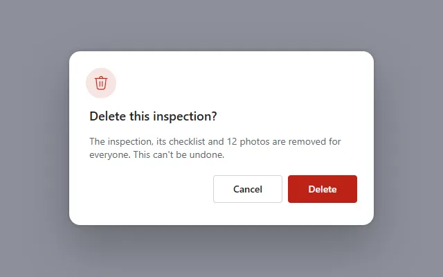
A modal with dimmed backdrop, icon, title, message and Cancel and destructive Delete buttons, opened and closed with one context variable.
- Version
- 2.0.0
- Updated
- Verified in Studio
- Not yet
- Author
- Ynias Bensch
- Tags
Overview
A modal confirmation for actions that are hard to undo. A dimmed backdrop covers the screen and blocks clicks on what is behind it, with a white panel on top: an icon tile, a title, a message that grows to fit, and Cancel and Delete buttons. The whole dialog shows and hides with the context variable locConfirmDialogOpen.
The panel is at most 440 pixels wide, centres itself, and is as tall as its content, so it works on phones and wide screens alike.
When to use
- Before deleting, submitting or sending something that can't easily be taken back.
- When the action needs one more sentence of explanation before people commit.
When not to use
- Routine actions that are easy to undo: confirm with a notification afterwards instead.
- Asking for input; a dialog with fields is a form, and deserves its own screen or panel.
Before you paste
- Something on the same screen that opens the dialog, for example a button with
OnSelect: UpdateContext({locConfirmDialogOpen: true}). Until then the dialog stays hidden. - Paste it directly on the screen, last, so it covers everything else. Inside a container it only covers that container.
Controls used
| Control | Version |
|---|---|
| GroupContainer | 1.5.0 |
| ModernIcon | 1.1.1 |
| ModernText | 1.0.0 |
| ModernButton | 1.0.0 |
YAML
Works as is, with example data inline. Paste it into a screen or container; the steps are underHow to paste.
Not yet verified in Power Apps Studio. The control versions are drafted from documentation. If Studio flags one, see How to paste for the fix.
- ConfirmDialogRoot:
    Control: GroupContainer@1.5.0
    Variant: ManualLayout
    Properties:
      DropShadow: =DropShadow.None
      Fill: =RGBA(15, 23, 42, 0.45)
      Height: =Parent.Height
      RadiusBottomLeft: =0
      RadiusBottomRight: =0
      RadiusTopLeft: =0
      RadiusTopRight: =0
      Visible: =locConfirmDialogOpen
      Width: =Parent.Width
    Children:
      - ConfirmDialogPanel:
          Control: GroupContainer@1.5.0
          Variant: AutoLayout
          Properties:
            DropShadow: =DropShadow.ExtraBold
            Fill: =Color.White
            Height: =ConfirmDialogIcon.Height + ConfirmDialogTitle.Height + ConfirmDialogMessage.Height + ConfirmDialogActions.Height + 3 * 12 + 8 + 48
            LayoutDirection: =LayoutDirection.Vertical
            LayoutGap: =12
            PaddingBottom: =24
            PaddingLeft: =24
            PaddingRight: =24
            PaddingTop: =24
            RadiusBottomLeft: =16
            RadiusBottomRight: =16
            RadiusTopLeft: =16
            RadiusTopRight: =16
            Width: =Min(440, Parent.Width - 32)
            X: =(Parent.Width - Self.Width) / 2
            Y: =(Parent.Height - Self.Height) / 2
          Children:
            - ConfirmDialogIcon:
                Control: ModernIcon@1.1.1
                Properties:
                  AccessibleLabel: ="Warning"
                  Fill: =ColorFade(ConfirmDialogConfirm.BasePaletteColor, 88%)
                  Height: =44
                  Icon: ="Delete"
                  IconColor: =ConfirmDialogConfirm.BasePaletteColor
                  LayoutMinHeight: =44
                  LayoutMinWidth: =44
                  PaddingBottom: =10
                  PaddingLeft: =10
                  PaddingRight: =10
                  PaddingTop: =10
                  RadiusBottomLeft: =22
                  RadiusBottomRight: =22
                  RadiusTopLeft: =22
                  RadiusTopRight: =22
                  Width: =44
            - ConfirmDialogTitle:
                Control: ModernText@1.0.0
                Properties:
                  AccessibleLabel: =Self.Text
                  AlignInContainer: =AlignInContainer.Stretch
                  FontWeight: =FontWeight.Semibold
                  Height: =28
                  LayoutMinHeight: =0
                  LayoutMinWidth: =80
                  PaddingBottom: =0
                  PaddingTop: =0
                  Size: =18
                  Text: ="Delete this inspection?"
            - ConfirmDialogMessage:
                Control: ModernText@1.0.0
                Properties:
                  AccessibleLabel: =Self.Text
                  AlignInContainer: =AlignInContainer.Stretch
                  AutoHeight: =true
                  Color: =ColorFade(App.Theme.Colors.Darker70, 35%)
                  FillPortions: =0
                  Height: =48
                  LayoutMinHeight: =0
                  LayoutMinWidth: =80
                  PaddingBottom: =0
                  PaddingTop: =0
                  Size: =14
                  Text: ="The inspection, its checklist and 12 photos are removed for everyone. This can't be undone."
            - ConfirmDialogActions:
                Control: GroupContainer@1.5.0
                Variant: AutoLayout
                Properties:
                  AlignInContainer: =AlignInContainer.Stretch
                  DropShadow: =DropShadow.None
                  FillPortions: =0
                  Height: =48
                  LayoutAlignItems: =LayoutAlignItems.End
                  LayoutDirection: =LayoutDirection.Horizontal
                  LayoutGap: =8
                  LayoutJustifyContent: =LayoutJustifyContent.End
                  LayoutMinHeight: =48
                  LayoutMinWidth: =80
                Children:
                  - ConfirmDialogCancel:
                      Control: ModernButton@1.0.0
                      Properties:
                        AccessibleLabel: =Self.Text
                        Appearance: =ButtonAppearance.Secondary
                        Height: =40
                        LayoutMinHeight: =40
                        LayoutMinWidth: =96
                        OnSelect: |
                          =UpdateContext({locConfirmDialogOpen: false})
                        Size: =14
                        Text: ="Cancel"
                        Width: =100
                  - ConfirmDialogConfirm:
                      Control: ModernButton@1.0.0
                      Properties:
                        AccessibleLabel: =Self.Text
                        Appearance: =ButtonAppearance.Primary
                        BasePaletteColor: =RGBA(196, 43, 28, 1)
                        Height: =40
                        LayoutMinHeight: =40
                        LayoutMinWidth: =96
                        OnSelect: |
                          =Notify("Deleted (example only).", NotificationType.Success);
                          UpdateContext({locConfirmDialogOpen: false})
                        Size: =14
                        Text: ="Delete"
                        Width: =100
Make it yours
The example runs on sample data. Replace these properties to connect it to your app.
Text on ConfirmDialogTitle
A question that names the action.
In the YAML
Text: ="Delete this inspection?"Your version
Text: ="Submit this inspection?"Text on ConfirmDialogMessage
What happens if people confirm, and whether it can be undone. The text grows to fit.
In the YAML
Text: ="The inspection, its checklist and 12 photos are removed for everyone. This can't be undone."Your version
Text: ="The report is sent to the site manager and can no longer be edited."OnSelect on ConfirmDialogConfirm
The real action, followed by closing the dialog. Change the button's Text to the verb of the action.
In the YAML
OnSelect: |
  =Notify("Deleted (example only).", NotificationType.Success);
  UpdateContext({locConfirmDialogOpen: false})
Your version
OnSelect: |
  =Remove(Inspections, InspectionsGallery.Selected);
  UpdateContext({locConfirmDialogOpen: false})
BasePaletteColor on ConfirmDialogConfirm
The colour of the confirm button, red for destructive actions. The icon tile above the title takes this colour too. Use your brand blue for actions that are not destructive.
In the YAML
BasePaletteColor: =RGBA(196, 43, 28, 1)Your version
BasePaletteColor: =RGBA(15, 108, 189, 1)Fill on ConfirmDialogRoot
The dimmed backdrop. It is hard-coded because the theme has no transparent colour; darken or lighten it to suit your theme.
In the YAML
Fill: =RGBA(15, 23, 42, 0.45)Your version
Fill: =RGBA(0, 0, 0, 0.35)How to paste
- Open your app in Power Apps Studio.
- Check that modern controls are on: Settings → Updates → Modern controls and themes. In newer environments they are on by default.
- Copy the YAML with the Copy button above the code.
- In the Tree view, select the screen or container that should hold the component and press Ctrl+V. The whole component arrives as one container,
ConfirmDialogRoot, with all its controls inside. - Work through Make it yours to swap the example data for your own.
Where your version of Studio has a code view for a control or screen, you can paste the same YAML there instead of into the tree view.
When Studio flags a control version
Each control in the YAML names its version, like Control: ModernButton@1.0.0. If that version is newer than what your environment knows, Studio falls back to the version it has or flags the control. All controls of one type in an app must also use the same version, so an app that already has an older ModernButton can reject the paste. To fix it, insert the same control from the Insert pane, copy it as code, note the version on its Control: line, update every matching line in the YAML and paste again.
Missing a component, or did this one not paste cleanly? Suggest a component or report an issue.