Toast with undo
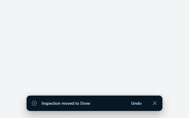
A dark notification at the bottom of the screen with a check icon, message, Undo button and close button, hiding itself after five seconds.
- Version
- 1.0.0
- Updated
- Verified in Studio
- Not yet
- Author
- Ynias Bensch
- Tags
Overview
A toast confirms what just happened and offers a way back, without blocking the screen. It floats at the bottom centre: a dark rounded bar with a check icon, the message, an Undo button and a close button. A hidden timer hides it again after five seconds, and starts over each time the toast appears.
Show it by setting locToastVisible to true; Undo, the close button and the timer set it back to false. The toast is at most 460 pixels wide and keeps 16 pixels from the screen edges on a phone.
When to use
- After an action that is easy to reverse, such as moving, archiving or deleting a record, instead of asking for confirmation first.
- Short confirmations of one line.
When not to use
- Errors people must act on: use an alert banner that stays until it is dismissed.
- Actions that can't be undone: use a confirm dialog before the action.
Before you paste
- Something that shows the toast after an action, for example
UpdateContext({locToastMessage: "Inspection deleted", locToastVisible: true})at the end of a button'sOnSelect. Until then it stays hidden. - Paste it directly on the screen, last, so it floats above everything else.
Controls used
| Control | Version |
|---|---|
| GroupContainer | 1.5.0 |
| ModernIcon | 1.1.1 |
| ModernText | 1.0.0 |
| ModernButton | 1.0.0 |
| Timer | 2.1.0 |
YAML
Works as is, with example data inline. Paste it into a screen or container; the steps are underHow to paste.
Not yet verified in Power Apps Studio. The control versions are drafted from documentation. If Studio flags one, see How to paste for the fix.
- ToastRoot:
    Control: GroupContainer@1.5.0
    Variant: AutoLayout
    Properties:
      DropShadow: =DropShadow.Bold
      Fill: =App.Theme.Colors.Darker70
      Height: =52
      LayoutAlignItems: =LayoutAlignItems.Center
      LayoutDirection: =LayoutDirection.Horizontal
      LayoutGap: =10
      PaddingBottom: =8
      PaddingLeft: =16
      PaddingRight: =8
      PaddingTop: =8
      RadiusBottomLeft: =12
      RadiusBottomRight: =12
      RadiusTopLeft: =12
      RadiusTopRight: =12
      Visible: =locToastVisible
      Width: =Min(460, Parent.Width - 32)
      X: =(Parent.Width - Self.Width) / 2
      Y: =Parent.Height - Self.Height - 24
    Children:
      - ToastIcon:
          Control: ModernIcon@1.1.1
          Properties:
            AccessibleLabel: ="Success"
            Height: =20
            Icon: ="CheckmarkCircle"
            IconColor: =App.Theme.Colors.Lighter60
            LayoutMinHeight: =20
            LayoutMinWidth: =20
            Width: =20
      - ToastMessage:
          Control: ModernText@1.0.0
          Properties:
            AccessibleLabel: =Self.Text
            Color: =Color.White
            FillPortions: =1
            Height: =30
            LayoutMinHeight: =0
            LayoutMinWidth: =80
            Size: =14
            Text: ="Inspection moved to Done"
            Wrap: =false
      - ToastUndo:
          Control: ModernButton@1.0.0
          Properties:
            AccessibleLabel: ="Undo"
            Appearance: =ButtonAppearance.Transparent
            Color: =App.Theme.Colors.Lighter60
            FontWeight: =FontWeight.Semibold
            Height: =36
            LayoutMinHeight: =36
            LayoutMinWidth: =64
            OnSelect: |
              =Notify("Undone (example only).", NotificationType.Information);
              UpdateContext({locToastVisible: false})
            Size: =14
            Text: ="Undo"
            Width: =68
      - ToastClose:
          Control: ModernButton@1.0.0
          Properties:
            AccessibleLabel: ="Dismiss"
            Appearance: =ButtonAppearance.Transparent
            Color: =ColorFade(Color.White, 30%)
            Height: =36
            Icon: ="Dismiss"
            Layout: =ButtonLayout.IconOnly
            LayoutMinHeight: =36
            LayoutMinWidth: =36
            OnSelect: |
              =UpdateContext({locToastVisible: false})
            Size: =14
            Tooltip: ="Dismiss"
            Width: =36
      - ToastTimer:
          Control: Timer@2.1.0
          Properties:
            AutoStart: =false
            Duration: =5000
            OnTimerEnd: |
              =UpdateContext({locToastVisible: false})
            Reset: =Not(locToastVisible)
            Start: =locToastVisible
            Visible: =false
Make it yours
The example runs on sample data. Replace these properties to connect it to your app.
Text on ToastMessage
Show the message that the action set, so one toast serves every action on the screen.
In the YAML
Text: ="Inspection moved to Done"Your version
Text: =locToastMessageOnSelect on ToastUndo
Undo the last action, then hide the toast.
In the YAML
OnSelect: |
  =Notify("Undone (example only).", NotificationType.Information);
  UpdateContext({locToastVisible: false})
Your version
OnSelect: |
  =Patch(Inspections, varLastInspection, {Status: varLastStatus});
  UpdateContext({locToastVisible: false})
Duration on ToastTimer
How long the toast stays, in milliseconds. Give people at least five seconds to reach Undo.
In the YAML
Duration: =5000Your version
Duration: =8000How to paste
- Open your app in Power Apps Studio.
- Check that modern controls are on: Settings → Updates → Modern controls and themes. In newer environments they are on by default.
- Copy the YAML with the Copy button above the code.
- In the Tree view, select the screen or container that should hold the component and press Ctrl+V. The whole component arrives as one container,
ToastRoot, with all its controls inside. - Work through Make it yours to swap the example data for your own.
Where your version of Studio has a code view for a control or screen, you can paste the same YAML there instead of into the tree view.
When Studio flags a control version
Each control in the YAML names its version, like Control: ModernButton@1.0.0. If that version is newer than what your environment knows, Studio falls back to the version it has or flags the control. All controls of one type in an app must also use the same version, so an app that already has an older ModernButton can reject the paste. To fix it, insert the same control from the Insert pane, copy it as code, note the version on its Control: line, update every matching line in the YAML and paste again.
Missing a component, or did this one not paste cleanly? Suggest a component or report an issue.