Progress ring
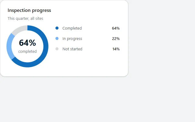
A donut chart with the main percentage in the middle and a legend, drawn as SVG in Power Fx from one table in the theme colours.
- Version
- 1.0.0
- Updated
- Verified in Studio
- Not yet
- Author
- Ynias Bensch
- Tags
Overview
A donut chart for "how far are we" questions: segments in theme colours, the share of the first segment in the middle, and a legend with values. There is no chart control involved; the ring is an SVG that Power Fx writes from the legend gallery's rows and shows in an Image control.
Values can be counts or percentages; the ring works out the shares itself. Colours come from the theme through JSON(), so changing the app theme recolours the chart.
When to use
- Progress of one thing split into two to four states.
- Dashboards next to KPI tiles, where one chart sums up a status.
When not to use
- More than four or five segments: the slices get too thin to read. Use a bar chart or a table.
- Trends over time: use the sparkline in the KPI tile.
Controls used
| Control | Version |
|---|---|
| GroupContainer | 1.5.0 |
| ModernText | 1.0.0 |
| Image | 2.2.3 |
| Gallery | 2.15.0 |
YAML
Works as is, with example data inline. Paste it into a screen or container; the steps are underHow to paste.
Not yet verified in Power Apps Studio. The control versions are drafted from documentation. If Studio flags one, see How to paste for the fix.
- ProgressRingRoot:
    Control: GroupContainer@1.5.0
    Variant: AutoLayout
    Properties:
      BorderColor: =ColorFade(App.Theme.Colors.Darker70, 88%)
      BorderThickness: =1
      DropShadow: =DropShadow.Light
      Fill: =Color.White
      Height: =ProgressRingTitle.Height + ProgressRingSubtitle.Height + ProgressRingBody.Height + 2 * 4 + 40
      LayoutDirection: =LayoutDirection.Vertical
      LayoutGap: =4
      PaddingBottom: =20
      PaddingLeft: =20
      PaddingRight: =20
      PaddingTop: =20
      RadiusBottomLeft: =16
      RadiusBottomRight: =16
      RadiusTopLeft: =16
      RadiusTopRight: =16
      Width: =Min(420, Parent.Width)
    Children:
      - ProgressRingTitle:
          Control: ModernText@1.0.0
          Properties:
            AccessibleLabel: =Self.Text
            AlignInContainer: =AlignInContainer.Stretch
            FontWeight: =FontWeight.Semibold
            Height: =26
            LayoutMinHeight: =0
            LayoutMinWidth: =80
            PaddingBottom: =0
            PaddingTop: =0
            Size: =16
            Text: ="Inspection progress"
            Wrap: =false
      - ProgressRingSubtitle:
          Control: ModernText@1.0.0
          Properties:
            AccessibleLabel: =Self.Text
            AlignInContainer: =AlignInContainer.Stretch
            Color: =ColorFade(App.Theme.Colors.Darker70, 45%)
            Height: =20
            LayoutMinHeight: =0
            LayoutMinWidth: =80
            PaddingBottom: =0
            PaddingTop: =0
            Size: =13
            Text: ="This quarter, all sites"
            Wrap: =false
      - ProgressRingBody:
          Control: GroupContainer@1.5.0
          Variant: AutoLayout
          Properties:
            AlignInContainer: =AlignInContainer.Stretch
            DropShadow: =DropShadow.None
            FillPortions: =0
            Height: =156
            LayoutAlignItems: =LayoutAlignItems.Center
            LayoutDirection: =LayoutDirection.Horizontal
            LayoutGap: =20
            LayoutMinHeight: =156
            LayoutMinWidth: =200
          Children:
            - ProgressRingChart:
                Control: Image@2.2.3
                Properties:
                  AccessibleLabel: |
                    =Concat(ProgressRingLegend.AllItems, Label & " " & Value, ", ")
                  Height: =140
                  Image: |
                    =With(
                        {
                            rows: ProgressRingLegend.AllItems,
                            circumference: 2 * Pi() * 52,
                            ink: Mid(JSON(App.Theme.Colors.Darker70), 2, 7),
                            muted: Mid(JSON(ColorFade(App.Theme.Colors.Darker70, 45%)), 2, 7)
                        },
                        With(
                            {total: Max(Sum(rows, Value), 1)},
                            "data:image/svg+xml;utf8," & EncodeUrl(
                                "<svg xmlns='http://www.w3.org/2000/svg' viewBox='0 0 120 120'>" &
                                "<g transform='rotate(-90 60 60)' fill='none' stroke-width='14'>" &
                                Concat(
                                    Sequence(CountRows(rows)),
                                    With(
                                        {
                                            row: Index(rows, Value),
                                            before: Sum(FirstN(rows, Value - 1), Value)
                                        },
                                        "<circle cx='60' cy='60' r='52' stroke='" & Mid(JSON(row.Color), 2, 7) &
                                        "' stroke-dasharray='" & Round(row.Value / total * circumference, 0) & " " & Round(circumference, 0) &
                                        "' stroke-dashoffset='" & Round(-Coalesce(before, 0) / total * circumference, 0) & "'/>"
                                    )
                                ) &
                                "</g>" &
                                "<text x='60' y='58' text-anchor='middle' font-family='Segoe UI, sans-serif' font-size='24' font-weight='700' fill='" & ink & "'>" &
                                Round(First(rows).Value / total * 100, 0) & "%</text>" &
                                "<text x='60' y='78' text-anchor='middle' font-family='Segoe UI, sans-serif' font-size='11' fill='" & muted & "'>" &
                                Lower(First(rows).Label) & "</text>" &
                                "</svg>"
                            )
                        )
                    )
                  LayoutMinHeight: =140
                  LayoutMinWidth: =140
                  TabIndex: =0
                  Width: =140
            - ProgressRingLegend:
                Control: Gallery@2.15.0
                Variant: Vertical
                Properties:
                  AccessibleLabel: ="Progress by status"
                  BorderThickness: =0
                  FillPortions: =1
                  Height: =Self.AllItemsCount * (Self.TemplateHeight + Self.TemplatePadding) + Self.TemplatePadding
                  Items: |
                    =Table(
                        {Label: "Completed", Value: 64, Color: App.Theme.Colors.Primary},
                        {Label: "In progress", Value: 22, Color: App.Theme.Colors.Lighter40},
                        {Label: "Not started", Value: 14, Color: ColorFade(App.Theme.Colors.Darker70, 85%)}
                    )
                  LayoutMinHeight: =0
                  LayoutMinWidth: =120
                  ShowScrollbar: =false
                  TabIndex: =0
                  TemplatePadding: =2
                  TemplateSize: =32
                Children:
                  - ProgressRingLegendRow:
                      Control: GroupContainer@1.5.0
                      Variant: AutoLayout
                      Properties:
                        DropShadow: =DropShadow.None
                        Height: =Parent.TemplateHeight
                        LayoutAlignItems: =LayoutAlignItems.Center
                        LayoutDirection: =LayoutDirection.Horizontal
                        LayoutGap: =8
                        Width: =Parent.TemplateWidth
                        X: =0
                        Y: =0
                      Children:
                        - ProgressRingLegendDot:
                            Control: GroupContainer@1.5.0
                            Variant: ManualLayout
                            Properties:
                              AlignInContainer: =AlignInContainer.Center
                              DropShadow: =DropShadow.None
                              Fill: =ThisItem.Color
                              FillPortions: =0
                              Height: =10
                              LayoutMinHeight: =10
                              LayoutMinWidth: =10
                              RadiusBottomLeft: =5
                              RadiusBottomRight: =5
                              RadiusTopLeft: =5
                              RadiusTopRight: =5
                              Width: =10
                        - ProgressRingLegendLabel:
                            Control: ModernText@1.0.0
                            Properties:
                              AccessibleLabel: =Self.Text
                              Color: =ColorFade(App.Theme.Colors.Darker70, 35%)
                              FillPortions: =1
                              Height: =30
                              LayoutMinHeight: =0
                              LayoutMinWidth: =60
                              Size: =13
                              Text: =ThisItem.Label
                              Wrap: =false
                        - ProgressRingLegendValue:
                            Control: ModernText@1.0.0
                            Properties:
                              AccessibleLabel: =Self.Text
                              Align: =Align.Right
                              FontWeight: =FontWeight.Semibold
                              Height: =30
                              LayoutMinHeight: =0
                              LayoutMinWidth: =40
                              Size: =13
                              Text: =ThisItem.Value & "%"
                              Width: =48
                              Wrap: =false
Make it yours
The example runs on sample data. Replace these properties to connect it to your app.
Items on ProgressRingLegend
The segments, in order. The ring, the percentage in the middle and the legend all read this one table; the first row is the one shown in the middle.
In the YAML
Items: |
  =Table(
      {Label: "Completed", Value: 64, Color: App.Theme.Colors.Primary},
      {Label: "In progress", Value: 22, Color: App.Theme.Colors.Lighter40},
      {Label: "Not started", Value: 14, Color: ColorFade(App.Theme.Colors.Darker70, 85%)}
  )
Your version
Items: |
  =Table(
      {Label: "Completed", Value: CountRows(Filter(Inspections, Status = "Completed")), Color: App.Theme.Colors.Primary},
      {Label: "In progress", Value: CountRows(Filter(Inspections, Status = "In progress")), Color: App.Theme.Colors.Lighter40},
      {Label: "Not started", Value: CountRows(Filter(Inspections, Status = "Not started")), Color: ColorFade(App.Theme.Colors.Darker70, 85%)}
  )
Text on ProgressRingTitle
What the ring shows. ProgressRingSubtitle underneath sets the scope.
In the YAML
Text: ="Inspection progress"Your version
Text: ="Audit progress"How to paste
- Open your app in Power Apps Studio.
- Check that modern controls are on: Settings → Updates → Modern controls and themes. In newer environments they are on by default.
- Copy the YAML with the Copy button above the code.
- In the Tree view, select the screen or container that should hold the component and press Ctrl+V. The whole component arrives as one container,
ProgressRingRoot, with all its controls inside. - Work through Make it yours to swap the example data for your own.
Where your version of Studio has a code view for a control or screen, you can paste the same YAML there instead of into the tree view.
When Studio flags a control version
Each control in the YAML names its version, like Control: ModernButton@1.0.0. If that version is newer than what your environment knows, Studio falls back to the version it has or flags the control. All controls of one type in an app must also use the same version, so an app that already has an older ModernButton can reject the paste. To fix it, insert the same control from the Insert pane, copy it as code, note the version on its Control: line, update every matching line in the YAML and paste again.
Missing a component, or did this one not paste cleanly? Suggest a component or report an issue.