Mobile bottom nav
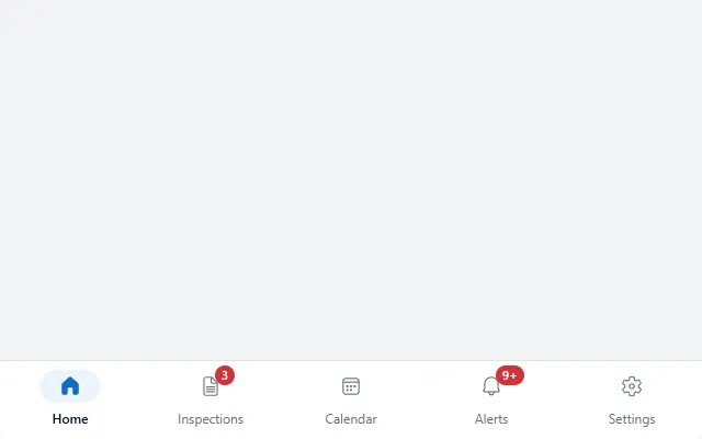
A phone tab bar pinned to the bottom of the screen with icons, labels, a pill behind the active icon and red count badges.
- Version
- 1.0.0
- Updated
- Verified in Studio
- Not yet
- Author
- Ynias Bensch
- Tags
Overview
A bottom navigation bar in the style of Material 3 and iOS for phone apps: a white bar along the bottom of the screen with an icon and a label per destination. The active destination gets a filled icon on a pill in a tint of the theme colour and a bold label. A red badge on the icon counts new items, showing 9+ above nine.
The bar is 72 pixels high, as wide as the screen, and places itself at the bottom with its Y formula. The destinations share the width evenly, and the whole area of each one is a button, so it is easy to hit with a thumb.
When to use
- Phone apps with three to five main sections that people switch between often.
- Apps used one-handed, on the move.
When not to use
- Tablet and desktop layouts: use side navigation.
- More than five sections: group them, or use side navigation with a menu button.
Before you paste
- Paste it directly on the screen, last, so it stays on top of the content and pins itself to the bottom.
Controls used
| Control | Version |
|---|---|
| GroupContainer | 1.5.0 |
| Gallery | 2.15.0 |
| ModernIcon | 1.1.1 |
| ModernText | 1.0.0 |
| ModernBadge | 1.0.0 |
| ModernButton | 1.0.0 |
YAML
Works as is, with example data inline. Paste it into a screen or container; the steps are underHow to paste.
Not yet verified in Power Apps Studio. The control versions are drafted from documentation. If Studio flags one, see How to paste for the fix.
- BottomNavRoot:
    Control: GroupContainer@1.5.0
    Variant: ManualLayout
    Properties:
      DropShadow: =DropShadow.None
      Fill: =Color.White
      Height: =72
      RadiusBottomLeft: =0
      RadiusBottomRight: =0
      RadiusTopLeft: =0
      RadiusTopRight: =0
      Width: =Parent.Width
      X: =0
      Y: =Parent.Height - Self.Height
    Children:
      - BottomNavDivider:
          Control: GroupContainer@1.5.0
          Variant: ManualLayout
          Properties:
            DropShadow: =DropShadow.None
            Fill: =ColorFade(App.Theme.Colors.Darker70, 88%)
            Height: =1
            Width: =Parent.Width
            X: =0
            Y: =0
      - BottomNavGallery:
          Control: Gallery@2.15.0
          Variant: Horizontal
          Properties:
            AccessibleLabel: ="Main navigation"
            BorderThickness: =0
            Height: =Parent.Height - 1
            Items: |
              =Table(
                  {Label: "Home", Icon: "Home", Count: 0},
                  {Label: "Inspections", Icon: "DocumentText", Count: 3},
                  {Label: "Calendar", Icon: "Calendar", Count: 0},
                  {Label: "Alerts", Icon: "Alert", Count: 12},
                  {Label: "Settings", Icon: "Settings", Count: 0}
              )
            ShowScrollbar: =false
            TabIndex: =0
            TemplatePadding: =0
            TemplateSize: =Self.Width / Max(1, Self.AllItemsCount)
            Width: =Parent.Width
            X: =0
            Y: =1
          Children:
            - BottomNavIndicator:
                Control: GroupContainer@1.5.0
                Variant: ManualLayout
                Properties:
                  DropShadow: =DropShadow.None
                  Fill: =If(ThisItem.Label = Coalesce(locBottomNavSelected, "Home"), App.Theme.Colors.Lighter80, Color.Transparent)
                  Height: =30
                  RadiusBottomLeft: =15
                  RadiusBottomRight: =15
                  RadiusTopLeft: =15
                  RadiusTopRight: =15
                  Width: =56
                  X: =(Parent.TemplateWidth - Self.Width) / 2
                  Y: =8
            - BottomNavIcon:
                Control: ModernIcon@1.1.1
                Properties:
                  AccessibleLabel: =ThisItem.Label
                  Height: =22
                  Icon: =ThisItem.Icon
                  IconColor: =If(ThisItem.Label = Coalesce(locBottomNavSelected, "Home"), App.Theme.Colors.Primary, ColorFade(App.Theme.Colors.Darker70, 40%))
                  IconStyle: =If(ThisItem.Label = Coalesce(locBottomNavSelected, "Home"), IconStyle.Filled, IconStyle.Outline)
                  Width: =22
                  X: =(Parent.TemplateWidth - Self.Width) / 2
                  Y: =12
            - BottomNavLabel:
                Control: ModernText@1.0.0
                Properties:
                  AccessibleLabel: =Self.Text
                  Align: =Align.Center
                  Color: =If(ThisItem.Label = Coalesce(locBottomNavSelected, "Home"), App.Theme.Colors.Darker70, ColorFade(App.Theme.Colors.Darker70, 40%))
                  FontWeight: =If(ThisItem.Label = Coalesce(locBottomNavSelected, "Home"), FontWeight.Semibold, FontWeight.Normal)
                  Height: =20
                  PaddingBottom: =0
                  PaddingLeft: =0
                  PaddingRight: =0
                  PaddingTop: =0
                  Size: =12
                  Text: =ThisItem.Label
                  Width: =Parent.TemplateWidth
                  Wrap: =false
                  X: =0
                  Y: =42
            - BottomNavBadge:
                Control: ModernBadge@1.0.0
                Properties:
                  AccessibleLabel: =ThisItem.Count & " new"
                  Appearance: =BadgeAppearance.Filled
                  Content: =If(ThisItem.Count > 9, "9+", Text(ThisItem.Count))
                  Height: =18
                  Intent: =BadgeIntent.Critical
                  Size: =11
                  Visible: =ThisItem.Count > 0
                  Width: =If(ThisItem.Count > 9, 26, 18)
                  X: =Parent.TemplateWidth / 2 + 4
                  Y: =4
            - BottomNavSelect:
                Control: ModernButton@1.0.0
                Properties:
                  AccessibleLabel: =ThisItem.Label & If(ThisItem.Count > 0, ", " & ThisItem.Count & " new", "") & If(ThisItem.Label = Coalesce(locBottomNavSelected, "Home"), ", current page", "")
                  Appearance: =ButtonAppearance.Transparent
                  Height: =Parent.TemplateHeight
                  OnSelect: |
                    =UpdateContext({locBottomNavSelected: ThisItem.Label})
                  Text: =""
                  Width: =Parent.TemplateWidth
                  X: =0
                  Y: =0
Make it yours
The example runs on sample data. Replace these properties to connect it to your app.
Items on BottomNavGallery
Three to five destinations, each with a Label, a Fluent Icon name and a Count for the badge (0 hides it).
In the YAML
Items: |
  =Table(
      {Label: "Home", Icon: "Home", Count: 0},
      {Label: "Inspections", Icon: "DocumentText", Count: 3},
      {Label: "Calendar", Icon: "Calendar", Count: 0},
      {Label: "Alerts", Icon: "Alert", Count: 12},
      {Label: "Settings", Icon: "Settings", Count: 0}
  )
Your version
Items: |
  =Table(
      {Label: "Home", Icon: "Home", Count: 0},
      {Label: "Tasks", Icon: "DocumentText", Count: CountRows(Filter(Tasks, Owner = User().Email, Status = "Open"))},
      {Label: "Settings", Icon: "Settings", Count: 0}
  )
OnSelect on BottomNavSelect
Go to the destination. Each screen has its own copy of the bar, so also set locBottomNavSelected in each screen's OnVisible to the label of that screen.
In the YAML
OnSelect: |
  =UpdateContext({locBottomNavSelected: ThisItem.Label})
Your version
OnSelect: |
  =UpdateContext({locBottomNavSelected: ThisItem.Label});
  Switch(
      ThisItem.Label,
      "Home", Navigate(HomeScreen, ScreenTransition.None),
      "Tasks", Navigate(TasksScreen, ScreenTransition.None),
      Navigate(SettingsScreen, ScreenTransition.None)
  )
How to paste
- Open your app in Power Apps Studio.
- Check that modern controls are on: Settings → Updates → Modern controls and themes. In newer environments they are on by default.
- Copy the YAML with the Copy button above the code.
- In the Tree view, select the screen or container that should hold the component and press Ctrl+V. The whole component arrives as one container,
BottomNavRoot, with all its controls inside. - Work through Make it yours to swap the example data for your own.
Where your version of Studio has a code view for a control or screen, you can paste the same YAML there instead of into the tree view.
When Studio flags a control version
Each control in the YAML names its version, like Control: ModernButton@1.0.0. If that version is newer than what your environment knows, Studio falls back to the version it has or flags the control. All controls of one type in an app must also use the same version, so an app that already has an older ModernButton can reject the paste. To fix it, insert the same control from the Insert pane, copy it as code, note the version on its Control: line, update every matching line in the YAML and paste again.
Missing a component, or did this one not paste cleanly? Suggest a component or report an issue.