Pagination
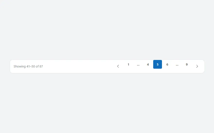
A page bar with "Showing 41–50 of 87", previous and next buttons and numbered pages that collapse into ellipses around the current page.
- Version
- 1.0.0
- Updated
- Verified in Studio
- Not yet
- Author
- Ynias Bensch
- Tags
Overview
Pagination splits a long list into pages. The bar shows which rows are on screen ("Showing 41–50 of 87"), previous and next buttons, and the page numbers. With more than seven pages it keeps the first and last page and the pages around the current one, and puts an ellipsis in the gaps, so the bar never grows wider than nine buttons.
The current page is in locPaginationPage and starts at 1. The page size and total are set once, in the Items of the page buttons; the summary and the next button read them from there.
When to use
- Long lists and tables where people jump to a part of the results, or come back to the same page.
- Lists with a known total.
When not to use
- Feeds people scroll through from the top: load more rows as they go instead.
- Short lists that fit on one or two screens.
Before you paste
- A gallery that shows the current page, for example with
Items: =With({p: Coalesce(locPaginationPage, 1), size: 10}, LastN(FirstN(Inspections, p * size), Min(size, CountRows(Inspections) - (p - 1) * size))).FirstNandLastNaren't delegable, so this works on up to 2,000 rows.
Controls used
| Control | Version |
|---|---|
| GroupContainer | 1.5.0 |
| ModernText | 1.0.0 |
| ModernButton | 1.0.0 |
| Gallery | 2.15.0 |
YAML
Works as is, with example data inline. Paste it into a screen or container; the steps are underHow to paste.
Not yet verified in Power Apps Studio. The control versions are drafted from documentation. If Studio flags one, see How to paste for the fix.
- PaginationRoot:
    Control: GroupContainer@1.5.0
    Variant: AutoLayout
    Properties:
      BorderColor: =ColorFade(App.Theme.Colors.Darker70, 88%)
      BorderThickness: =1
      DropShadow: =DropShadow.None
      Fill: =Color.White
      Height: =56
      LayoutAlignItems: =LayoutAlignItems.Center
      LayoutDirection: =LayoutDirection.Horizontal
      LayoutGap: =4
      PaddingLeft: =16
      PaddingRight: =12
      RadiusBottomLeft: =12
      RadiusBottomRight: =12
      RadiusTopLeft: =12
      RadiusTopRight: =12
      Width: =Parent.Width
    Children:
      - PaginationSummary:
          Control: ModernText@1.0.0
          Properties:
            AccessibleLabel: =Self.Text
            Color: =ColorFade(App.Theme.Colors.Darker70, 45%)
            FillPortions: =1
            Height: =30
            LayoutMinHeight: =0
            LayoutMinWidth: =120
            PaddingLeft: =0
            Size: =13
            Text: |
              =With(
                  {r: First(PaginationPages.AllItems), p: Coalesce(locPaginationPage, 1)},
                  "Showing " & ((p - 1) * r.Size + 1) & "–" & Min(p * r.Size, r.Total) & " of " & r.Total
              )
            Wrap: =false
      - PaginationPrevious:
          Control: ModernButton@1.0.0
          Properties:
            AccessibleLabel: ="Previous page"
            Appearance: =ButtonAppearance.Subtle
            DisplayMode: =If(Coalesce(locPaginationPage, 1) = 1, DisplayMode.Disabled, DisplayMode.Edit)
            Height: =36
            Icon: ="ChevronRight"
            IconRotation: =180
            Layout: =ButtonLayout.IconOnly
            LayoutMinHeight: =36
            LayoutMinWidth: =36
            OnSelect: |
              =UpdateContext({locPaginationPage: Max(1, Coalesce(locPaginationPage, 1) - 1)})
            Size: =14
            Tooltip: ="Previous page"
            Width: =36
      - PaginationPages:
          Control: Gallery@2.15.0
          Variant: Horizontal
          Properties:
            AccessibleLabel: ="Pages"
            BorderThickness: =0
            FillPortions: =0
            Height: =40
            Items: |
              =With(
                  {total: 87, size: 10, p: Coalesce(locPaginationPage, 1)},
                  With(
                      {n: Max(1, RoundUp(total / size, 0))},
                      ForAll(
                          If(
                              n <= 7, ForAll(Sequence(n) As i, {Page: i.Value}),
                              p <= 4, Table({Page: 1}, {Page: 2}, {Page: 3}, {Page: 4}, {Page: 5}, {Page: 0}, {Page: n}),
                              p >= n - 3, Table({Page: 1}, {Page: 0}, {Page: n - 4}, {Page: n - 3}, {Page: n - 2}, {Page: n - 1}, {Page: n}),
                              Table({Page: 1}, {Page: 0}, {Page: p - 1}, {Page: p}, {Page: p + 1}, {Page: 0}, {Page: n})
                          ) As slot,
                          {Page: slot.Page, Pages: n, Size: size, Total: total}
                      )
                  )
              )
            LayoutMinHeight: =40
            LayoutMinWidth: =40
            ShowScrollbar: =false
            TabIndex: =0
            TemplatePadding: =0
            TemplateSize: =40
            Width: =Self.AllItemsCount * 40
          Children:
            - PaginationPage:
                Control: ModernButton@1.0.0
                Properties:
                  AccessibleLabel: |
                    =If(ThisItem.Page = 0, "More pages", "Page " & ThisItem.Page & If(ThisItem.Page = Coalesce(locPaginationPage, 1), ", current", ""))
                  Appearance: =If(ThisItem.Page = Coalesce(locPaginationPage, 1), ButtonAppearance.Primary, ButtonAppearance.Subtle)
                  DisplayMode: =If(ThisItem.Page = 0, DisplayMode.View, DisplayMode.Edit)
                  Height: =36
                  OnSelect: |
                    =If(ThisItem.Page > 0, UpdateContext({locPaginationPage: ThisItem.Page}))
                  Size: =13
                  Text: =If(ThisItem.Page = 0, "…", Text(ThisItem.Page))
                  Width: =36
                  X: =2
                  Y: =2
      - PaginationNext:
          Control: ModernButton@1.0.0
          Properties:
            AccessibleLabel: ="Next page"
            Appearance: =ButtonAppearance.Subtle
            DisplayMode: =If(Coalesce(locPaginationPage, 1) >= First(PaginationPages.AllItems).Pages, DisplayMode.Disabled, DisplayMode.Edit)
            Height: =36
            Icon: ="ChevronRight"
            Layout: =ButtonLayout.IconOnly
            LayoutMinHeight: =36
            LayoutMinWidth: =36
            OnSelect: |
              =UpdateContext({locPaginationPage: Min(First(PaginationPages.AllItems).Pages, Coalesce(locPaginationPage, 1) + 1)})
            Size: =14
            Tooltip: ="Next page"
            Width: =36
Make it yours
The example runs on sample data. Replace these properties to connect it to your app.
Items on PaginationPages
Set total to the number of rows and size to the rows per page; the rest builds the page buttons.
In the YAML
Items: |
  =With(
      {total: 87, size: 10, p: Coalesce(locPaginationPage, 1)},
      With(
          {n: Max(1, RoundUp(total / size, 0))},
          ForAll(
              If(
                  n <= 7, ForAll(Sequence(n) As i, {Page: i.Value}),
                  p <= 4, Table({Page: 1}, {Page: 2}, {Page: 3}, {Page: 4}, {Page: 5}, {Page: 0}, {Page: n}),
                  p >= n - 3, Table({Page: 1}, {Page: 0}, {Page: n - 4}, {Page: n - 3}, {Page: n - 2}, {Page: n - 1}, {Page: n}),
                  Table({Page: 1}, {Page: 0}, {Page: p - 1}, {Page: p}, {Page: p + 1}, {Page: 0}, {Page: n})
              ) As slot,
              {Page: slot.Page, Pages: n, Size: size, Total: total}
          )
      )
  )
Your version
Items: |
  =With(
      {total: CountRows(Inspections), size: 10, p: Coalesce(locPaginationPage, 1)},
      With(
          {n: Max(1, RoundUp(total / size, 0))},
          ForAll(
              If(
                  n <= 7, ForAll(Sequence(n) As i, {Page: i.Value}),
                  p <= 4, Table({Page: 1}, {Page: 2}, {Page: 3}, {Page: 4}, {Page: 5}, {Page: 0}, {Page: n}),
                  p >= n - 3, Table({Page: 1}, {Page: 0}, {Page: n - 4}, {Page: n - 3}, {Page: n - 2}, {Page: n - 1}, {Page: n}),
                  Table({Page: 1}, {Page: 0}, {Page: p - 1}, {Page: p}, {Page: p + 1}, {Page: 0}, {Page: n})
              ) As slot,
              {Page: slot.Page, Pages: n, Size: size, Total: total}
          )
      )
  )
How to paste
- Open your app in Power Apps Studio.
- Check that modern controls are on: Settings → Updates → Modern controls and themes. In newer environments they are on by default.
- Copy the YAML with the Copy button above the code.
- In the Tree view, select the screen or container that should hold the component and press Ctrl+V. The whole component arrives as one container,
PaginationRoot, with all its controls inside. - Work through Make it yours to swap the example data for your own.
Where your version of Studio has a code view for a control or screen, you can paste the same YAML there instead of into the tree view.
When Studio flags a control version
Each control in the YAML names its version, like Control: ModernButton@1.0.0. If that version is newer than what your environment knows, Studio falls back to the version it has or flags the control. All controls of one type in an app must also use the same version, so an app that already has an older ModernButton can reject the paste. To fix it, insert the same control from the Insert pane, copy it as code, note the version on its Control: line, update every matching line in the YAML and paste again.
Missing a component, or did this one not paste cleanly? Suggest a component or report an issue.