Empty state
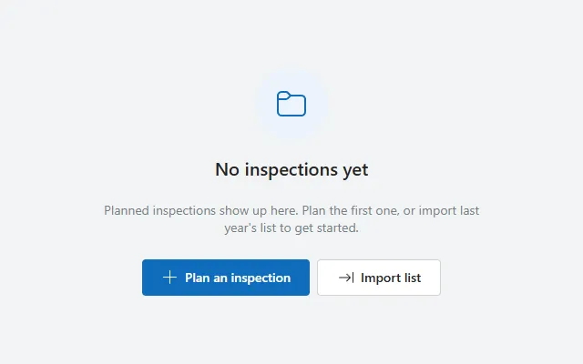
A centred icon in a soft circle, title, short explanation and primary and secondary actions for lists that have nothing to show yet.
- Version
- 2.0.0
- Updated
- Verified in Studio
- Not yet
- Author
- Ynias Bensch
- Tags
Overview
What a screen shows when a list has nothing in it yet: an icon in a soft circle of the theme colour, a title that says what is missing, a short explanation and two actions. Everything is centred in the space it gets.
Show it with the same condition that hides your list, for example Visible: =IsEmpty(RequestsGallery.AllItems) on EmptyStateRoot.
When to use
- Lists that can legitimately be empty: a new user, a filter with no matches, a finished to-do list.
- First-run screens, where the main action is the first step people should take.
When not to use
- Errors and failed loads: use the alert banner with a retry.
- Places where the empty list is obvious and the action is already on screen.
Controls used
| Control | Version |
|---|---|
| GroupContainer | 1.5.0 |
| ModernIcon | 1.1.1 |
| ModernText | 1.0.0 |
| ModernButton | 1.0.0 |
YAML
Works as is, with example data inline. Paste it into a screen or container; the steps are underHow to paste.
Not yet verified in Power Apps Studio. The control versions are drafted from documentation. If Studio flags one, see How to paste for the fix.
- EmptyStateRoot:
    Control: GroupContainer@1.5.0
    Variant: AutoLayout
    Properties:
      DropShadow: =DropShadow.None
      Height: =Parent.Height
      LayoutAlignItems: =LayoutAlignItems.Center
      LayoutDirection: =LayoutDirection.Vertical
      LayoutGap: =12
      LayoutJustifyContent: =LayoutJustifyContent.Center
      PaddingBottom: =24
      PaddingLeft: =24
      PaddingRight: =24
      PaddingTop: =24
      Width: =Parent.Width
    Children:
      - EmptyStateIcon:
          Control: ModernIcon@1.1.1
          Properties:
            AccessibleLabel: ="No results"
            Fill: =App.Theme.Colors.Lighter80
            Height: =80
            Icon: ="Folder"
            IconColor: =App.Theme.Colors.Primary
            LayoutMinHeight: =80
            LayoutMinWidth: =80
            PaddingBottom: =20
            PaddingLeft: =20
            PaddingRight: =20
            PaddingTop: =20
            RadiusBottomLeft: =40
            RadiusBottomRight: =40
            RadiusTopLeft: =40
            RadiusTopRight: =40
            Width: =80
      - EmptyStateTitle:
          Control: ModernText@1.0.0
          Properties:
            AccessibleLabel: =Self.Text
            Align: =Align.Center
            AutoHeight: =true
            FontWeight: =FontWeight.Semibold
            Height: =38
            LayoutMinHeight: =0
            LayoutMinWidth: =80
            Size: =20
            Text: ="No inspections yet"
            Width: =Min(440, Parent.Width - 48)
      - EmptyStateText:
          Control: ModernText@1.0.0
          Properties:
            AccessibleLabel: =Self.Text
            Align: =Align.Center
            AutoHeight: =true
            Color: =ColorFade(App.Theme.Colors.Darker70, 45%)
            Height: =52
            LayoutMinHeight: =0
            LayoutMinWidth: =80
            Size: =14
            Text: ="Planned inspections show up here. Plan the first one, or import last year's list to get started."
            Width: =Min(440, Parent.Width - 48)
      - EmptyStateActions:
          Control: GroupContainer@1.5.0
          Variant: AutoLayout
          Properties:
            DropShadow: =DropShadow.None
            FillPortions: =0
            Height: =48
            LayoutAlignItems: =LayoutAlignItems.End
            LayoutDirection: =LayoutDirection.Horizontal
            LayoutGap: =8
            LayoutJustifyContent: =LayoutJustifyContent.Center
            LayoutMinHeight: =48
            LayoutMinWidth: =120
            Width: =Min(440, Parent.Width - 48)
          Children:
            - EmptyStateAction:
                Control: ModernButton@1.0.0
                Properties:
                  AccessibleLabel: =Self.Text
                  Appearance: =ButtonAppearance.Primary
                  Height: =40
                  Icon: ="Add"
                  LayoutMinHeight: =40
                  LayoutMinWidth: =120
                  OnSelect: =Notify("Replace this with your own action.", NotificationType.Information)
                  Size: =14
                  Text: ="Plan an inspection"
                  Width: =184
            - EmptyStateSecondary:
                Control: ModernButton@1.0.0
                Properties:
                  AccessibleLabel: =Self.Text
                  Appearance: =ButtonAppearance.Secondary
                  Height: =40
                  Icon: ="ArrowImport"
                  LayoutMinHeight: =40
                  LayoutMinWidth: =120
                  OnSelect: =Notify("Replace this with your import action.", NotificationType.Information)
                  Size: =14
                  Text: ="Import list"
                  Width: =136
Make it yours
The example runs on sample data. Replace these properties to connect it to your app.
Text on EmptyStateTitle
Say what is missing, in the words people use for it.
In the YAML
Text: ="No inspections yet"Your version
Text: ="No requests assigned to you"Text on EmptyStateText
One or two sentences on why it is empty and what happens next. The text grows to fit.
In the YAML
Text: ="Planned inspections show up here. Plan the first one, or import last year's list to get started."Your version
Text: ="New requests appear here as soon as a manager assigns them."OnSelect on EmptyStateAction
The main thing people can do from here. Change the button's Text with it.
In the YAML
OnSelect: =Notify("Replace this with your own action.", NotificationType.Information)Your version
OnSelect: =Navigate(NewRequestScreen, ScreenTransition.Cover)Icon on EmptyStateIcon
A Fluent icon name that fits the content, such as Folder, Mail or Calendar.
In the YAML
Icon: ="Folder"Your version
Icon: ="Mail"How to paste
- Open your app in Power Apps Studio.
- Check that modern controls are on: Settings → Updates → Modern controls and themes. In newer environments they are on by default.
- Copy the YAML with the Copy button above the code.
- In the Tree view, select the screen or container that should hold the component and press Ctrl+V. The whole component arrives as one container,
EmptyStateRoot, with all its controls inside. - Work through Make it yours to swap the example data for your own.
Where your version of Studio has a code view for a control or screen, you can paste the same YAML there instead of into the tree view.
When Studio flags a control version
Each control in the YAML names its version, like Control: ModernButton@1.0.0. If that version is newer than what your environment knows, Studio falls back to the version it has or flags the control. All controls of one type in an app must also use the same version, so an app that already has an older ModernButton can reject the paste. To fix it, insert the same control from the Insert pane, copy it as code, note the version on its Control: line, update every matching line in the YAML and paste again.
Missing a component, or did this one not paste cleanly? Suggest a component or report an issue.