Tag picker
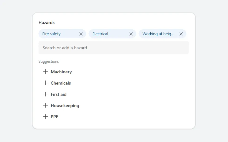
Chips for the chosen tags with a remove button each, a search field, matching suggestions and a Create button for new tags.
- Version
- 1.0.0
- Updated
- Verified in Studio
- Not yet
- Author
- Ynias Bensch
- Tags
Overview
A tag picker for adding several values from a list, or new ones: the chosen tags appear as chips at the top, each with a button to remove it. Under them, a search field filters the suggestions as people type, and selecting a suggestion adds it. When the text matches no suggestion, a Create button adds it as a new tag.
The chips wrap onto as many rows as they need, about three per row on a phone. The chosen tags are kept in locTagPickerValue as one text, for example |Fire safety|Electrical|; TagPickerChips.AllItems gives them as a table. To start from saved tags, set the variable in the screen's OnVisible.
When to use
- Labels, skills, hazards or categories where a record can have several, and the list isn't fixed.
- Up to about ten chosen tags.
When not to use
- Picking one value: use a dropdown.
- A short fixed list where every option should be visible: use checkboxes.
Before you paste
- Something that saves the tags, for example
Patch(Inspections, varInspection, {Hazards: Concat(TagPickerChips.AllItems, Value, "; ")}).
Controls used
| Control | Version |
|---|---|
| GroupContainer | 1.5.0 |
| ModernText | 1.0.0 |
| Gallery | 2.15.0 |
| ModernButton | 1.0.0 |
| ModernTextInput | 1.1.2 |
YAML
Works as is, with example data inline. Paste it into a screen or container; the steps are underHow to paste.
Not yet verified in Power Apps Studio. The control versions are drafted from documentation. If Studio flags one, see How to paste for the fix.
- TagPickerRoot:
    Control: GroupContainer@1.5.0
    Variant: AutoLayout
    Properties:
      BorderColor: =ColorFade(App.Theme.Colors.Darker70, 88%)
      BorderThickness: =1
      DropShadow: =DropShadow.Light
      Fill: =Color.White
      Height: |
        =TagPickerLabel.Height + If(TagPickerChips.Visible, TagPickerChips.Height, TagPickerNone.Height) + TagPickerInput.Height + TagPickerSuggestionsLabel.Height + TagPickerSuggestions.Height + If(TagPickerCreate.Visible, TagPickerCreate.Height + 6, 0) + 4 * 6 + 40
      LayoutDirection: =LayoutDirection.Vertical
      LayoutGap: =6
      PaddingBottom: =20
      PaddingLeft: =20
      PaddingRight: =20
      PaddingTop: =20
      RadiusBottomLeft: =16
      RadiusBottomRight: =16
      RadiusTopLeft: =16
      RadiusTopRight: =16
      Width: =Min(520, Parent.Width)
    Children:
      - TagPickerLabel:
          Control: ModernText@1.0.0
          Properties:
            AccessibleLabel: =Self.Text
            AlignInContainer: =AlignInContainer.Stretch
            FontWeight: =FontWeight.Semibold
            Height: =24
            LayoutMinHeight: =0
            LayoutMinWidth: =80
            PaddingBottom: =0
            PaddingLeft: =0
            PaddingTop: =0
            Size: =14
            Text: ="Hazards"
            Wrap: =false
      - TagPickerChips:
          Control: Gallery@2.15.0
          Variant: Vertical
          Properties:
            AccessibleLabel: ="Selected tags"
            AlignInContainer: =AlignInContainer.Stretch
            BorderThickness: =0
            FillPortions: =0
            Height: =RoundUp(Self.AllItemsCount / Max(1, RoundDown(Self.Width / 160, 0)), 0) * Self.TemplateHeight
            Items: =Filter(Split(Coalesce(locTagPickerValue, "|"), "|"), Len(Value) > 0)
            LayoutMinHeight: =0
            LayoutMinWidth: =120
            ShowScrollbar: =false
            TabIndex: =0
            TemplatePadding: =0
            TemplateSize: =36
            Visible: =Self.AllItemsCount > 0
            WrapCount: =Max(1, RoundDown(Self.Width / 160, 0))
          Children:
            - TagPickerChip:
                Control: GroupContainer@1.5.0
                Variant: ManualLayout
                Properties:
                  DropShadow: =DropShadow.None
                  Fill: =App.Theme.Colors.Lighter80
                  Height: =28
                  RadiusBottomLeft: =14
                  RadiusBottomRight: =14
                  RadiusTopLeft: =14
                  RadiusTopRight: =14
                  Width: =Parent.TemplateWidth - 8
                  X: =0
                  Y: =4
            - TagPickerChipText:
                Control: ModernText@1.0.0
                Properties:
                  AccessibleLabel: =Self.Text
                  Color: =App.Theme.Colors.Darker30
                  Height: =28
                  PaddingBottom: =0
                  PaddingLeft: =12
                  PaddingTop: =0
                  Size: =13
                  Text: =ThisItem.Value
                  Width: =Parent.TemplateWidth - 40
                  Wrap: =false
                  X: =0
                  Y: =4
            - TagPickerChipRemove:
                Control: ModernButton@1.0.0
                Properties:
                  AccessibleLabel: ="Remove " & ThisItem.Value
                  Appearance: =ButtonAppearance.Transparent
                  Height: =24
                  Icon: ="Dismiss"
                  Layout: =ButtonLayout.IconOnly
                  OnSelect: |
                    =UpdateContext({locTagPickerValue: Substitute(Coalesce(locTagPickerValue, "|"), "|" & ThisItem.Value & "|", "|")})
                  Size: =12
                  Tooltip: ="Remove"
                  Width: =24
                  X: =Parent.TemplateWidth - 38
                  Y: =6
      - TagPickerNone:
          Control: ModernText@1.0.0
          Properties:
            AccessibleLabel: =Self.Text
            AlignInContainer: =AlignInContainer.Stretch
            Color: =ColorFade(App.Theme.Colors.Darker70, 45%)
            Height: =28
            LayoutMinHeight: =0
            LayoutMinWidth: =80
            PaddingLeft: =0
            Size: =13
            Text: ="No hazards added yet"
            Visible: =Not(TagPickerChips.Visible)
            Wrap: =false
      - TagPickerInput:
          Control: ModernTextInput@1.1.2
          Properties:
            AccessibleLabel: ="Search or add a hazard"
            AlignInContainer: =AlignInContainer.Stretch
            Height: =40
            LayoutMinHeight: =40
            LayoutMinWidth: =120
            Placeholder: ="Search or add a hazard"
            Size: =14
      - TagPickerSuggestionsLabel:
          Control: ModernText@1.0.0
          Properties:
            AccessibleLabel: =Self.Text
            AlignInContainer: =AlignInContainer.Stretch
            Color: =ColorFade(App.Theme.Colors.Darker70, 45%)
            Height: =28
            LayoutMinHeight: =0
            LayoutMinWidth: =80
            PaddingBottom: =0
            PaddingLeft: =0
            PaddingTop: =8
            Size: =12
            Text: =If(IsBlank(TagPickerInput.Text), "Suggestions", "Matches")
            Wrap: =false
      - TagPickerSuggestions:
          Control: Gallery@2.15.0
          Variant: Vertical
          Properties:
            AccessibleLabel: ="Suggested tags"
            AlignInContainer: =AlignInContainer.Stretch
            BorderThickness: =0
            FillPortions: =0
            Height: =Self.AllItemsCount * (Self.TemplateHeight + Self.TemplatePadding) + Self.TemplatePadding
            Items: |
              =FirstN(
                  Filter(
                      ["Fire safety", "Electrical", "Machinery", "Chemicals", "Working at height", "First aid", "Housekeeping", "PPE", "Traffic", "Noise"],
                      Not("|" & Value & "|" in Coalesce(locTagPickerValue, "|")),
                      IsBlank(TagPickerInput.Text) || StartsWith(Value, TagPickerInput.Text)
                  ),
                  5
              )
            LayoutMinHeight: =0
            LayoutMinWidth: =120
            ShowScrollbar: =false
            TabIndex: =0
            TemplatePadding: =0
            TemplateSize: =36
          Children:
            - TagPickerSuggestion:
                Control: ModernButton@1.0.0
                Properties:
                  AccessibleLabel: ="Add " & ThisItem.Value
                  Align: =Align.Left
                  Appearance: =ButtonAppearance.Subtle
                  Height: =34
                  Icon: ="Add"
                  OnSelect: |
                    =UpdateContext({locTagPickerValue: Coalesce(locTagPickerValue, "|") & ThisItem.Value & "|"});
                    Reset(TagPickerInput)
                  Size: =14
                  Text: =ThisItem.Value
                  Width: =Parent.TemplateWidth
                  X: =0
                  Y: =1
      - TagPickerCreate:
          Control: ModernButton@1.0.0
          Properties:
            AccessibleLabel: =Self.Text
            Align: =Align.Left
            AlignInContainer: =AlignInContainer.Stretch
            Appearance: =ButtonAppearance.Subtle
            Height: =34
            Icon: ="Add"
            LayoutMinHeight: =34
            LayoutMinWidth: =80
            OnSelect: |
              =UpdateContext({locTagPickerValue: Coalesce(locTagPickerValue, "|") & Trim(TagPickerInput.Text) & "|"});
              Reset(TagPickerInput)
            Size: =14
            Text: ="Create """ & Trim(TagPickerInput.Text) & """"
            Visible: |
              =Len(Trim(TagPickerInput.Text)) > 0 && Not("|" & Trim(TagPickerInput.Text) & "|" in Coalesce(locTagPickerValue, "|")) && IsEmpty(Filter(TagPickerSuggestions.AllItems, Value = Trim(TagPickerInput.Text)))
Make it yours
The example runs on sample data. Replace these properties to connect it to your app.
Items on TagPickerSuggestions
The list of known tags to suggest. Keep the two filter conditions and FirstN, which hide tags that are already chosen and show the first five matches.
In the YAML
Items: |
  =FirstN(
      Filter(
          ["Fire safety", "Electrical", "Machinery", "Chemicals", "Working at height", "First aid", "Housekeeping", "PPE", "Traffic", "Noise"],
          Not("|" & Value & "|" in Coalesce(locTagPickerValue, "|")),
          IsBlank(TagPickerInput.Text) || StartsWith(Value, TagPickerInput.Text)
      ),
      5
  )
Your version
Items: |
  =FirstN(
      Filter(
          Distinct(Hazards, Name),
          Not("|" & Value & "|" in Coalesce(locTagPickerValue, "|")),
          IsBlank(TagPickerInput.Text) || StartsWith(Value, TagPickerInput.Text)
      ),
      5
  )
Text on TagPickerLabel
What the tags describe.
In the YAML
Text: ="Hazards"Your version
Text: ="Skills"How to paste
- Open your app in Power Apps Studio.
- Check that modern controls are on: Settings → Updates → Modern controls and themes. In newer environments they are on by default.
- Copy the YAML with the Copy button above the code.
- In the Tree view, select the screen or container that should hold the component and press Ctrl+V. The whole component arrives as one container,
TagPickerRoot, with all its controls inside. - Work through Make it yours to swap the example data for your own.
Where your version of Studio has a code view for a control or screen, you can paste the same YAML there instead of into the tree view.
When Studio flags a control version
Each control in the YAML names its version, like Control: ModernButton@1.0.0. If that version is newer than what your environment knows, Studio falls back to the version it has or flags the control. All controls of one type in an app must also use the same version, so an app that already has an older ModernButton can reject the paste. To fix it, insert the same control from the Insert pane, copy it as code, note the version on its Control: line, update every matching line in the YAML and paste again.
Missing a component, or did this one not paste cleanly? Suggest a component or report an issue.