Responsive app shell
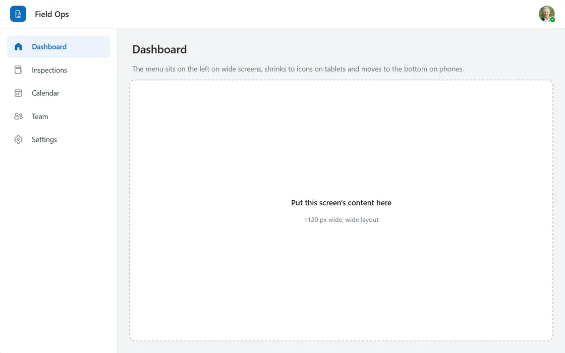
A screen frame with header, menu and content area that keeps a side menu on wide screens, shrinks it to icons on tablets and moves it to the bottom on phones.
- Version
- 1.0.0
- Updated
- Author
- Ynias Bensch
- Tags
Overview
The frame around every screen of an app that runs on a desktop, a tablet and a phone: a header with logo, app name and the signed-in user, a menu, and a content area for the screen itself. It follows the width of the screen in three steps:
- Wide (900 px and up): a side menu with icons and labels.
- Compact (600 to 899 px): the side menu shrinks to icons; hover shows the label as a tooltip.
- Phone (under 600 px): the side menu goes away and a bottom menu takes over, where thumbs can reach it.
One hidden text control, AppShellMode, turns the width into "wide", "compact" or "phone". Every control that changes reads that text, so the breakpoints are written once. The menu is defined once as well: the bottom menu shows the rows of the side menu.
The content area AppShellSlot fills whatever space is left. In the example it shows its own width and the layout, so you can drag the Studio window narrower and watch the shell change. Replace its two texts with your screen's content.
Everything is sized from its parent with auto-layout containers, nothing is placed with fixed X and Y, so the shell needs the app's Scale to fit setting turned off.
When to use
- Apps used on more than one kind of device, such as an inspection app that runs on a laptop in the office and on a phone on site.
- Apps with three to six main screens that people switch between often.
When not to use
- Phone-only or tablet-only apps with a fixed size: a plain header and bottom menu are simpler.
- Apps with one main screen; a header is enough.
Before you paste
- A responsive app: in Settings, Display, turn off Scale to fit, so the screen follows the window and
Parent.Widthchanges. - Paste it directly on the screen, so it fills the whole screen. Put your own controls inside
AppShellSlot.
Controls used
| Control | Version |
|---|---|
| GroupContainer | 1.5.0 |
| ModernText | 1.0.0 |
| ModernIcon | 1.1.1 |
| ModernAvatar | 1.1.0 |
| Gallery | 2.15.0 |
| ModernButton | 1.0.0 |
YAML
Works as is, with example data inline. Paste it into a screen or container; the steps are underHow to paste.
Not yet verified in Power Apps Studio. The control versions are drafted from documentation. If Studio flags one, see How to paste for the fix.
- AppShellRoot:
Control: GroupContainer@1.5.0
Variant: AutoLayout
Properties:
DropShadow: =DropShadow.None
Fill: =ColorFade(App.Theme.Colors.Darker70, 95%)
Height: =Parent.Height
LayoutDirection: =LayoutDirection.Vertical
LayoutGap: =0
RadiusBottomLeft: =0
RadiusBottomRight: =0
RadiusTopLeft: =0
RadiusTopRight: =0
Width: =Parent.Width
Children:
# Hidden. Holds the layout for the current width; every other control reads it.
- AppShellMode:
Control: ModernText@1.0.0
Properties:
AccessibleLabel: =Self.Text
Height: =20
LayoutMinHeight: =0
LayoutMinWidth: =0
Text: =If(Parent.Width >= 900, "wide", Parent.Width >= 600, "compact", "phone")
Visible: =false
Width: =80
- AppShellHeader:
Control: GroupContainer@1.5.0
Variant: AutoLayout
Properties:
AlignInContainer: =AlignInContainer.Stretch
DropShadow: =DropShadow.None
Fill: =Color.White
FillPortions: =0
Height: =56
LayoutAlignItems: =LayoutAlignItems.Center
LayoutDirection: =LayoutDirection.Horizontal
LayoutGap: =12
LayoutMinHeight: =56
LayoutMinWidth: =120
PaddingLeft: =If(AppShellMode.Text = "phone", 16, 20)
PaddingRight: =If(AppShellMode.Text = "phone", 16, 20)
RadiusBottomLeft: =0
RadiusBottomRight: =0
RadiusTopLeft: =0
RadiusTopRight: =0
Children:
- AppShellLogo:
Control: ModernIcon@1.1.1
Properties:
AccessibleLabel: ="App logo"
Fill: =App.Theme.Colors.Primary
Height: =32
Icon: ="Building"
IconColor: =Color.White
LayoutMinHeight: =32
LayoutMinWidth: =32
PaddingBottom: =7
PaddingLeft: =7
PaddingRight: =7
PaddingTop: =7
RadiusBottomLeft: =8
RadiusBottomRight: =8
RadiusTopLeft: =8
RadiusTopRight: =8
Width: =32
- AppShellName:
Control: ModernText@1.0.0
Properties:
AccessibleLabel: =Self.Text
FillPortions: =1
FontWeight: =FontWeight.Semibold
Height: =34
LayoutMinHeight: =0
LayoutMinWidth: =80
PaddingBottom: =0
PaddingTop: =0
Size: =16
Text: ="Field Ops"
Wrap: =false
- AppShellAvatar:
Control: ModernAvatar@1.1.0
Properties:
AccessibleLabel: =User().FullName
Badge: =PresenceBadge.Available
Height: =32
Image: =User().Image
LayoutMinHeight: =32
LayoutMinWidth: =32
Name: =User().FullName
Width: =32
- AppShellHeaderDivider:
Control: GroupContainer@1.5.0
Variant: ManualLayout
Properties:
AlignInContainer: =AlignInContainer.Stretch
DropShadow: =DropShadow.None
Fill: =ColorFade(App.Theme.Colors.Darker70, 88%)
FillPortions: =0
Height: =1
LayoutMinHeight: =1
LayoutMinWidth: =0
RadiusBottomLeft: =0
RadiusBottomRight: =0
RadiusTopLeft: =0
RadiusTopRight: =0
- AppShellBody:
Control: GroupContainer@1.5.0
Variant: AutoLayout
Properties:
AlignInContainer: =AlignInContainer.Stretch
DropShadow: =DropShadow.None
FillPortions: =1
LayoutDirection: =LayoutDirection.Horizontal
LayoutGap: =0
LayoutMinHeight: =0
LayoutMinWidth: =120
Children:
- AppShellNav:
Control: GroupContainer@1.5.0
Variant: AutoLayout
Properties:
AlignInContainer: =AlignInContainer.Stretch
DropShadow: =DropShadow.None
Fill: =Color.White
FillPortions: =0
LayoutDirection: =LayoutDirection.Vertical
LayoutGap: =4
LayoutMinHeight: =0
LayoutMinWidth: =72
PaddingBottom: =12
PaddingLeft: =12
PaddingRight: =12
PaddingTop: =12
RadiusBottomLeft: =0
RadiusBottomRight: =0
RadiusTopLeft: =0
RadiusTopRight: =0
Visible: =AppShellMode.Text <> "phone"
Width: =If(AppShellMode.Text = "wide", 232, 72)
Children:
- AppShellNavGallery:
Control: Gallery@2.15.0
Variant: Vertical
Properties:
AccessibleLabel: ="Main navigation"
AlignInContainer: =AlignInContainer.Stretch
BorderThickness: =0
FillPortions: =0
Height: =Self.AllItemsCount * (Self.TemplateHeight + Self.TemplatePadding) + Self.TemplatePadding
# Screen holds a name here; put real screen references in your own table.
Items: |
=Table(
{Label: "Dashboard", Icon: "Home", Screen: "HomeScreen"},
{Label: "Inspections", Icon: "Notebook", Screen: "InspectionsScreen"},
{Label: "Calendar", Icon: "Calendar", Screen: "CalendarScreen"},
{Label: "Team", Icon: "People", Screen: "TeamScreen"},
{Label: "Settings", Icon: "Settings", Screen: "SettingsScreen"}
)
LayoutMinHeight: =0
LayoutMinWidth: =48
ShowScrollbar: =false
TabIndex: =0
TemplatePadding: =2
TemplateSize: =44
Children:
- AppShellNavItem:
Control: GroupContainer@1.5.0
Variant: AutoLayout
Properties:
DropShadow: =DropShadow.None
Fill: =If(ThisItem.Label = AppShellPageTitle.Text, App.Theme.Colors.Lighter80, Color.Transparent)
Height: =Parent.TemplateHeight
LayoutAlignItems: =LayoutAlignItems.Center
LayoutDirection: =LayoutDirection.Horizontal
LayoutGap: =12
LayoutJustifyContent: =If(AppShellMode.Text = "wide", LayoutJustifyContent.Start, LayoutJustifyContent.Center)
PaddingLeft: =If(AppShellMode.Text = "wide", 12, 0)
PaddingRight: =If(AppShellMode.Text = "wide", 12, 0)
RadiusBottomLeft: =8
RadiusBottomRight: =8
RadiusTopLeft: =8
RadiusTopRight: =8
Width: =Parent.TemplateWidth
X: =0
Y: =0
Children:
- AppShellNavIcon:
Control: ModernIcon@1.1.1
Properties:
AccessibleLabel: =ThisItem.Label
Height: =20
Icon: =ThisItem.Icon
IconColor: =If(ThisItem.Label = AppShellPageTitle.Text, App.Theme.Colors.Primary, ColorFade(App.Theme.Colors.Darker70, 35%))
IconStyle: =If(ThisItem.Label = AppShellPageTitle.Text, IconStyle.Filled, IconStyle.Outline)
LayoutMinHeight: =20
LayoutMinWidth: =20
Width: =20
- AppShellNavLabel:
Control: ModernText@1.0.0
Properties:
AccessibleLabel: =Self.Text
Color: =If(ThisItem.Label = AppShellPageTitle.Text, App.Theme.Colors.Primary, ColorFade(App.Theme.Colors.Darker70, 15%))
FillPortions: =1
FontWeight: =If(ThisItem.Label = AppShellPageTitle.Text, FontWeight.Semibold, FontWeight.Normal)
Height: =30
LayoutMinHeight: =0
LayoutMinWidth: =60
Size: =14
Text: =ThisItem.Label
Visible: =AppShellMode.Text = "wide"
Wrap: =false
- AppShellNavButton:
Control: ModernButton@1.0.0
Properties:
AccessibleLabel: =ThisItem.Label & If(ThisItem.Label = AppShellPageTitle.Text, ", current page", "")
Appearance: =ButtonAppearance.Transparent
Height: =Parent.TemplateHeight
Layout: =ButtonLayout.TextOnly
OnSelect: |
=UpdateContext({locAppShellPage: ThisItem.Label})
Size: =14
Text: =""
Tooltip: =If(AppShellMode.Text = "wide", "", ThisItem.Label)
Width: =Parent.TemplateWidth
X: =0
Y: =0
- AppShellNavDivider:
Control: GroupContainer@1.5.0
Variant: ManualLayout
Properties:
AlignInContainer: =AlignInContainer.Stretch
DropShadow: =DropShadow.None
Fill: =ColorFade(App.Theme.Colors.Darker70, 88%)
FillPortions: =0
LayoutMinHeight: =0
LayoutMinWidth: =1
RadiusBottomLeft: =0
RadiusBottomRight: =0
RadiusTopLeft: =0
RadiusTopRight: =0
Visible: =AppShellNav.Visible
Width: =1
- AppShellMain:
Control: GroupContainer@1.5.0
Variant: AutoLayout
Properties:
AlignInContainer: =AlignInContainer.Stretch
DropShadow: =DropShadow.None
FillPortions: =1
LayoutDirection: =LayoutDirection.Vertical
LayoutGap: =12
LayoutMinHeight: =0
LayoutMinWidth: =120
PaddingBottom: =If(AppShellMode.Text = "phone", 16, 24)
PaddingLeft: =If(AppShellMode.Text = "phone", 16, 24)
PaddingRight: =If(AppShellMode.Text = "phone", 16, 24)
PaddingTop: =If(AppShellMode.Text = "phone", 16, 24)
Children:
- AppShellPageTitle:
Control: ModernText@1.0.0
Properties:
AccessibleLabel: =Self.Text
AlignInContainer: =AlignInContainer.Stretch
FontWeight: =FontWeight.Semibold
Height: =34
LayoutMinHeight: =0
LayoutMinWidth: =80
PaddingBottom: =0
PaddingTop: =0
Size: =22
Text: =Coalesce(locAppShellPage, "Dashboard")
Wrap: =false
- AppShellPageIntro:
Control: ModernText@1.0.0
Properties:
AccessibleLabel: =Self.Text
AlignInContainer: =AlignInContainer.Stretch
AutoHeight: =true
Color: =ColorFade(App.Theme.Colors.Darker70, 40%)
Height: =24
LayoutMinHeight: =0
LayoutMinWidth: =80
PaddingBottom: =0
PaddingTop: =0
Size: =14
Text: ="The menu sits on the left on wide screens, shrinks to icons on tablets and moves to the bottom on phones."
- AppShellSlot:
Control: GroupContainer@1.5.0
Variant: AutoLayout
Properties:
AlignInContainer: =AlignInContainer.Stretch
BorderColor: =ColorFade(App.Theme.Colors.Darker70, 75%)
BorderStyle: =BorderStyle.Dashed
BorderThickness: =2
DropShadow: =DropShadow.None
Fill: =ColorFade(Color.White, 40%)
FillPortions: =1
LayoutAlignItems: =LayoutAlignItems.Center
LayoutDirection: =LayoutDirection.Vertical
LayoutGap: =4
LayoutJustifyContent: =LayoutJustifyContent.Center
LayoutMinHeight: =96
LayoutMinWidth: =120
RadiusBottomLeft: =12
RadiusBottomRight: =12
RadiusTopLeft: =12
RadiusTopRight: =12
Children:
- AppShellSlotTitle:
Control: ModernText@1.0.0
Properties:
AccessibleLabel: =Self.Text
Align: =Align.Center
AlignInContainer: =AlignInContainer.Stretch
FontWeight: =FontWeight.Semibold
Height: =30
LayoutMinHeight: =0
LayoutMinWidth: =80
PaddingBottom: =0
PaddingTop: =0
Size: =15
Text: ="Put this screen's content here"
Wrap: =false
- AppShellSlotInfo:
Control: ModernText@1.0.0
Properties:
AccessibleLabel: =Self.Text
Align: =Align.Center
AlignInContainer: =AlignInContainer.Stretch
Color: =ColorFade(App.Theme.Colors.Darker70, 40%)
Height: =28
LayoutMinHeight: =0
LayoutMinWidth: =80
PaddingBottom: =0
PaddingTop: =0
Size: =13
Text: =AppShellRoot.Width & " px wide, " & AppShellMode.Text & " layout"
Wrap: =false
- AppShellBottomBar:
Control: GroupContainer@1.5.0
Variant: ManualLayout
Properties:
AlignInContainer: =AlignInContainer.Stretch
DropShadow: =DropShadow.None
Fill: =Color.White
FillPortions: =0
Height: =65
LayoutMinHeight: =65
LayoutMinWidth: =120
RadiusBottomLeft: =0
RadiusBottomRight: =0
RadiusTopLeft: =0
RadiusTopRight: =0
Visible: =AppShellMode.Text = "phone"
Children:
- AppShellBottomDivider:
Control: GroupContainer@1.5.0
Variant: ManualLayout
Properties:
DropShadow: =DropShadow.None
Fill: =ColorFade(App.Theme.Colors.Darker70, 88%)
Height: =1
RadiusBottomLeft: =0
RadiusBottomRight: =0
RadiusTopLeft: =0
RadiusTopRight: =0
Width: =Parent.Width
X: =0
Y: =0
- AppShellBottomGallery:
Control: Gallery@2.15.0
Variant: Horizontal
Properties:
AccessibleLabel: ="Main navigation"
BorderThickness: =0
Height: =Parent.Height - 1
# The same menu as the side navigation, so it is defined once.
Items: =AppShellNavGallery.AllItems
ShowScrollbar: =false
TabIndex: =0
TemplatePadding: =0
TemplateSize: =Self.Width / Max(1, Self.AllItemsCount)
Width: =Parent.Width
X: =0
Y: =1
Children:
- AppShellBottomIndicator:
Control: GroupContainer@1.5.0
Variant: ManualLayout
Properties:
DropShadow: =DropShadow.None
Fill: =If(ThisItem.Label = AppShellPageTitle.Text, App.Theme.Colors.Lighter80, Color.Transparent)
Height: =28
RadiusBottomLeft: =14
RadiusBottomRight: =14
RadiusTopLeft: =14
RadiusTopRight: =14
Width: =52
X: =(Parent.TemplateWidth - Self.Width) / 2
Y: =7
- AppShellBottomIcon:
Control: ModernIcon@1.1.1
Properties:
AccessibleLabel: =ThisItem.Label
Height: =20
Icon: =ThisItem.Icon
IconColor: =If(ThisItem.Label = AppShellPageTitle.Text, App.Theme.Colors.Primary, ColorFade(App.Theme.Colors.Darker70, 40%))
IconStyle: =If(ThisItem.Label = AppShellPageTitle.Text, IconStyle.Filled, IconStyle.Outline)
Width: =20
X: =(Parent.TemplateWidth - Self.Width) / 2
Y: =11
- AppShellBottomLabel:
Control: ModernText@1.0.0
Properties:
AccessibleLabel: =Self.Text
Align: =Align.Center
Color: =If(ThisItem.Label = AppShellPageTitle.Text, App.Theme.Colors.Darker70, ColorFade(App.Theme.Colors.Darker70, 40%))
FontWeight: =If(ThisItem.Label = AppShellPageTitle.Text, FontWeight.Semibold, FontWeight.Normal)
Height: =20
PaddingBottom: =0
PaddingLeft: =0
PaddingRight: =0
PaddingTop: =0
Size: =11
Text: =ThisItem.Label
Width: =Parent.TemplateWidth
Wrap: =false
X: =0
Y: =38
- AppShellBottomButton:
Control: ModernButton@1.0.0
Properties:
AccessibleLabel: =ThisItem.Label & If(ThisItem.Label = AppShellPageTitle.Text, ", current page", "")
Appearance: =ButtonAppearance.Transparent
Height: =Parent.TemplateHeight
OnSelect: |
=UpdateContext({locAppShellPage: ThisItem.Label})
Text: =""
Width: =Parent.TemplateWidth
X: =0
Y: =0Make it yours
The example runs on sample data. Replace these properties to connect it to your app.
Items on AppShellNavGallery
One row per menu item. The bottom menu on phones reads the same rows, so this is the only menu to change. Put screen references in Screen in your own table; the example uses names so it works without those screens.
In the YAML
Items: |
  =Table(
      {Label: "Dashboard", Icon: "Home", Screen: "HomeScreen"},
      {Label: "Inspections", Icon: "Notebook", Screen: "InspectionsScreen"},
      {Label: "Calendar", Icon: "Calendar", Screen: "CalendarScreen"},
      {Label: "Team", Icon: "People", Screen: "TeamScreen"},
      {Label: "Settings", Icon: "Settings", Screen: "SettingsScreen"}
  )
Your version
Items: |
  =Table(
      {Label: "Dashboard", Icon: "Home", Screen: HomeScreen},
      {Label: "Inspections", Icon: "Notebook", Screen: InspectionsScreen},
      {Label: "Settings", Icon: "Settings", Screen: SettingsScreen}
  )
OnSelect on AppShellNavButton
Go to the screen in the row. Give AppShellBottomButton in the bottom menu the same formula.
In the YAML
OnSelect: |
  =UpdateContext({locAppShellPage: ThisItem.Label})
Your version
OnSelect: =Navigate(ThisItem.Screen, ScreenTransition.None)Text on AppShellPageTitle
The page title. Both menus highlight the item whose label matches it, so with real screens, read it from the screen you are on and paste the shell on every screen.
In the YAML
Text: =Coalesce(locAppShellPage, "Dashboard")Your version
Text: =LookUp(AppShellNavGallery.AllItems, Screen = App.ActiveScreen).LabelText on AppShellMode
The breakpoints. This hidden text says which layout fits the current width, and every other control reads it. Change the numbers here and the whole shell follows.
In the YAML
Text: =If(Parent.Width >= 900, "wide", Parent.Width >= 600, "compact", "phone")Your version
Text: =If(Parent.Width >= 1024, "wide", Parent.Width >= 640, "compact", "phone")Text on AppShellName
The app name next to the logo tile.
In the YAML
Text: ="Field Ops"Your version
Text: ="Site audits"How to paste
- Open your app in Power Apps Studio.
- Check that modern controls are on: Settings → Updates → Modern controls and themes. In newer environments they are on by default.
- Copy the YAML with the Copy button above the code.
- In the Tree view, select the screen or container that should hold the component and press Ctrl+V. The whole component arrives as one container,
AppShellRoot, with all its controls inside. - Work through Make it yours to swap the example data for your own.
Where your version of Studio has a code view for a control or screen, you can paste the same YAML there instead of into the tree view.
When Studio flags a control version
Each control in the YAML names its version, like Control: ModernButton@1.0.0. If that version is newer than what your environment knows, Studio falls back to the version it has or flags the control. All controls of one type in an app must also use the same version, so an app that already has an older ModernButton can reject the paste. To fix it, insert the same control from the Insert pane, copy it as code, note the version on its Control: line, update every matching line in the YAML and paste again.
Missing a component, or did this one not paste cleanly? Suggest a component or report an issue.