Busy overlay
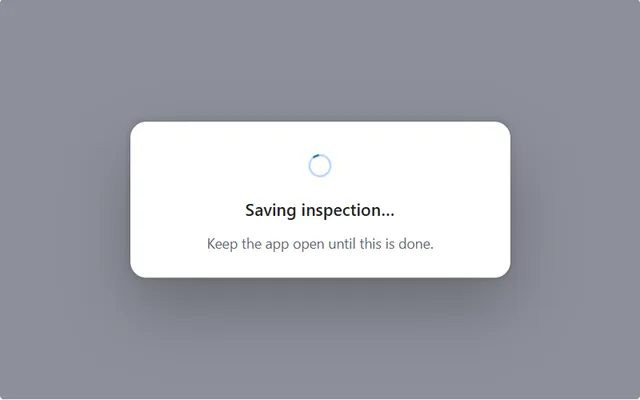
A dimmed overlay with spinner and message that blocks the screen while a save runs, and turns into an error panel with Try again if it fails.
- Version
- 1.0.0
- Updated
- Author
- Ynias Bensch
- Tags
Overview
A full-screen overlay for actions that take a moment, such as a Patch, SubmitForm or flow call. A dimmed backdrop blocks taps on everything behind it, so nobody can tap Save twice or leave a half-filled form, and a white panel shows a spinner and a message that names the action.
If the action fails, the same panel turns into an error panel: an error icon, the message, the error text and Close and Try again buttons. People see what went wrong in the place they were already looking, instead of in a banner at the top that disappears.
Three context variables drive it. locBusyOverlayState is "busy", "error" or empty, and locBusyOverlayMessage and locBusyOverlayError hold the texts. IfError takes care of switching between them: its second argument runs when Patch fails and its third only when it succeeds.
The panel is at most 380 pixels wide, centres itself and is as tall as its content.
How to start it
Put this on the button that saves. It shows the overlay, runs Patch, and then hides the overlay or switches it to the error panel:
UpdateContext({
    locBusyOverlayState: "busy",
    locBusyOverlayMessage: "Saving inspection…",
    locBusyOverlayError: ""
});
IfError(
    Patch(Inspections, Defaults(Inspections), {Title: "Fire safety audit"}),
    UpdateContext({
        locBusyOverlayState: "error",
        locBusyOverlayMessage: "The inspection wasn't saved",
        locBusyOverlayError: FirstError.Message
    }),
    UpdateContext({locBusyOverlayState: ""})
)
The overlay shows up even though the formula runs in one go: Patch waits for the server, and the screen redraws while it waits.
When to use
- Saves and calls that take more than about half a second, where a second tap would cause a duplicate.
- Actions people must not interrupt, such as submitting a signed report.
When not to use
- Loading a list or a page: show a skeleton in place of the content, so people can still navigate.
- Background work like syncing, where people can keep going; use a small status indicator instead.
Before you paste
- The action that shows it: put the formula under How to start it on your save button. Until something on the screen sets
locBusyOverlayState,locBusyOverlayMessageandlocBusyOverlayError, Studio flags those names. - Paste it directly on the screen, last, so it covers everything else. Inside a container it only covers that container.
Controls used
| Control | Version |
|---|---|
| GroupContainer | 1.5.0 |
| ModernSpinner | 1.1.0 |
| ModernIcon | 1.1.1 |
| ModernText | 1.0.0 |
| ModernButton | 1.0.0 |
YAML
Works as is, with example data inline. Paste it into a screen or container; the steps are underHow to paste.
Not yet verified in Power Apps Studio. The control versions are drafted from documentation. If Studio flags one, see How to paste for the fix.
- BusyOverlayRoot:
    Control: GroupContainer@1.5.0
    Variant: ManualLayout
    Properties:
      DropShadow: =DropShadow.None
      Fill: =RGBA(15, 23, 42, 0.45)
      Height: =Parent.Height
      RadiusBottomLeft: =0
      RadiusBottomRight: =0
      RadiusTopLeft: =0
      RadiusTopRight: =0
      Visible: =Not(IsBlank(locBusyOverlayState))
      Width: =Parent.Width
    Children:
      - BusyOverlayPanel:
          Control: GroupContainer@1.5.0
          Variant: AutoLayout
          Properties:
            DropShadow: =DropShadow.ExtraBold
            Fill: =Color.White
            # Hidden children take no space, so the height follows the state.
            Height: |
              =BusyOverlayMessage.Height + BusyOverlayDetail.Height + 48 +
              If(locBusyOverlayState = "error", BusyOverlayErrorIcon.Height + BusyOverlayActions.Height + 3 * 12, BusyOverlaySpinner.Height + 2 * 12)
            LayoutAlignItems: =LayoutAlignItems.Center
            LayoutDirection: =LayoutDirection.Vertical
            LayoutGap: =12
            PaddingBottom: =24
            PaddingLeft: =24
            PaddingRight: =24
            PaddingTop: =24
            RadiusBottomLeft: =16
            RadiusBottomRight: =16
            RadiusTopLeft: =16
            RadiusTopRight: =16
            Width: =Min(380, Parent.Width - 32)
            X: =(Parent.Width - Self.Width) / 2
            Y: =(Parent.Height - Self.Height) / 2
          Children:
            - BusyOverlaySpinner:
                Control: ModernSpinner@1.1.0
                Properties:
                  AccessibleLabel: =BusyOverlayMessage.Text
                  Height: =40
                  LayoutMinHeight: =40
                  LayoutMinWidth: =40
                  Visible: =locBusyOverlayState <> "error"
                  Width: =40
            - BusyOverlayErrorIcon:
                Control: ModernIcon@1.1.1
                Properties:
                  AccessibleLabel: ="Error"
                  BasePaletteColor: =RGBA(196, 43, 28, 1)
                  Fill: =ColorFade(Self.BasePaletteColor, 88%)
                  Height: =44
                  Icon: ="ErrorCircle"
                  IconColor: =Self.BasePaletteColor
                  LayoutMinHeight: =44
                  LayoutMinWidth: =44
                  PaddingBottom: =10
                  PaddingLeft: =10
                  PaddingRight: =10
                  PaddingTop: =10
                  RadiusBottomLeft: =22
                  RadiusBottomRight: =22
                  RadiusTopLeft: =22
                  RadiusTopRight: =22
                  Visible: =locBusyOverlayState = "error"
                  Width: =44
            - BusyOverlayMessage:
                Control: ModernText@1.0.0
                Properties:
                  AccessibleLabel: =Self.Text
                  Align: =Align.Center
                  AlignInContainer: =AlignInContainer.Stretch
                  AutoHeight: =true
                  FontWeight: =FontWeight.Semibold
                  Height: =34
                  LayoutMinHeight: =0
                  LayoutMinWidth: =80
                  PaddingBottom: =0
                  PaddingTop: =0
                  Size: =17
                  Text: =locBusyOverlayMessage
            - BusyOverlayDetail:
                Control: ModernText@1.0.0
                Properties:
                  AccessibleLabel: =Self.Text
                  Align: =Align.Center
                  AlignInContainer: =AlignInContainer.Stretch
                  AutoHeight: =true
                  Color: =ColorFade(App.Theme.Colors.Darker70, 35%)
                  Height: =28
                  LayoutMinHeight: =0
                  LayoutMinWidth: =80
                  PaddingBottom: =0
                  PaddingTop: =0
                  Size: =14
                  Text: =If(locBusyOverlayState = "error", locBusyOverlayError, "Keep the app open until this is done.")
            - BusyOverlayActions:
                Control: GroupContainer@1.5.0
                Variant: AutoLayout
                Properties:
                  AlignInContainer: =AlignInContainer.Stretch
                  DropShadow: =DropShadow.None
                  FillPortions: =0
                  Height: =40
                  LayoutDirection: =LayoutDirection.Horizontal
                  LayoutGap: =8
                  LayoutJustifyContent: =LayoutJustifyContent.Center
                  LayoutMinHeight: =40
                  LayoutMinWidth: =80
                  Visible: =locBusyOverlayState = "error"
                Children:
                  - BusyOverlayClose:
                      Control: ModernButton@1.0.0
                      Properties:
                        AccessibleLabel: =Self.Text
                        Appearance: =ButtonAppearance.Secondary
                        Height: =40
                        LayoutMinHeight: =40
                        LayoutMinWidth: =96
                        OnSelect: |
                          =UpdateContext({locBusyOverlayState: ""})
                        Size: =14
                        Text: ="Close"
                        Width: =100
                  - BusyOverlayRetry:
                      Control: ModernButton@1.0.0
                      Properties:
                        AccessibleLabel: =Self.Text
                        Appearance: =ButtonAppearance.Primary
                        Height: =40
                        LayoutMinHeight: =40
                        LayoutMinWidth: =96
                        OnSelect: |
                          =UpdateContext({locBusyOverlayState: ""});
                          Notify("Run the action again here (example only).", NotificationType.Information)
                        Size: =14
                        Text: ="Try again"
                        Width: =116
Make it yours
The example runs on sample data. Replace these properties to connect it to your app.
OnSelect on BusyOverlayRetry
Run the failed action again. Selecting the button that started it keeps the action in one place.
In the YAML
OnSelect: |
  =UpdateContext({locBusyOverlayState: ""});
  Notify("Run the action again here (example only).", NotificationType.Information)
Your version
OnSelect: |
  =UpdateContext({locBusyOverlayState: ""});
  Select(InspectionSaveButton)
Text on BusyOverlayDetail
The line under the message. While busy it asks people to wait; after an error it shows the error from FirstError.Message. Write your own text for errors you expect.
In the YAML
Text: =If(locBusyOverlayState = "error", locBusyOverlayError, "Keep the app open until this is done.")Your version
Text: |
  =If(
      locBusyOverlayState = "error",
      If(Connection.Connected, locBusyOverlayError, "You're offline. Connect and try again."),
      "Keep the app open until this is done."
  )
BasePaletteColor on BusyOverlayErrorIcon
The colour of the error icon; its tile is a tint of the same colour. It is hard-coded because the theme has no red.
In the YAML
BasePaletteColor: =RGBA(196, 43, 28, 1)Your version
BasePaletteColor: =RGBA(164, 38, 44, 1)Fill on BusyOverlayRoot
The dimmed backdrop. It is hard-coded because the theme has no transparent colour; darken or lighten it to suit your theme.
In the YAML
Fill: =RGBA(15, 23, 42, 0.45)Your version
Fill: =RGBA(255, 255, 255, 0.7)How to paste
- Open your app in Power Apps Studio.
- Check that modern controls are on: Settings → Updates → Modern controls and themes. In newer environments they are on by default.
- Copy the YAML with the Copy button above the code.
- In the Tree view, select the screen or container that should hold the component and press Ctrl+V. The whole component arrives as one container,
BusyOverlayRoot, with all its controls inside. - Work through Make it yours to swap the example data for your own.
Where your version of Studio has a code view for a control or screen, you can paste the same YAML there instead of into the tree view.
When Studio flags a control version
Each control in the YAML names its version, like Control: ModernButton@1.0.0. If that version is newer than what your environment knows, Studio falls back to the version it has or flags the control. All controls of one type in an app must also use the same version, so an app that already has an older ModernButton can reject the paste. To fix it, insert the same control from the Insert pane, copy it as code, note the version on its Control: line, update every matching line in the YAML and paste again.
Missing a component, or did this one not paste cleanly? Suggest a component or report an issue.